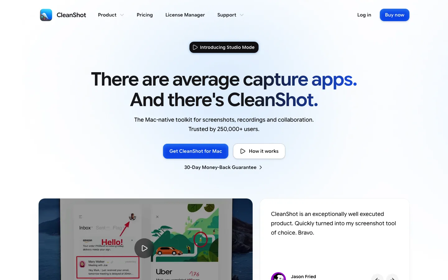
cleanshot.com3views
Nine details, seven pinned.
View as Markdown ↗Sized by coverage · click to copy.
Marketing infrastructure for agents
GeistSans · 60/66 · 600 · -1.8px
Marketing infrastructure
GeistSans · 14/20 · 500 · normal
One integration for every channel. Official APIs only
GeistSans · 24/32 · 600 · -0.48px
Give your product or agent a way to reach customers anywhere. Skip months of pla
GeistSans · 16/24 · 400 · normal
POST /v1/posts
Menlo · 9/16 · 700 · 0.45px
Specimens are the page's own words at their measured metrics; shown in Inter when the family is not loaded.
 1234567
Blurred stepped-bar hero art: vertical columns in an orange-to-cream gradient, heavily Gaussian-blurred and anchored to the bottom edge. It gives abstract data-viz warmth with no illustration or screenshot needed
Live-number eyebrow pill above the H1 ("48,522 accounts connected this week ›"): accent text on a pale peach tint, radius 4–6px, chevron trailing. Social proof turned into the eyebrow
Paired hero CTAs: a solid vermilion "Start for free" (12px radius, 44px tall, 500 weight) beside a white, hairline-bordered "Continue with Google" with the G logo, so the second button skips the signup step instead of just being a "Learn more"
"Works with" row: overlapping circular agent/tool logos with a "+4" overflow chip and a copy icon after them. It works like an avatar stack, but for integrations
Full-bleed accent announcement bar (#eb3514, white 500-weight text, rocket icon, arrow) that matches the CTA color exactly, so the brand hue gets set before the nav even renders
Partner badges set in a 25px-radius hairline capsule over a dotted-grid field, all inside the page's ruled center column. The dot grid gives an empty band texture without color
Dark-mode band for the code section: window-chrome traffic lights, icon tabs (API / MCP / CLI) with a 2px vermilion underline on the active tab, and a syntax block whose keys are tinted in the accent. Below it sits a row of pill-shaped language chips with the active one inverted to white
Accent eyebrow plus tinted chip labels on cards ("Voice & Calls ›" in vermilion on peach): the same tint recipe as the hero pill, reused as card category links
Ruled center column: 1px warm-gray (#d0cfcc) vertical rules run the full page height at the container edges, with sections divided by horizontal hairlines, so the whole page sits on a blueprint frame
saas · landing · mixed · minimal, corporate-clean, bento · warm, technical, confident, energetic, trustworthy