steel.dev0views
Eight details, seven pinned.
View as Markdown ↗Sized by coverage · click to copy.
Ship faster than ever.
inter · 60/60 · 600 · -1.5px
1. Select a component
inter · 24/32 · 600 · normal
Whenever you spot a component you like, just fire up YoinkUI and click on it
inter · 16/20 · 400 · normal
Specimens are the page's own words at their measured metrics; shown in Inter when the family is not loaded.
 1234678
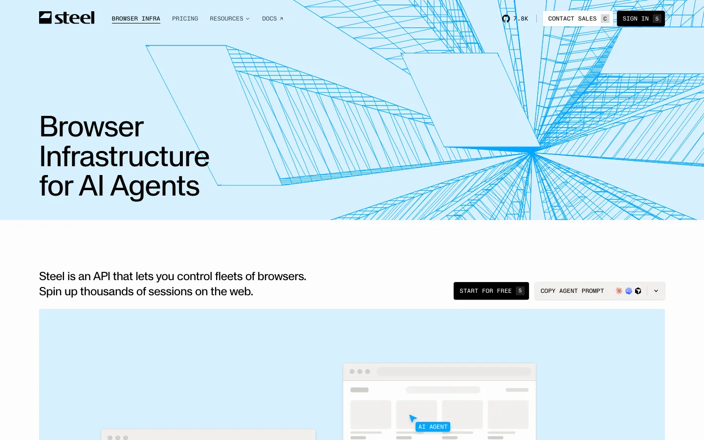
Blueprint grid as the hero's only ornament — a 1px cerulean graph-paper grid at very low opacity, roughly 60px cells, drawn edge to edge and clipped hard at the section boundary with no fade or vignette softening it
Two-tone headline instead of a highlight — 60px Inter at weight 600, 60px line height (a 1.0 ratio, so the two lines nearly touch) and -1.5px tracking, with the entire second line set in the accent; the color break carries all the emphasis, so no italic, underline or marker shape is needed
Install button that names its own surface — a 48px pill, border-radius: 9999px, 12px/30px padding, solid #000000 with a 16px/600 white label, and the Chrome glyph in a filled circle to the left of the text so the CTA reads as an extension install rather than a signup
Social proof compressed into one centered line — three overlapping circular avatars, five amber stars, and a single bolded number inside an otherwise gray sentence, all stacked between the subhead and the button so the proof is passed before the click
Chromeless header that becomes a floating capsule — transparent with no bar fill and no bottom border at rest, then on scroll it collapses into a translucent blurred pill inset from both edges, carrying the same logo, three links and install button at the same sizes
Content column drawn, not implied — the dark band marks its measure with two full-height vertical hairlines and lets the page ground continue outside them, which reads as a layout guide left visible on purpose
Hairline cells in place of feature tiles — the steps sit in a two-up then one-up grid divided by 1px rules on a #101012 ground, with no card fill, no radius and no shadow; each numbered heading gets a short accent bar flush to its left, the only color in the whole band
The closing section mirrors the hero instead of restating it — the band inverts back to white with a soft cool glow bleeding in from the sides, repeats the same 48px black pill, and hands straight off to a black footer, so the page ends on the same two moves it opened with
saas · landing · mixed · minimal, swiss · confident, technical, energetic, optimistic