Dia · Oct 20261view
Eight details, eight pinned.
View as Markdown ↗Sized by coverage · click to copy.
A week of launches from WorkOS
Instrument Serif · 40/48 · 400 · 0.4px
SwimClub
Times New Roman · 44/53 · 400 · normal
Take full control of your auth UI with custom CSS. Style elements, customize lay
Times New Roman · 19/27 · 400 · normal
background-color
Ibm Plex Mono · 12/19 · 400 · 0.24px
Specimens are the page's own words at their measured metrics; shown in Inter when the family is not loaded.
 12345678
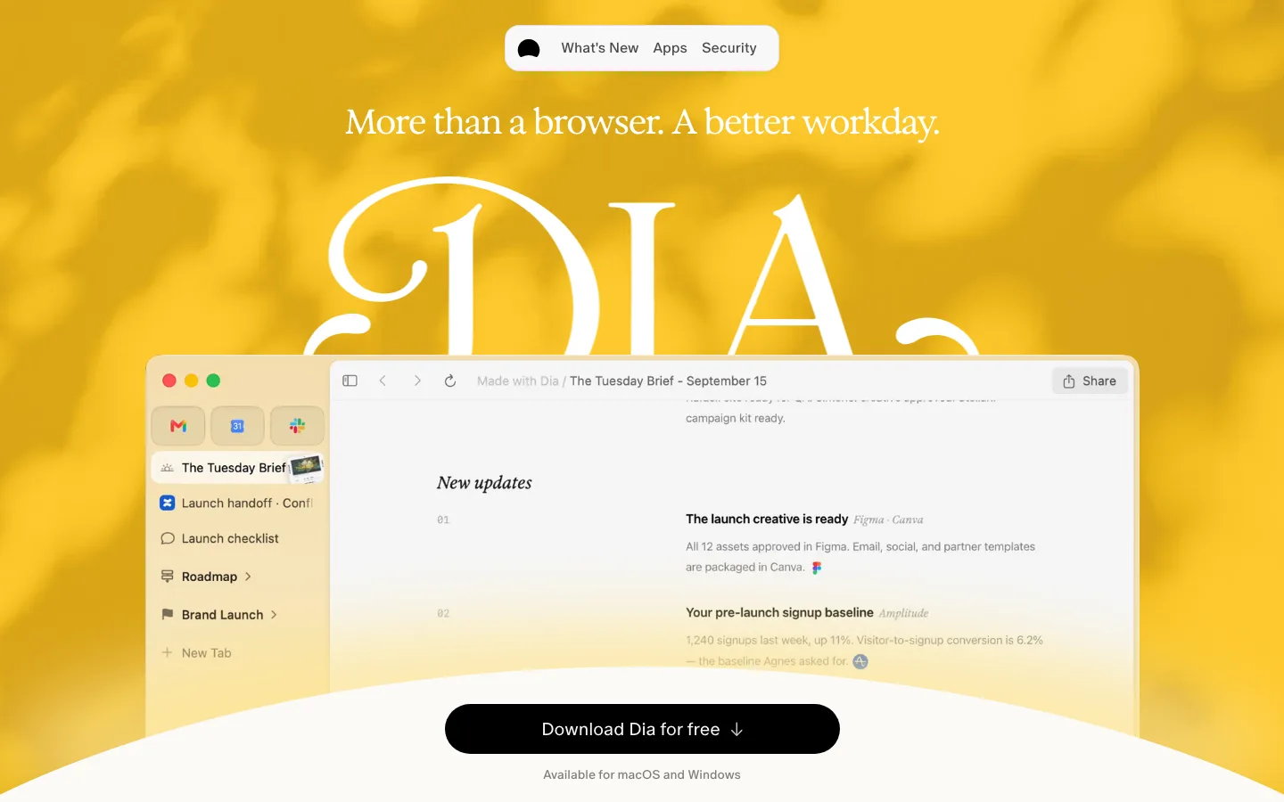
Dithered cloud sky as a hero ground — a soft blue gradient with visible halftone dither, so the "photo" feels printed rather than rendered, and the cream page below it reads as paper.
Glossy script wordmark as the hero object — "Launch Week" set in a chrome/glass brush script, tilted, sitting *in* the clouds rather than on top of a heading stack; the real headline is demoted to a side window.
Classic-OS window as the universal container — hairline border, pinstriped title bar with an app icon, dated label ("Launch 02: 06.24"), cream fill. Every launch, the hero card, and the CTA all use the same chrome, so a campaign of six releases reads as one system.
Fictional demo app ("SwimClub") in a consistent pixel-art dialect — 8-bit pool/cabana icons, a "NEW" pill, a rounded search field with a glossy magnifier button, and beveled toggles; the product feature is shown *through* a toy product instead of a screenshot.
All-serif type pairing — Instrument Serif display (72px, 400, slight positive tracking) over a Times-family body at 19px/1.4; no sans anywhere but the logo.
One gel button — the aqua CTA (#a6e3fa on #0f0f14 text) with a vertical shine gradient, 1px border, 4px radius and 56px height, used exactly once so the glossiness stays special.
Tiny radii everywhere (2–6px) — keeps the retro-OS feeling; nothing is pill-shaped except the search field and "Popular" badge inside the fictional app.
Near-black code panels as the only dark surfaces, set against the sky-blue demo canvas so the "developer" layer is legible at a glance.
saas · landing · light