skale.solutions1view

Ten details, ten pinned.
View as Markdown ↗Sized by coverage · click to copy.
Wireframe Aa Design Studio
InterDisplay · 44/44 · 600 · -0.66px
Career
InterVariable · 12/20 · 425 · -0.06px
World-class visual design, shipped in weeks not months. From standout marketing
InterVariable · 16/24 · 425 · -0.24px
Work Soon
InterVariable · 13/20 · 450 · -0.065px
Specimens are the page's own words at their measured metrics; shown in Inter when the family is not loaded.
 12345678910
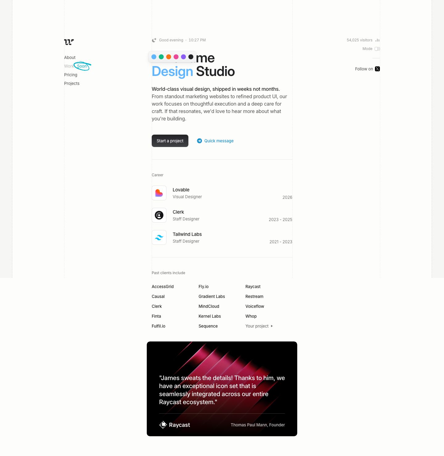
Dashed vertical construction lines run the full height at every column edge (1px dashed #d4d3d3 on #f6f6f4/#fcfcfb), so the grid stays visible as a design object and the page reads like a Figma frame, which fits a studio called Wireframe
A floating swatch strip (six 14px dots in a white 8px-radius pill with a soft shadow) overlaps the headline and recolors the accent word live, a playful brand demo that costs one component
The headline's second line tints one word (sky-blue "Design" beside near-black "Studio") instead of using a gradient or a highlight, which brands the page with color alone
A disabled nav item ("Work" grayed to #b3b3b3) carries a hand-drawn cyan ellipse scribble around a "Soon" label, a human mark on an otherwise ruled layout
An ambient status line above the H1 (moon icon, "Good evening · 10:27 PM" at 12px #8d8e8e) and a right-rail "54,025 visitors" counter with a tiny bar glyph make a static page feel alive and local
The CTA pair contrasts a near-black filled button (#2f2f31 gradient, 8px radius, 40px tall, 13px/500) with a borderless text action in #1d93d2 led by a Telegram glyph, a primary and a "low-commitment" path side by side
Career rows use 48px white app-icon tiles (10px radius, hairline border, faint shadow) with company and role stacked left and the date range right-aligned to the column edge in gray tabular figures
The client roll is a plain three-column text grid of names at 14px with no logos, ending in a gray "Your project ▸" cell that turns the list into an invitation
After a page of near-white, one black testimonial card (10px radius, wider than the column by 16px each side) with a diagonal pink-red light-streak image delivers the quote at 20px white, attribution split under a hairline: Raycast logo left, name right
The contact address is pinned bottom-left in the sticky nav ("For new business inquiries:" at 11px over the email at 14px), so the way to hire is always on screen without a footer
agency · landing · light · minimal, swiss · calm, confident, human, technical