usetalkify.app6views
Ten details, ten pinned.
View as Markdown ↗Sized by coverage · click to copy.
The faster, cheaper, better harness for creative work.
seasonSerif · 84/85 · 300 · -2.088px
Connect to 100+ Creative tools
seasonSerif · 48/55 · 300 · -0.48px
Blender blockout into photoreal footage
subito · 15/23 · 500 · normal
Your taste. Your vision. Voyager lets you direct AI agents and models from a sin
subito · 20/31 · 400 · -0.4px
Free · 1,000 credits a month · or bring your own Claude or ChatGPT
subito · 13/21 · 400 · normal
Specimens are the page's own words at their measured metrics; shown in Inter when the family is not loaded.
 12345678910
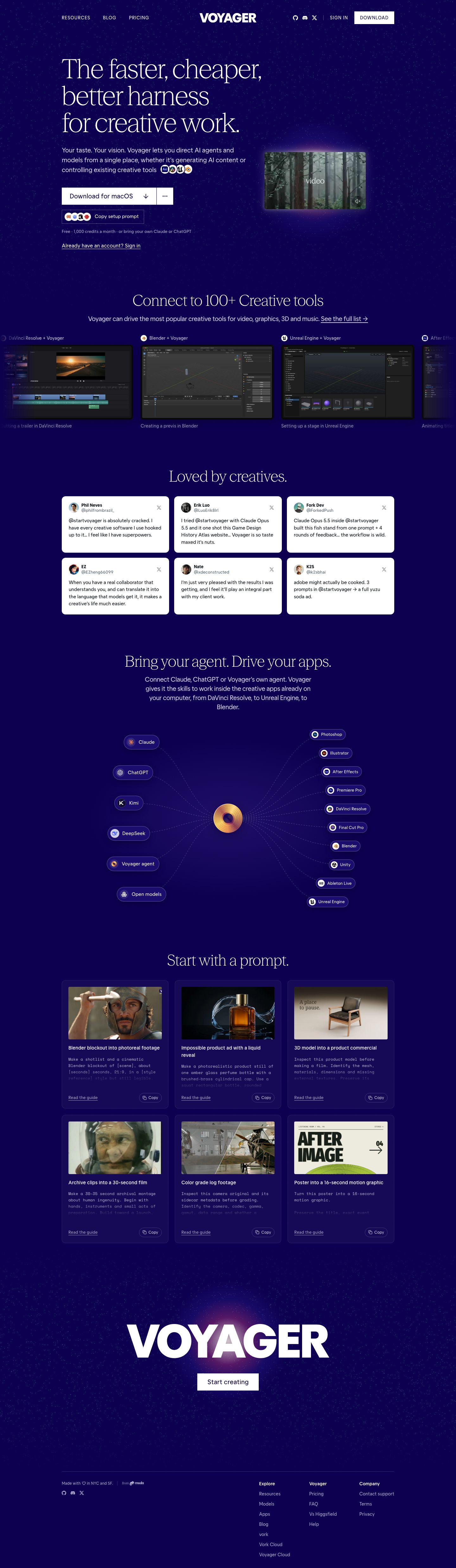
Light serif display at 83px, weight 300, -2.1px tracking, line-height 1.02. Three short stacked lines get an elegant, almost bookish voice on a dark tech page.
A split primary CTA: a wide white "Download for macOS ↓" slab joined to a square "⋯" segment by a 1px seam. It reads as one button with an overflow menu for other platforms, with no dropdown chrome.
A secondary "Copy setup prompt" button. It is an outlined rectangle that opens with an overlapping stack of four agent logos, so the integrations become the button's icon.
Inline app-logo coins (Ae, Resolve, Unreal, Blender) sit at the end of the sub-headline sentence and overlap like an avatar stack. They prove the claim mid-sentence.
The hero video floats in a soft violet-to-warm halo, a large blurred radial glow that bleeds past the card's 6px corners. It stands in for a spotlight instead of a frame or a shadow.
A symmetric nav: tracked uppercase text links on the left, a centered heavy wordmark, then icon links and a hairline divider before a square white CTA. There is no bar fill and no border, just floating type on the sky.
Testimonials are pure-white X-post cards (8px radius, avatar, handle, gray X glyph) in a 3×2 grid, set straight onto the indigo. The flip to light is the section's only contrast event.
A radial hub diagram: AI models fan in from the left and creative apps fan out to the right. Each is a dark pill chip, and dashed hairlines converge on one glowing gold disc at the center, so the product's position is drawn as a literal hub.
The prompt cards set the prompt itself in a monospace face that fades out over its last two lines. A ghost-pill "Copy" button and an underlined "Read the guide" link sit under it, and the card is a faint lighter-indigo panel with a 1px border.
The closing CTA is the wordmark blown up to roughly 140px, white on a radial bloom of light, with one small square white "Start creating" button below.
saas · landing · dark · editorial, dark-techno, minimal · elegant, mysterious, confident, calm, futuristic