marcfavro.com6views
Eleven details, ten pinned.
View as Markdown ↗Sized by coverage · click to copy.
I CREATE; THEREFORE I AM
Inter · 130/117 · 400 · -4.194px
I’m the founder & creative director at ✣HOVS, a studio that builds and runs its
Inter · 23/31 · 400 · normal
NEW
MaisonNeue-Medium · 10/24 · 400 · 1.4px
Specimens are the page's own words at their measured metrics; shown in Inter when the family is not loaded.
 123456781011
Flush-left brand tab: a 236×68px red (#e3131b) block bleeds off the left edge, rounds only its right corners (~10px) and holds a white serif wordmark. It stays fixed while every section scrolls under it
Three-column nav as a table of contents. Each column has a tiny wide-tracked uppercase label (REPERTOIRE / CRÉATIVITÉ / NARRATIVE, ~11px, +0.14em, olive-gray) over three links, and each link indents ~10px more than the one above, so the column steps diagonally
A ✣ ornament glyph before every nav link, plus red superscript "NEW" flags at 10px with 1.4px tracking. Typographic decoration instead of icons or badges
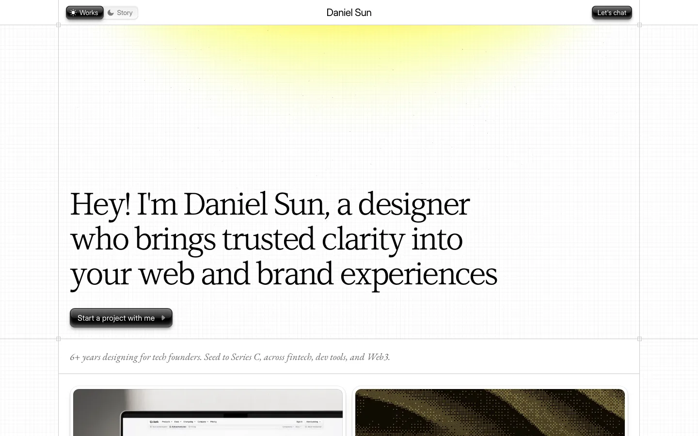
Weight-switched manifesto: one 130px Inter headline with -4.2px tracking and 0.9 line-height. Line one is Bold, line two Light, line three Bold again, so the rhythm comes from weight alone
An engraved line illustration (cherubs holding a Latin banner) sits centered above the sans headline. One piece of antique ornament makes a modern grid feel authored
Gothic-arch hairline pattern: repeating pointed arches drawn in ~1px lines at about 8% white opacity across the black hero, a texture you only notice up close
Each case study takes over the whole viewport in a single flat brand color (cobalt for NASA, red for Mars, yellow for Semplice), so the scroll reads like turning pages in a printed book
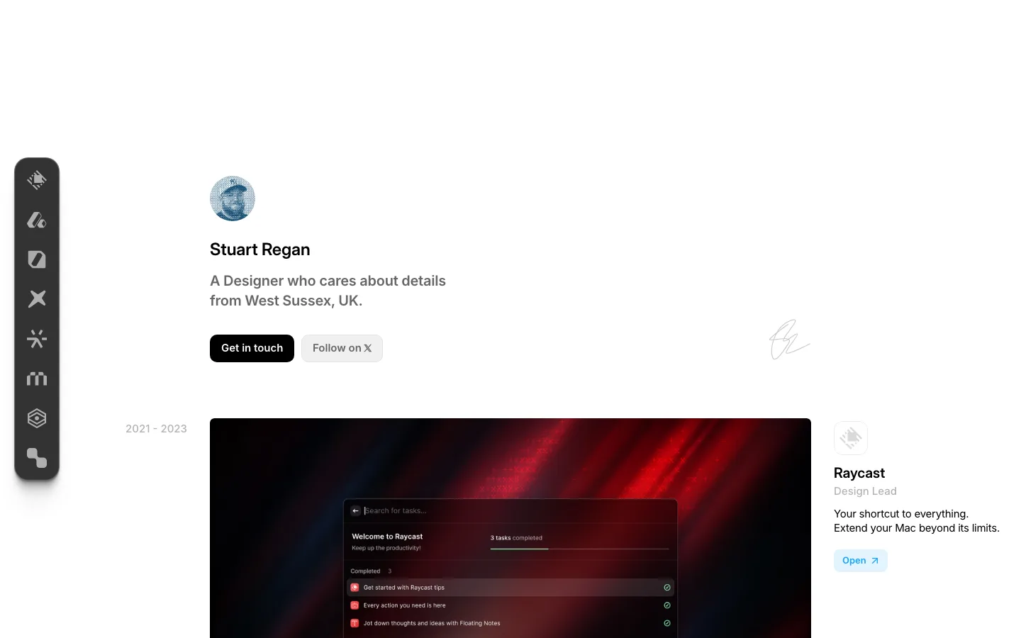
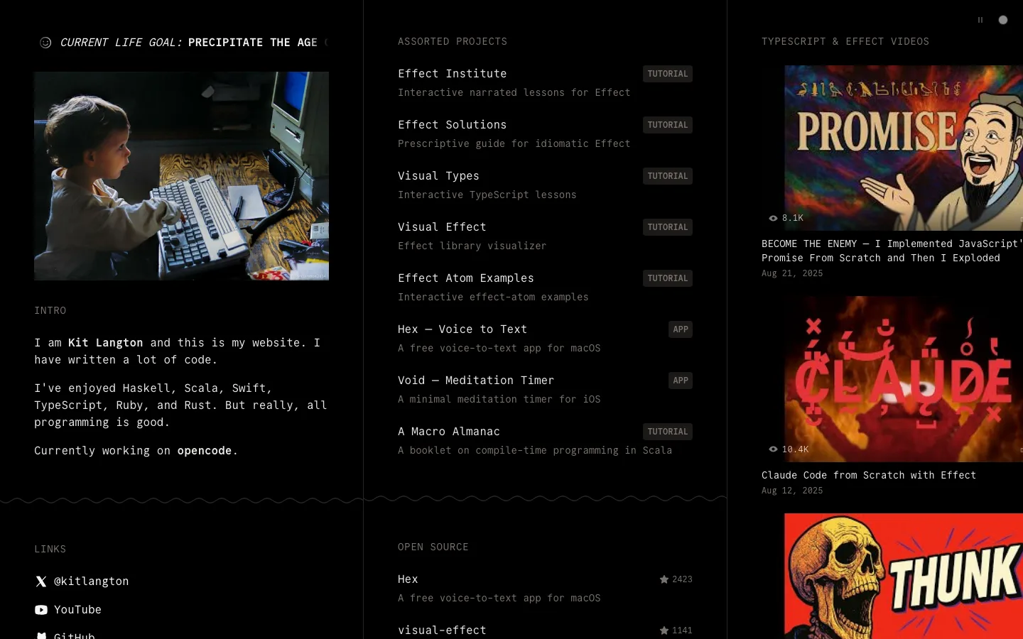
Split caption under each project image: a bold "Name — one-line thesis" at ~22px on the left and a small gray paragraph of body text on the right, set on a 12-column grid
Fixed red circular index button with a vertical, letter-spaced "INDEX" label running down beneath it. Persistent navigation that takes up almost no space
Interstitial blog shelf: "Featured Essays" set in large light Inter with a gray subline, then three square abstract-art covers with sentence-case titles, on a plain white break between color chapters
Pull quote set in white bold sans on a red rounded card, dropped into a dark gallery like a printed insert
portfolio · landing · mixed · editorial, swiss, maximalist · confident, rebellious, premium, edgy, human