ultramock.io4views
Eight details, seven pinned.
View as Markdown ↗Sized by coverage · click to copy.
You used forms before. Now use insight.
Geist · 56/64 · 400 · -0.56px
Ask anywhere, get insights in one place
Geist · 36/42 · 400 · -0.36px
On your website
Geist · 20/28 · 500 · -0.1px
The AI survey platform that writes like a specialist, and analyzes like a team o
Inter · 20/32 · 400 · normal
Specimens are the page's own words at their measured metrics; shown in Inter when the family is not loaded.
 1234567
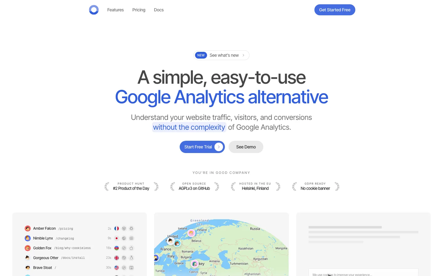
Hero subline highlights: the two claims ("specialist", "team of data analysts") are set in color on a matching pale tint pill — blue text on blue-tinted ground, orange on peach — so emphasis is a highlighter stroke rather than a bold weight.
Page column bounded by full-height hairlines with small "+" corner ticks where section rules cross them, giving a blueprint / graph-paper structure without any visible grid.
Split-tone feature copy: the right-hand paragraph alternates muted gray and near-black spans ("Send surveys across channels, track engagement in real time") so the nouns carry the sentence.
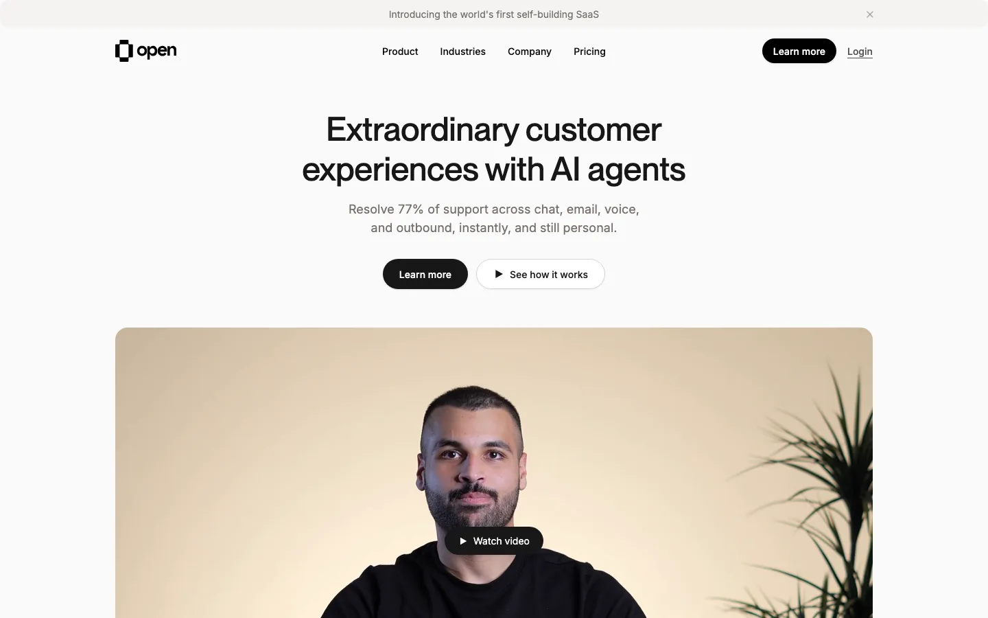
Bento feature cards numbered with a monospace badge ("2.1", "2.2") in the top-left, headline underlined with a hairline rather than weighted, and a UI mock that bleeds off the bottom edge under a soft gradient wash.
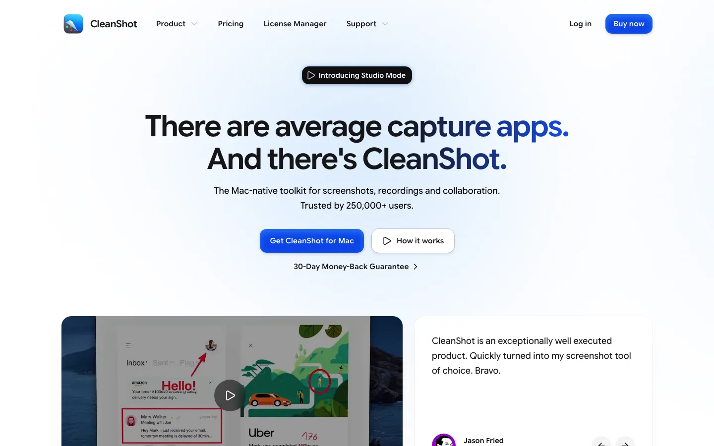
App frame directly under the hero at full column width, with a three-step segmented control (Create · Collect · Validate) and a token meter in the top bar — the product shown as a real working surface, not a floating screenshot.
Primary CTA pill carries a circular chevron button inside its right end, and the nav CTA reuses the same pill at 40px so the two read as one component.
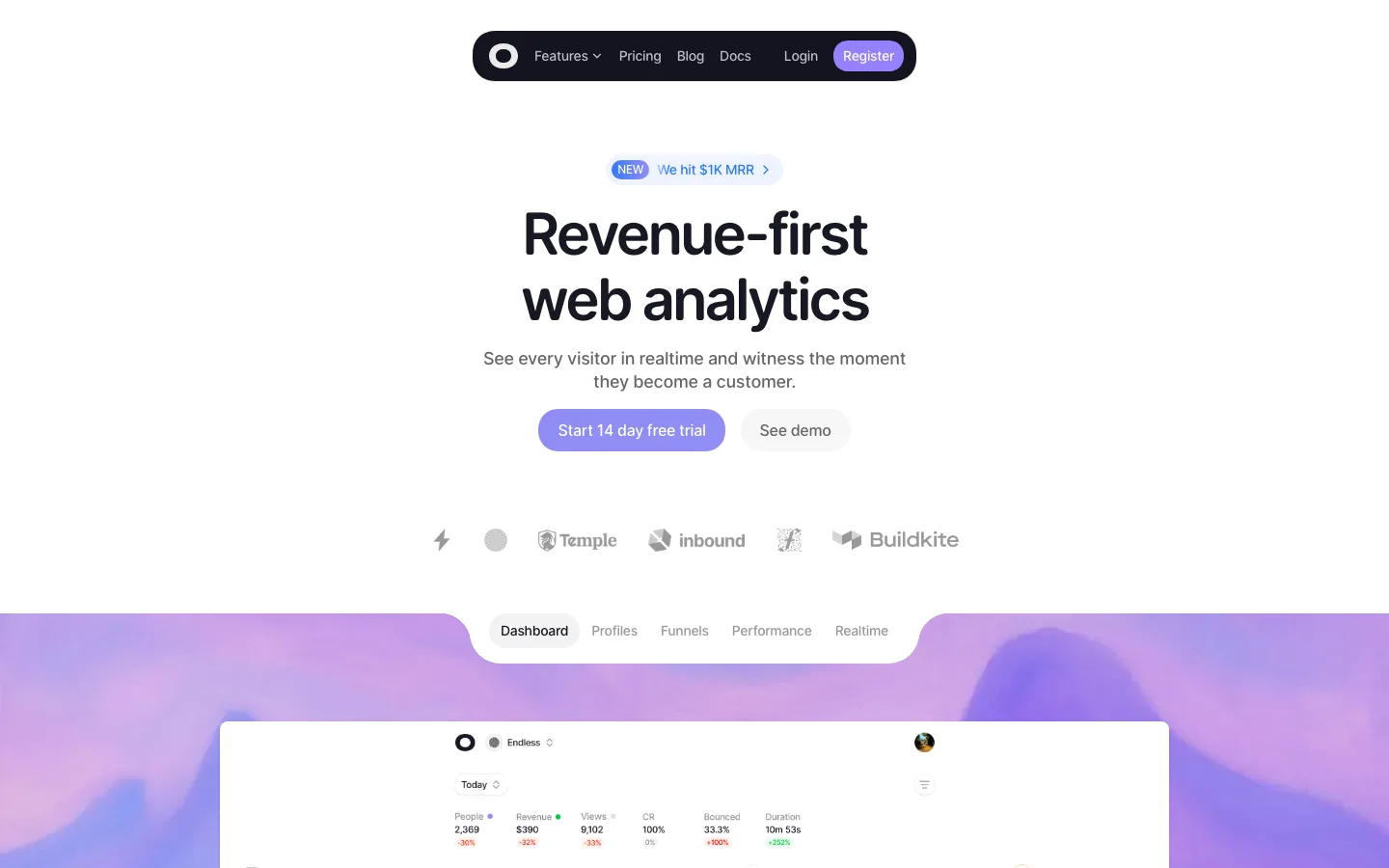
Eyebrow pills per section in a single soft lilac with a sparkle glyph; status chips in the response table use mint fill + green check, the only saturated greens on the page.
Radii ladder is deliberate: 8–10px on inner UI controls, 24px on the bento cards, 999px on every pill.
saas · landing · light · minimal, corporate-clean, bento · calm, trustworthy, technical, confident, premium