atalanta.tech5views
Nine details, nine pinned.
View as Markdown ↗Sized by coverage · click to copy.
Automate the entire revenue cycle
ABC Areal · 52/53 · 500 · -1.296px
Connect your existing tools
ABC Areal · 28/31 · 500 · -0.56px
CONNECTS YOUR GTM STACK, GIVES AGENTS THE CONTEXT TO ACT, AND KEEPS YOUR TEAM RU
Roboto Mono · 18/21 · 400 · -0.45px
BACKED BY Y COMBINATOR
Roboto Mono · 11/17 · 400 · 0.99px
Specimens are the page's own words at their measured metrics; shown in Inter when the family is not loaded.
 123456789
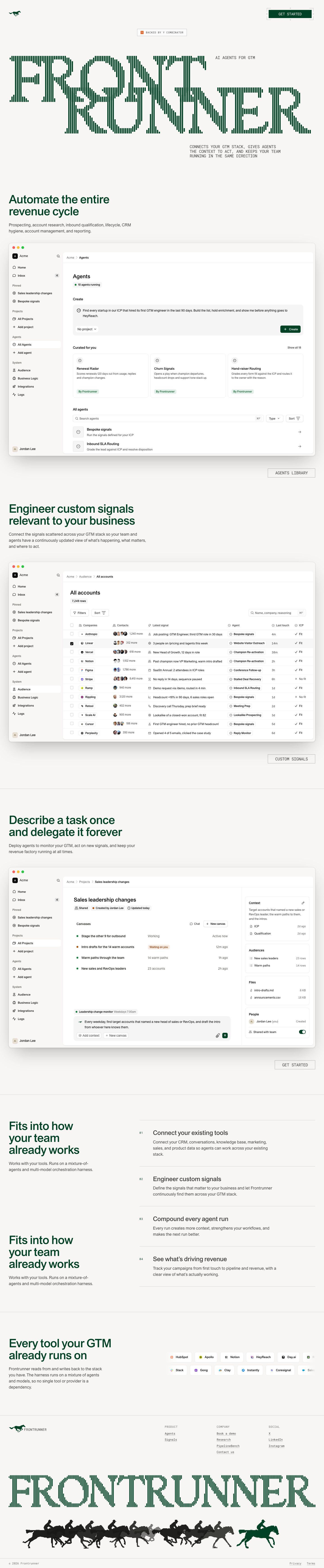
Pinstriped display wordmark: a slab serif drawn entirely as 4–6px vertical bars with gaps, so the letters dissolve into texture at the edges. One color, no gradient, and it works as hero art and as the brand together
Staggered two-line lockup: the second word is pushed right and up until its cap height overlaps the first word's baseline, so the two lines interlock instead of stacking, with the mono tagline tucked into the gap at the top right
CTA inside crop-mark brackets: the solid green square "GET STARTED" button sits in a thin gray frame of L-shaped corner marks and "+" registration ticks, like a print proof or a viewfinder. The button itself stays plain
Investor badge as a mono hairline tag: a tiny orange Y square plus "BACKED BY Y COMBINATOR" in 11px mono with +0.99px tracking, inside a 1px gray box with square corners. Social proof that reads like a spec label
Mono, all-caps subhead set ragged in a narrow column off to the right under the wordmark (18px, -0.45px), so the body copy looks like terminal output rather than marketing
True-to-life app mockups: full macOS windows with traffic lights, a light-gray sidebar and a white content pane, real-looking data (logos, avatar stacks, status chips), a soft diffuse shadow and 12px corners. No perspective, no glow, nothing cropped
Outline mono "section exit" buttons: after each mockup, a large right-aligned ghost button ("AGENTS LIBRARY", "CUSTOM SIGNALS") with a 1px gray border and wide-tracked mono caps closes the section and doubles as navigation
Numbered feature list on hairlines: tiny mono "01"–"04" indices in a narrow gutter, a 28px grotesk title and gray body, each row divided by a full-width 1px rule. No cards, no icons
Footer horse race: a row of black horse-and-jockey silhouettes with one green rider out in front, a literal illustration of the brand name in the brand color, set under a full-width repeat of the striped wordmark
saas · landing · light · minimal, swiss, editorial · technical, confident, calm, serious, premium