validata.so0views

14 details, 13 pinned.
View as Markdown ↗Sized by coverage · click to copy.
The design tool for creating premium product visuals The design tool for creatin
overusedGrotesk · 16/16 · 500 · -0.32px
From screen to finished visual
overusedGrotesk · 60/57 · 500 · -2.4px
Capture or import
overusedGrotesk · 22/33 · 600 · -0.33px
Turn app, website and SaaS screens into polished images and motion for launches,
GeistSans · 18/27 · 400 · normal
[01]
GeistMono · 10/15 · 400 · 1.2px
Specimens are the page's own words at their measured metrics; shown in Inter when the family is not loaded.
 12345678910111213
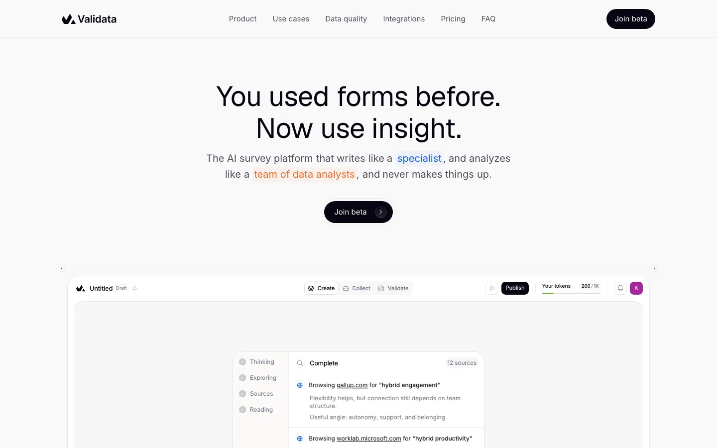
Detached header tray: inset from the viewport edge by 20px with a 1px light-gray border and ~16px radius, no fill change and no shadow, logo left, links dead center, CTA right, so the nav reads as a floating object rather than a page band.
The CTA is the only saturated color in the chrome: a vertical orange gradient with a lighter top highlight, a 1px darker orange border, 16px radius, and a soft same-hue glow beneath it; the identical button repeats in the header and under the headline.
Display type is a medium-weight grotesk at about -0.04em tracking with line-height under 1 (57px on 60px), which makes a plain two-line headline feel dense and expensive with no weight contrast at all.
Nav links are 13px uppercase Geist Sans in #6e6e6b with light tracking, quiet enough that the only dark mark in the header is the pie-chart logo.
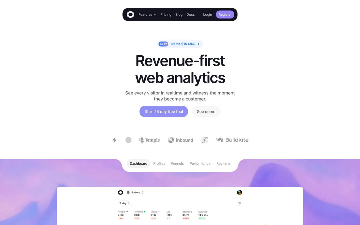
The hero media is a real scene rather than a gradient: a fisheye sky photo with the device floating in it, full container width at 24px radius, so the product's output supplies the page's color.
Grayscale logo marquee directly under the hero, then a second pass later as a hairline-ruled logo grid under a tiny tracked mono caption, so proof appears twice in two densities.
Split section header: a left-aligned two-line grotesk head on the left half and a gray 16px paragraph bottom-aligned in the right column, instead of stacking the subhead under the title.
Nested bento: an outer container with a 1px hairline and 24px radius holds inner cards at ~16px radius, each a pale gray media well over a white caption band with a 20px medium title and gray one-liner.
An AI-integration card shows the feature as a Geist Mono chat transcript: tiny tracked "CLAUDE" header, gray prompts, orange bullet dots before each tool call, a blinking orange cursor, plus an orange-outline mono BETA pill.
Testimonials as a three-column masonry wall of X-post cards: avatar, bold name with a verified check, gray handle, an X glyph top right, body text, then a light-gray date, all on white cards with a hairline and ~16px radius.
The highlighted pricing tier is marked by an orange border and the orange gradient button while the free tier stays plain white, so the recommended plan is the only warm block in the section.
A real editor screenshot as the late-page showcase, with Geist Mono micro-labels, pill toggles and a timeline where only the active clip is orange, tying the product UI to the CTA color.
The footer signs off with an oversized pixel-font wordmark in very pale gray, cropped at the bottom edge, beside a small pill segmented control for system, light and dark themes.
Step markers use bracketed mono numerals like "[01]" in Geist Mono 10px with 1.2px tracking, a technical tag against the soft grotesk headings.
saas · landing · light · minimal, corporate-clean, bento · premium, confident, technical, calm