offgrid.inc0views

Nine details, nine pinned.
View as Markdown ↗Sized by coverage · click to copy.
Users have higher expectations than ever
Neue Montreal Medium · 48/53 · 400 · -1.44px
Client Name
Neue Montreal Medium · 24/31 · 400 · -0.64px
Startups trust us for embedded product design for AI-native products.
Neue Montreal Medium · 20/24 · 500 · normal
TRUSTED BY VENTURE-BACKED STARTUPS
Geist Mono · 13/26 · 500 · normal
Specimens are the page's own words at their measured metrics; shown in Inter when the family is not loaded.
 123456789
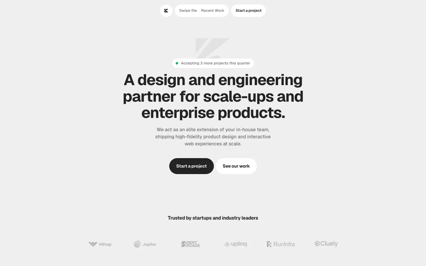
Sticky pitch rail: the headline, CTAs, social proof and location sit in a fixed ~420px column while only the work scrolls beside it, so the offer is on screen at every scroll depth and the work never has to share space with text
Navless header: the wordmark is the only thing up top. There are no links and no menu, and the two hero pills do the navigating
Live local clock as the footer line: "Brooklyn, NY / Tuesday, September 22 at 11:27:47 PM EST" ticks in muted gray at the foot of the rail. It says "real studio, real time zone" without an About section
Monospace eyebrow over the logos: Geist Mono 13px, uppercase, wide letterspacing, dim gray. It is the only mono text on the page, and that makes it read as a label rather than copy
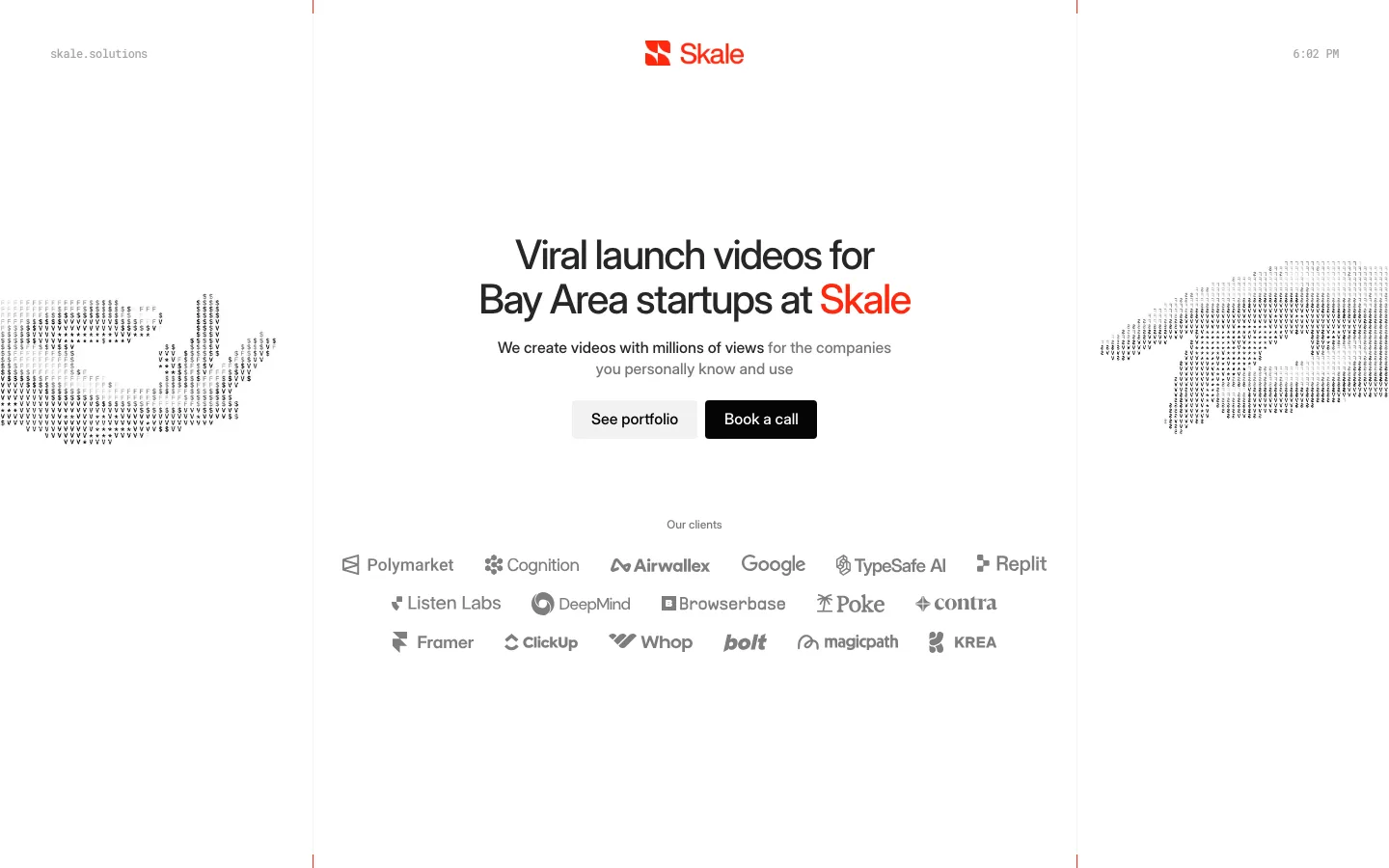
A 2×3 client logo grid knocked back to one mid-gray (around #4d5253–#6b6f72). It is quiet enough to sit permanently in view without competing with the headline
CTA pair as solid plus tonal pills: a white "Start a project" with black text beside a barely lifted charcoal "About", both 40px tall with a 100px radius. The hierarchy comes from fill alone, with no border and no arrow
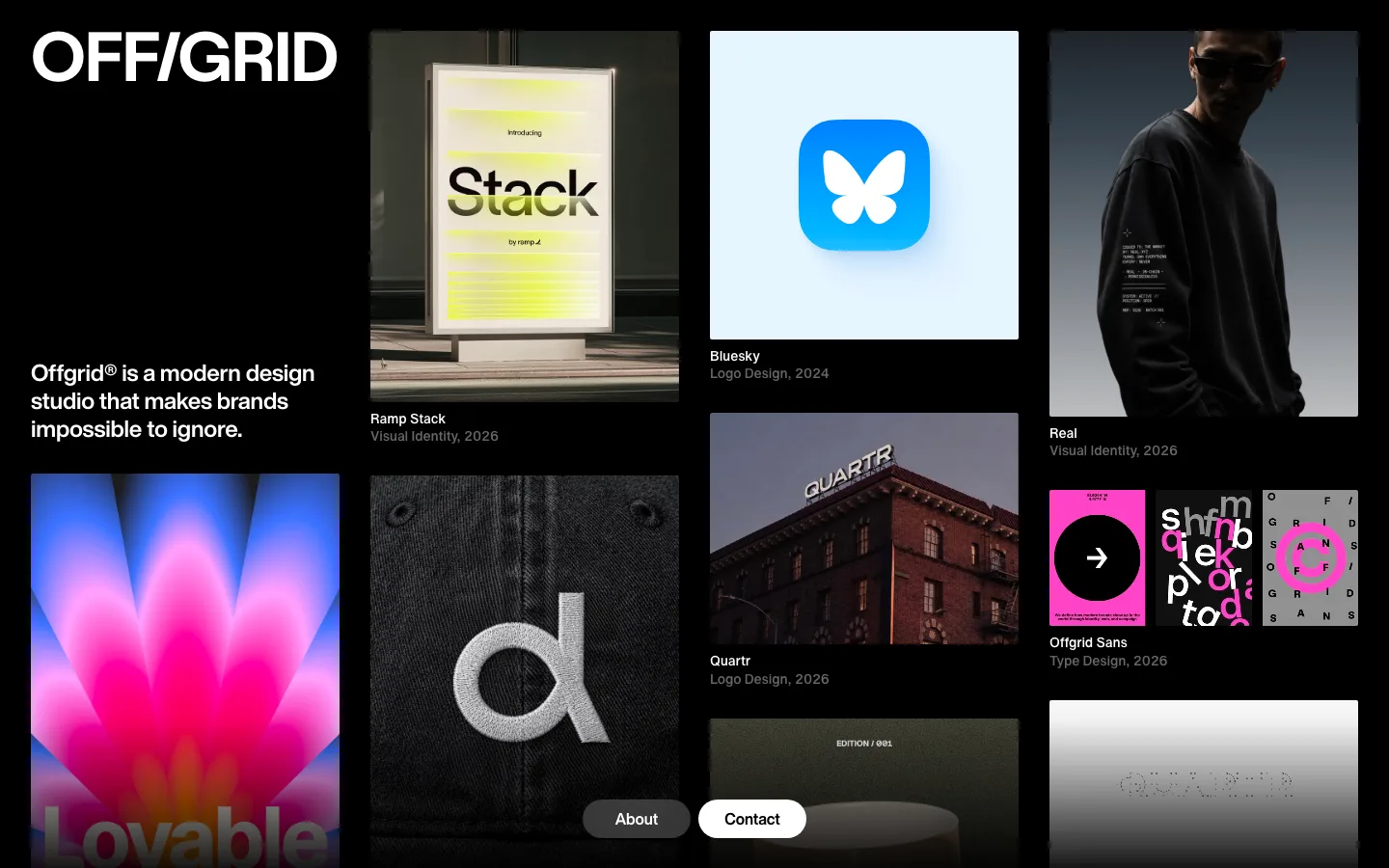
Case tiles as staged canvases: each project is a full-width 8px-radius tile about 610px tall, with a ~16px dark gutter between tiles. The product UI floats on a photographic backdrop (sky, a textured wall, a velvet drape) or sits centered on a flat #fbfbfa panel, so the screenshots look art-directed rather than dumped in
Phone triptychs on a flat white panel: three states of one flow side by side (light, tinted and dark variants of the same chat screen). One tile shows range and system thinking without a caption
Headline set in Neue Montreal at 48px/1.1, weight 400, tracking −1.44px (−0.03em), in white on near-black. It is regular weight, not bold, and the tight tracking alone gives it presence
agency · landing · dark · minimal, swiss · confident, premium, serious, technical