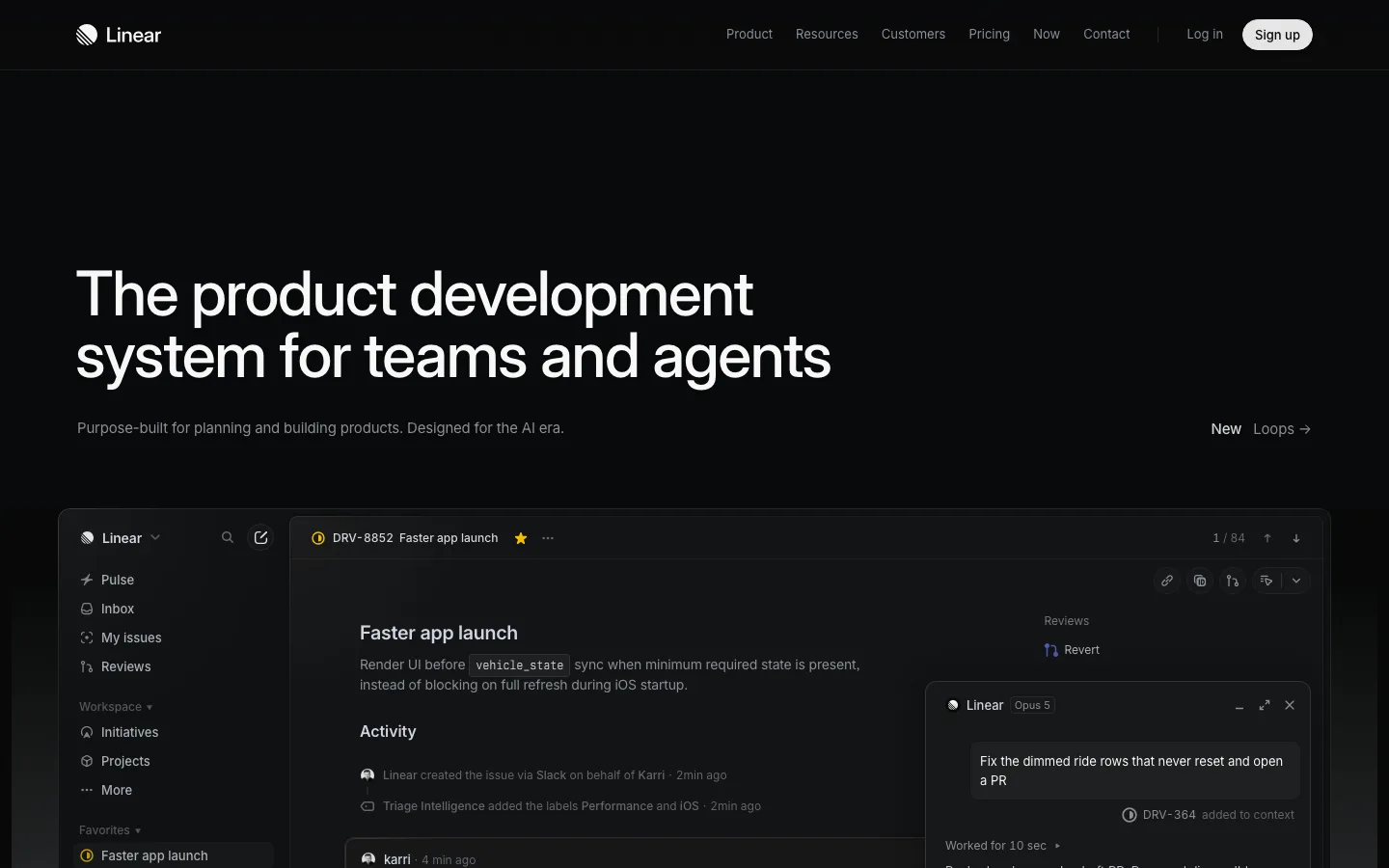
linear.app1view
Eight details, eight pinned.
View as Markdown ↗Sized by coverage · click to copy.
The AI marketing platform to win in ChatGPT AI search platforms
interVariable · 48/56 · 500 · -1.08px
Your AI Marketer makes it possible
interVariable · 48/56 · 500 · -1.08px
Recents
interVariable · 12/16 · 400 · normal
Multiply what you can accomplish with an AI Marketer trained on what consumers p
interVariable · 18/24 · 400 · -0.045px
AEO content
interVariable · 12/16 · 500 · normal
Specimens are the page's own words at their measured metrics; shown in Inter when the family is not loaded.
 12345678
Announcement ledge as a second header row — a blue-tinted pill badge, one sentence and a trailing arrow on a full-width strip in a different near-black from the page, so it reads as a shelf under the nav rather than a banner pasted over it
A vendor logo typeset *inside* the display line — the ChatGPT mark sits inline at cap height with the 48px/500 headline text, doing the work a logo wall usually does, in the first sentence
Twin CTAs that differ only by ground — identical 8px radius, 14px/500 label, 32px height and 6px/12px padding; the primary is #ffffff with #222222 text, the secondary the same shape in #2c2c2e with light text, and neither carries a border
The fold is handed to the product at real scale — a three-pane workbench (nav sidebar, agent transcript, document tab) drawn at genuine 12–14px UI sizes with readable copy, so the screenshot proves density instead of gesturing at it
Dashed vertical hairlines run the full page height at the content column edges, turning every section into a bounded cell; horizontal hairlines close each one, and the grid is the only ornament the page allows itself
Saturation is reserved for data — the palette is eight grays from #050505 to #f0f0f0, and the only strong colors on the page are chart bars, sparklines and a gauge, so any hue instantly reads as a value
One photography band interrupts the all-dark UI deck — a full-bleed lifestyle photo with oversize percentage figures set over it, which lands hard precisely because nothing else on the page is a picture
The footer carries live signals rather than only links — a small numeric count badge riding the Careers item and an amber square-dot status line stating the current system state
saas · landing · dark · dark-techno, minimal, swiss · technical, confident, premium, serious