tryalcove.com0views
Ten details, nine pinned.
View as Markdown ↗Sized by coverage · click to copy.
Satisfying sound with every keystroke
ui-sans-serif · 96/96 · 700 · -2.4px
High fidelity sound
ui-sans-serif · 30/36 · 700 · -0.4px
New
ui-sans-serif · 12/16 · 600 · normal
Specimens are the page's own words at their measured metrics; shown in Inter when the family is not loaded.
 123456789
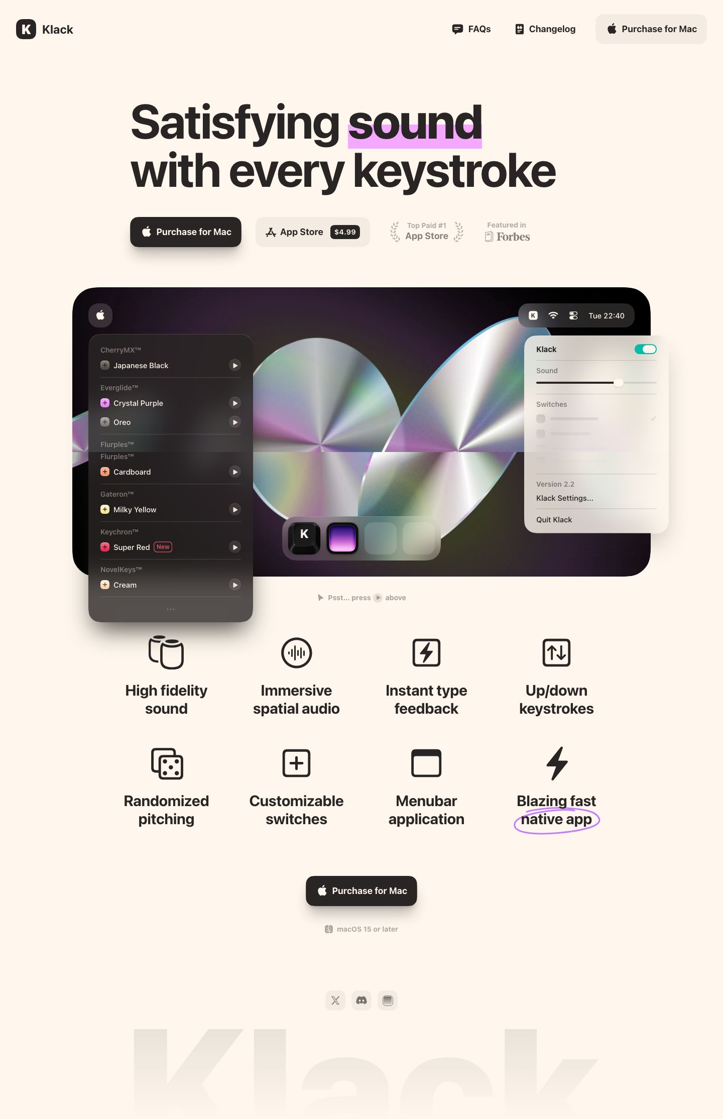
Highlighter block behind one headline word — a flat lavender-pink rectangle sitting on the lower ~60% of the glyphs of "sound," square-cornered, no rotation, so the emphasis reads as a marker swipe rather than a UI chip.
Price baked into the secondary button — the ghost "App Store" button carries an inline dark $4.99 pill at its right end, so the price is visible without a pricing section and the secondary CTA does double duty.
Social proof as muted laurels beside the CTAs — "Top Paid #1 App Store" framed in faint laurel sprigs and a grayed "Featured in Forbes," both set at ~40% opacity on the button row so they sit as quiet credentials, not logos competing with the buttons.
Primary CTA with a long, soft drop shadow — the near-black pill-ish button (16px radius, Apple glyph, 18px/700) floats on a wide, low-opacity warm shadow, while the secondary is a flat tinted fill with none: depth alone ranks the two.
Product demo staged as a fake desktop — a 24px-radius black panel with a mock menu bar (time, wifi, app icon in a frosted capsule) hosts the real UI: a dark translucent switch list on the left and a light frosted popover breaking out past the right edge of the frame.
"Psst... press above" whisper hint — a tiny gray cursor glyph plus inline play icon under the demo nudges interaction without a heading or arrow.
Feature grid with no cards — eight line icons over two-line 30px/700 centered labels on bare cream, four across, letting typography carry the grid instead of boxes.
Hand-drawn ellipse around the last feature — a loose lavender pen loop circles "native app," reusing the highlighter hue as an annotation to close the grid on its strongest claim.
Ghosted giant wordmark footer — "Klack" set enormous in a cream-on-cream tint, cropped by the page bottom, beneath three small gray social chips.
Frosted header on scroll — the transparent header gains a cream blur fill and a soft bottom shadow once content passes under it, keeping its tinted "Purchase for Mac" button.
saas · landing · light · minimal, glassmorphic · warm, playful, premium, confident, friendly