trysundrop.app7views
Ten details, eight pinned.
View as Markdown ↗Sized by coverage · click to copy.
Building is no longer the bottleneck. Getting feedback is.
Mona Sans · 48/52 · 400 · -0.96px
A shorter path from comment to fix.
Mona Sans · 36/42 · 400 · normal
Install
Mona Sans · 20/28 · 500 · -0.2px
Let reviewers comment directly on your running project. Keep the conversation in
Mona Sans · 18/27 · 400 · 0.16px
Following Sara
Mona Sans · 13/20 · 400 · 0.16px
Specimens are the page's own words at their measured metrics; shown in Inter when the family is not loaded.
 23456789
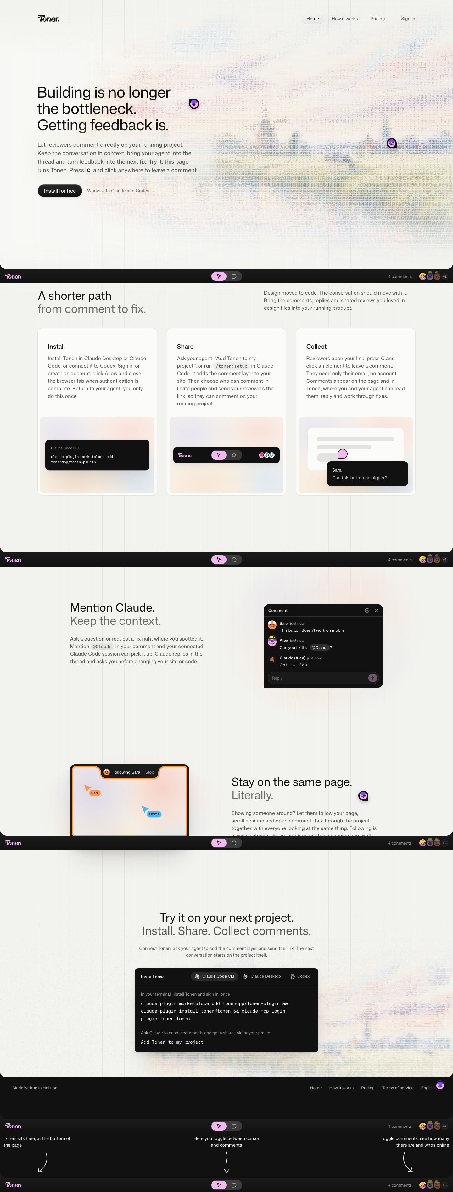
The product runs on its own landing page: a fixed dark dock along the viewport bottom (wordmark, a cursor/comment toggle with the active side in pink, "4 comments" and an avatar stack) is the real tool, so the hero says "Press C and click anywhere" and means it
Pastel ASCII-art landscape as the hero backdrop: glyph-rendered hills in faded peach, blue and lilac that fade into the paper at every edge, so it reads as texture rather than as an image
Comment pins left in the hero: dark rounded speech-bubble markers with a mascot face inside, sitting on the page as if a reviewer had already been there
An inline keyboard chip mid-sentence: a small bordered "C" key set in the body copy, which turns the subhead into an instruction
Two-tone section heads: first line in ink, second line in mid-gray (#726f6f) at the same size and weight ("Stay on the same page. / Literally.") for a statement and its punchline without a second style
Step cards with a demo plate: a hairline white card with text on top and, below it, an inset pastel-gradient plate holding a tiny dark UI fragment (CLI snippet, toolbar, comment tooltip)
A "following" frame: a thick orange border around the viewport mock with a notch tab at the top ("Following Sara · Stop") and named cursor flags in each person's color
A tabbed install terminal as the closing CTA: a near-black panel with Claude Code CLI / Desktop / Codex pill tabs, a gray caption above each step and the commands in mono
Hand-drawn arrow annotations under the footer explain the dock ("Tonen sits here", "toggle between cursor and comments"), a playful onboarding layer outside the page
Faint vertical hairline columns run behind every section, so the grid stays visible without any card borders
saas · landing · light · minimal, playful · calm, friendly, technical, human, warm