batchbanana.com3views
Nine details, nine pinned.
View as Markdown ↗Sized by coverage · click to copy.
All-in-one video creation
oracle · 32/38 · 400 · -0.64px
High production, low effort. Tella transforms your videos into brilliant content
oracle · 52/62 · 400 · -1.04px
Publish
Inter · 18/28 · 600 · normal
Record, edit, and share every video you need
oracle · 32/38 · 400 · -0.64px
Help Center Walkthru
Inter · 13/16 · 600 · normal
Specimens are the page's own words at their measured metrics; shown in Inter when the family is not loaded.
 123456789
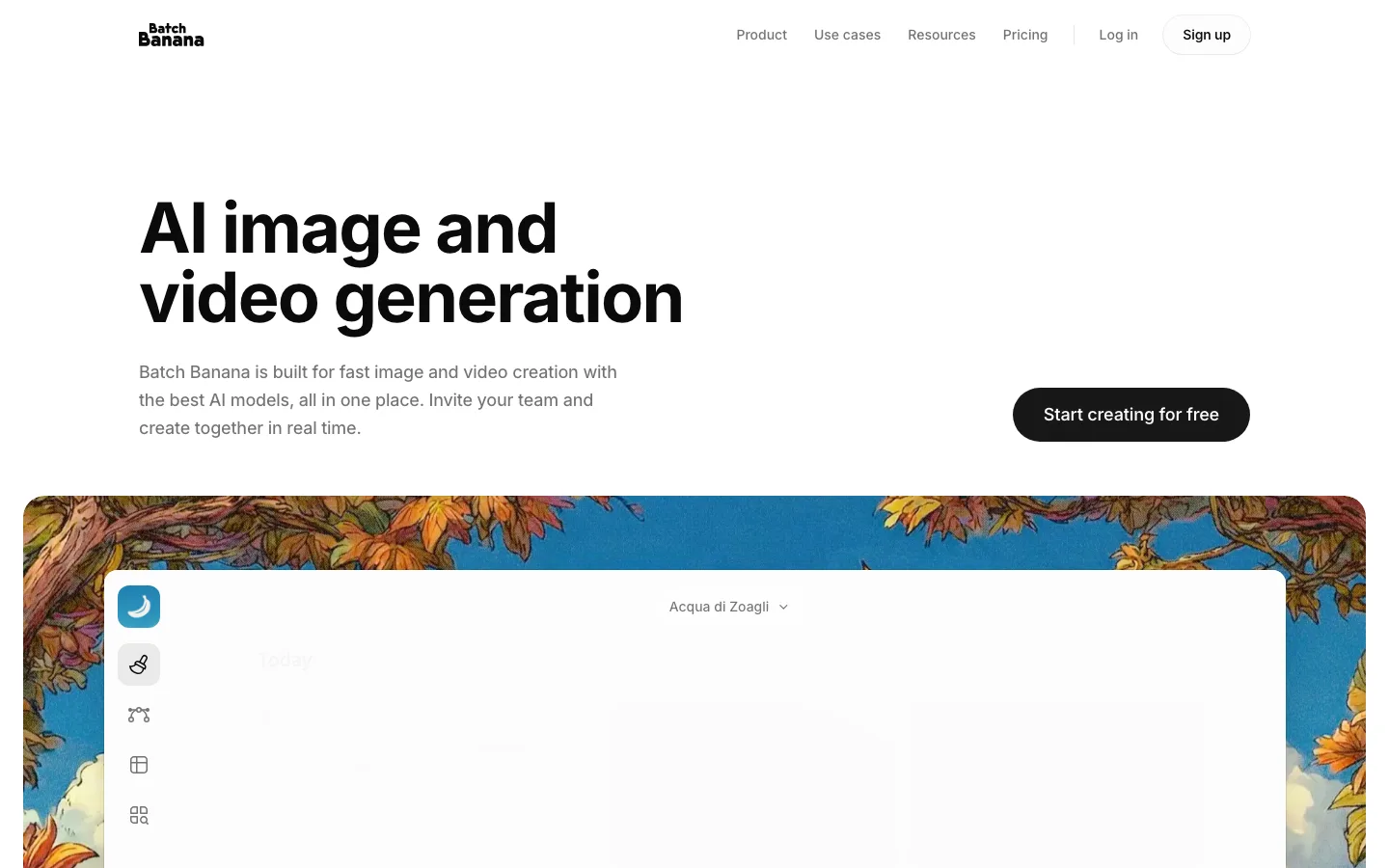
A two-tone hero headline. The product name in near-black and the promise in mid-gray (#8a8a8a-ish), both at the same size and weight, so the hierarchy comes from value, not scale or boldness.
A small, left-aligned hero (32px h1, about 300px of copy and one wide pill CTA) that hands the fold straight to a full-width product frame instead of competing with it.
A segmented use-case switcher floating inside the showcase frame. Inactive tabs are gray text with a small glyph. The active one becomes a white pill with a hairline shadow and a violet bar icon.
Pastel pixel-glitch noise (scanline smears of pink, lime and lavender) bleeds only into the outer edges of the rounded showcase cards. It's a motion-suggesting texture that stays out of the content.
Header CTAs as a matched pair of short pills: "Log in" with a white fill and hairline border, "Sign up" with a solid violet fill. Both are 31px tall, with no shadow.
A stated thesis in one centered paragraph, mostly gray with select words ("transforms", "brilliant content", "anywhere") lifted to black. It reads as emphasis by contrast, never by bold.
Each feature card is followed by a centered row of outlined capability chips (macOS, Windows, Chrome, Web, plus "Auto Capture" with a violet "New" badge) acting as a sub-nav for that feature.
A three-up card grid where every card's top is a cropped, overflowing slice of real UI (analytics stats, an invite list, stacked playlist panels), with a plain title, gray description and violet link below.
The closing CTA reuses the glitch texture as a full-width band behind a centered headline and violet pill, which bookends the hero's frame.
saas · landing · light · minimal, bento · calm, confident, friendly, human