revid.ai2views
Eight details, seven pinned.
View as Markdown ↗Sized by coverage · click to copy.
Grow and monetize your audience, faster
Inter · 60/66 · 500 · -3px
Your Growth Dashboard, Built Into 𝕏
Inter · 36/40 · 500 · normal
Start Every Day With Proven Ideas.
Inter · 30/36 · 500 · -0.75px
Create, schedule posts, and engage strategically. Everything you need to grow on
Inter · 16/26 · 400 · normal
Specimens are the page's own words at their measured metrics.
 1234567
Hero headline is Inter 500 at 60/66 with -3px tracking (≈ -0.05em) — the density comes from negative letter-spacing on a medium weight, not from bold; h3 drops to -0.75px and body runs 16/26 at normal tracking
One word of the headline is filled with a warm orange-to-amber gradient while the rest stays pure white, so the page has exactly one saturated word above the fold
The only light source is a soft radial ember bloom low behind the product mockup, fading into #181818 within a third of the viewport — no section fills, no panels, no glass, just that bloom
Blueprint chrome: 1px vertical rules at the container's left and right margins run the full page, and each section boundary is ticked with a small filled triangle pointing inward from both rules
Card grids place small plus-shaped crosshairs at their corner intersections instead of borders — the grid is implied by four marks rather than drawn
Every section head opens with the same eyebrow: a fully rounded pill (radius 9999px, count 79 on this page) holding a ringed icon circle then a 14px label, centered above a 36/40 weight-500 heading
Feature lists use a small orange dot, a white title line and a gray subline, with a thin vertical hairline dropping from each dot to connect the items into a spine
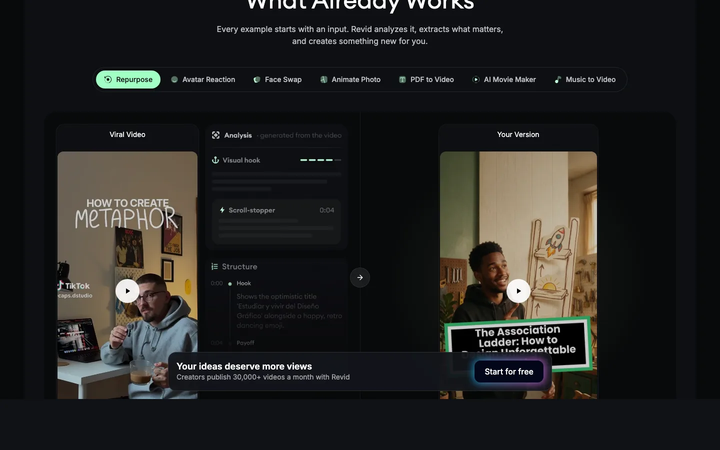
A persistent bottom bar floats above the page all the way down — a 16px-radius dark card with a bold promise, a gray trust line and the same gray CTA, never full width, always centered
saas · landing · dark · dark-techno, bento · technical, confident, energetic, warm