kargul.studio0views

Six details, five pinned.
View as Markdown ↗Sized by coverage · click to copy.
Startups don’t need big design teams. They need momentum
Inter · 22/33 · 600 · normal
We help startups move fast and look sharp - across product, brand, motion, and b
Inter Display · 18/23 · 400 · normal
AI Data Agent for your SQL
Inter · 12/17 · 400 · normal
Specimens are the page's own words at their measured metrics; shown in Inter when the family is not loaded.
 12346
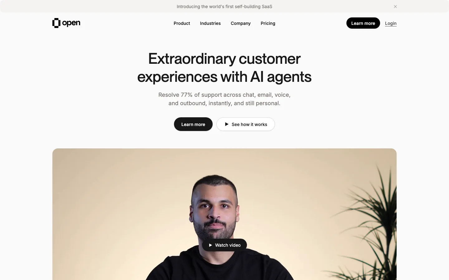
12346Two-tier button hierarchy in one row: a flat pale-gray ghost pill beside a near-black pill with a faint vertical gradient and a spread shadow, so the primary action looks physically raised.
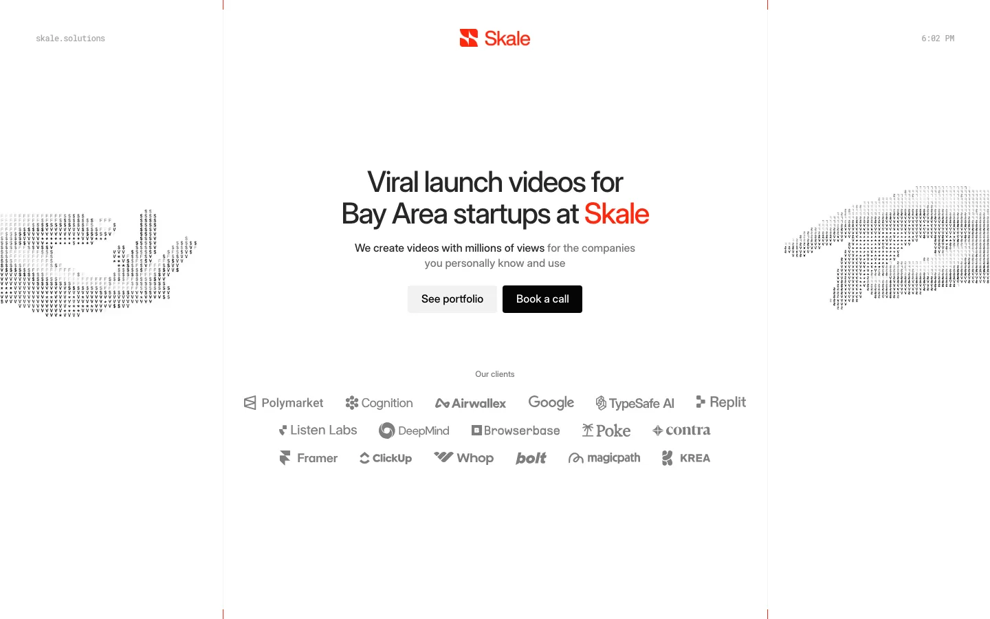
Client logos rendered in light gray and masked with a horizontal fade at both ends, so the strip feels infinite without a marquee.
The case-study reel opens in a deep green (#0a2723) frame with 60px corners on a white page — a single dark slab that gives the section weight without switching the whole scheme dark.
Feature cards whose illustrations are cropped, faded mini-UIs (a Slack availability list, task-status badges, a Figma layer panel with a "Superfine" cursor) — the product shows itself and then vanishes into white before the copy starts.
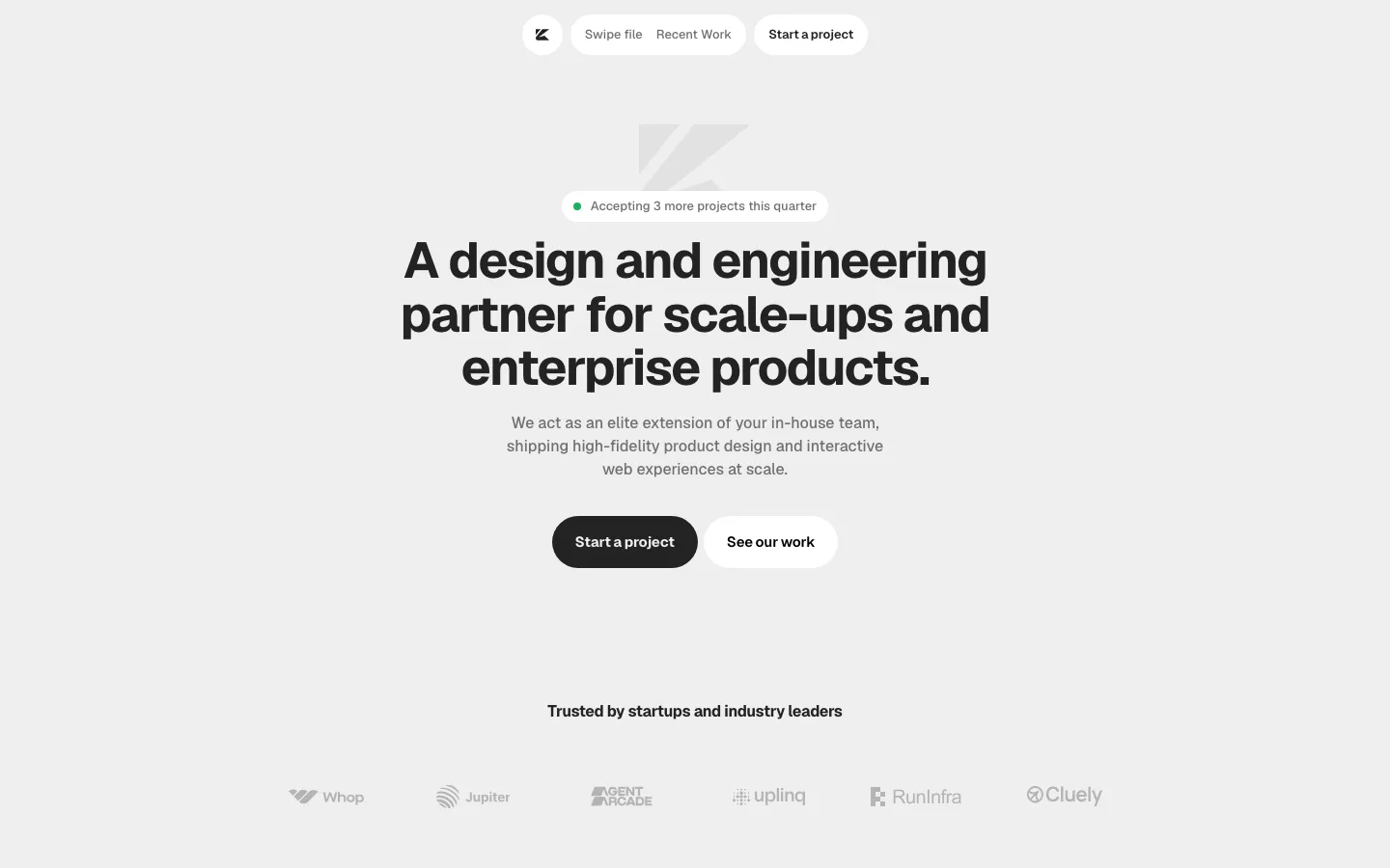
Sticky nav collapses into a floating white pill with a square monogram at the left and the CTA at the right, shadowed so it hovers over content.
Headline set at 600 weight, tight tracking, two short lines, with a plain 18px sentence beneath — restraint does the selling.
agency · landing · light · minimal, corporate-clean · confident, calm, trustworthy, premium