monaco.com4views
Eight details, eight pinned.
View as Markdown ↗Sized by coverage · click to copy.
Sunlight on your desktop.
Hedvig Letters Serif · 75/76 · 400 · -1.1232px
A live wallpaper of sunlight on a wall. It follows the real sun where you are, f
Instrument Sans · 18/26 · 400 · normal
Sun 21 Jun 08:45
-apple-system · 13/13 · 500 · normal
Specimens are the page's own words at their measured metrics; shown in Inter when the family is not loaded.
 12345678
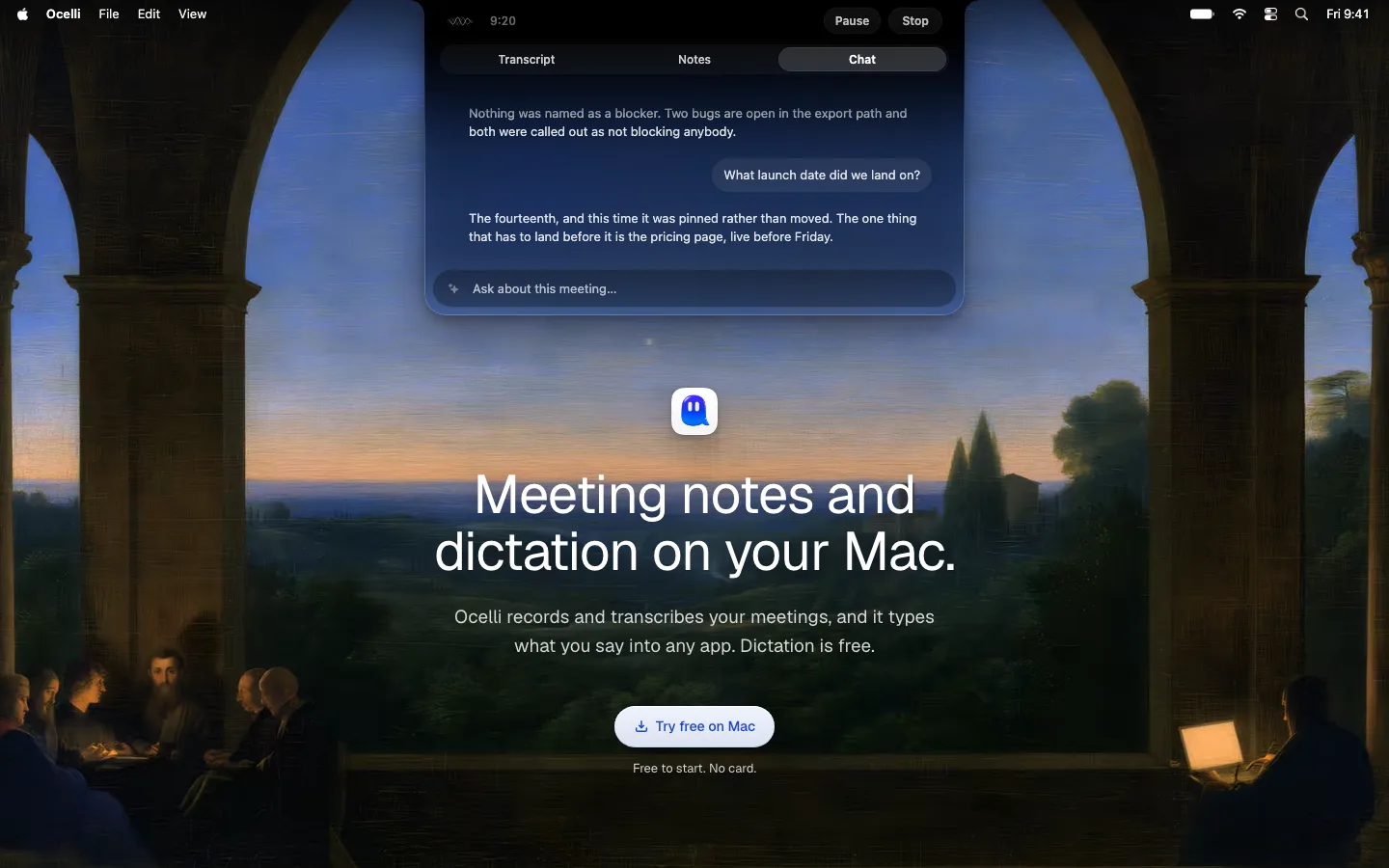
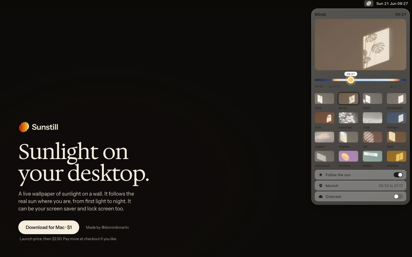
The product shown as a live menu-bar dropdown, not a screenshot. The page draws a fake macOS menu bar (icon plus "Sun 21 Jun 08:42" in 13px/500 system font) at the top-right and hangs the real settings panel from it. The visitor sees exactly where the app lives on their own Mac
Bottom-left anchored pitch. Logo, headline, body and CTA all sit in the lower half of the left column, leaving ~45% of the viewport above them empty. The headline reads like a caption at the foot of a dark room, not a banner
A day-cycle gradient slider as the main control. A thin track runs from night blue through dawn peach to pale day and back to dusk orange. The thumb is a glowing amber sun disc with a time bubble ("08:42") above it, and sunrise/sunset ticks (05:13, 21:17) sit under the track. The gradient doubles as the brand story
A 4×4 named swatch grid with a selected state. Small 6px-radius thumbnails, each with its own lit wall color (rust, lavender, mint, mustard), captioned in tiny muted labels. The active one gets a dark inset frame rather than a colored ring
A price inside the button label: "Download for Mac · $1", with a middle dot. A 12px muted line below makes the pay-what-you-want terms honest: "Launch price, then $2.50. Pay more at checkout if you like."
A cream pill CTA instead of white. #f7efdd fill, #1f1c1b text, 16px/600, 14×26 padding, 48px tall, fully rounded. On a warm black, the cream reads as sunlight where pure white would read as a screen
The maker credit sits beside the CTA as a quiet text link ("Made by @dominikmartn", ~13px gray), on the button's baseline row rather than in a footer
The logo is a set of vertical stripes inside a circle, shading from yellow through orange to red, like light through blinds. It's the one saturated color on the page, so it pulls the eye to the brand without any other accent
saas · landing · dark · minimal, editorial, luxury · warm, calm, elegant, premium, human