sohna.dev/waterlemon0views

Seven details, seven pinned.
View as Markdown ↗Sized by coverage · click to copy.
Tools for designers and engineers who care about craft
Inter · 76/92 · 700 · -3px
Sohna Waterlemon
Inter · 24/32 · 700 · -0.16px
Generate consistent icons for your product with AI Skills
Inter · 18/24 · 400 · normal
Specimens are the page's own words at their measured metrics.
 1234567
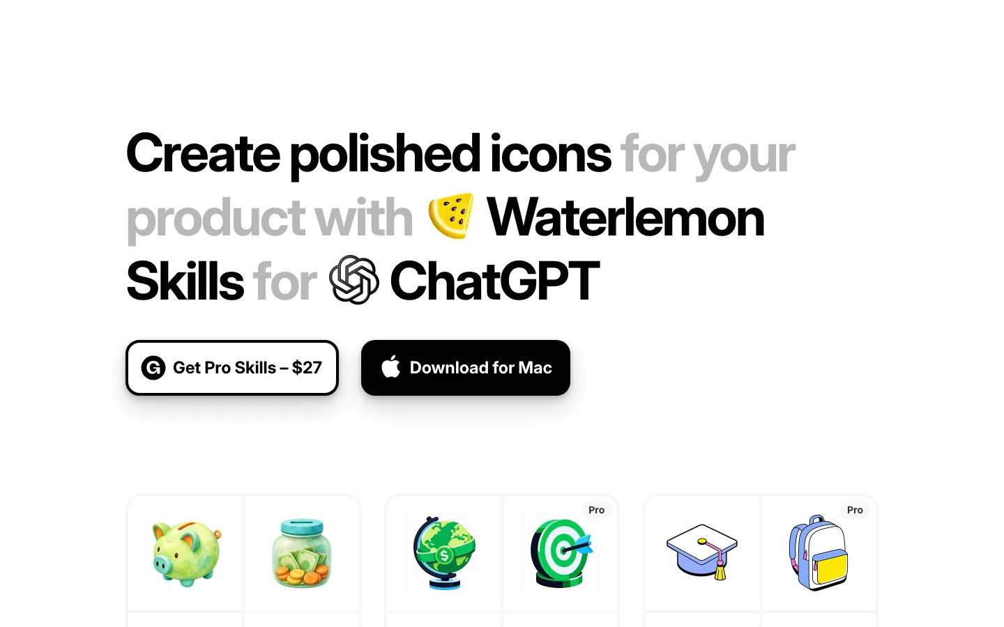
The headline ends with a ghosted, light-gray copy of the logo mark as punctuation — the brand sits inside the sentence instead of above it.
Zero chrome: no nav, no links, no hero image. Logo, headline, three cards, copyright. The page height (904px) is the viewport.
Cards are tonal, not outlined: #f7f7f7-ish fill on #fdfdfd page, 24px radius, no border, no shadow — the hierarchy is a one-step tint.
Every card is a fixed template — icon top-left, ~110px of air, bold title, two-line description, black CTA — so the differing icons carry all the differentiation.
The 3D icons are rendered with soft top-light and a slight tilt, giving a flat page real depth without any gradient in the layout itself.
Buttons: solid #020202, 14px radius, 16×24 padding, 18px/700 label, height 56 — chunky, tactile, and the only hard black shapes below the headline.
Tight negative tracking on the display size (−3px at 76px) against untracked 18px body: one typeface, two voices.
saas · landing · light · minimal, playful · calm, confident, playful, technical, friendly