reducto.ai0views

Eight details, eight pinned.
View as Markdown ↗Sized by coverage · click to copy.
Built for product teams
Atacama · 40/50 · 400 · -0.8px
Soffi AI Summary
Geist · 17/17 · 600 · normal
Edit your design system, see updates live, and ship changes as production-ready
Instrument Sans · 18/23 · 400 · normal
editor-dashboard-content.tsx
ui-monospace · 12/16 · 400 · normal
Specimens are the page's own words at their measured metrics; shown in Inter when the family is not loaded.
 12345678
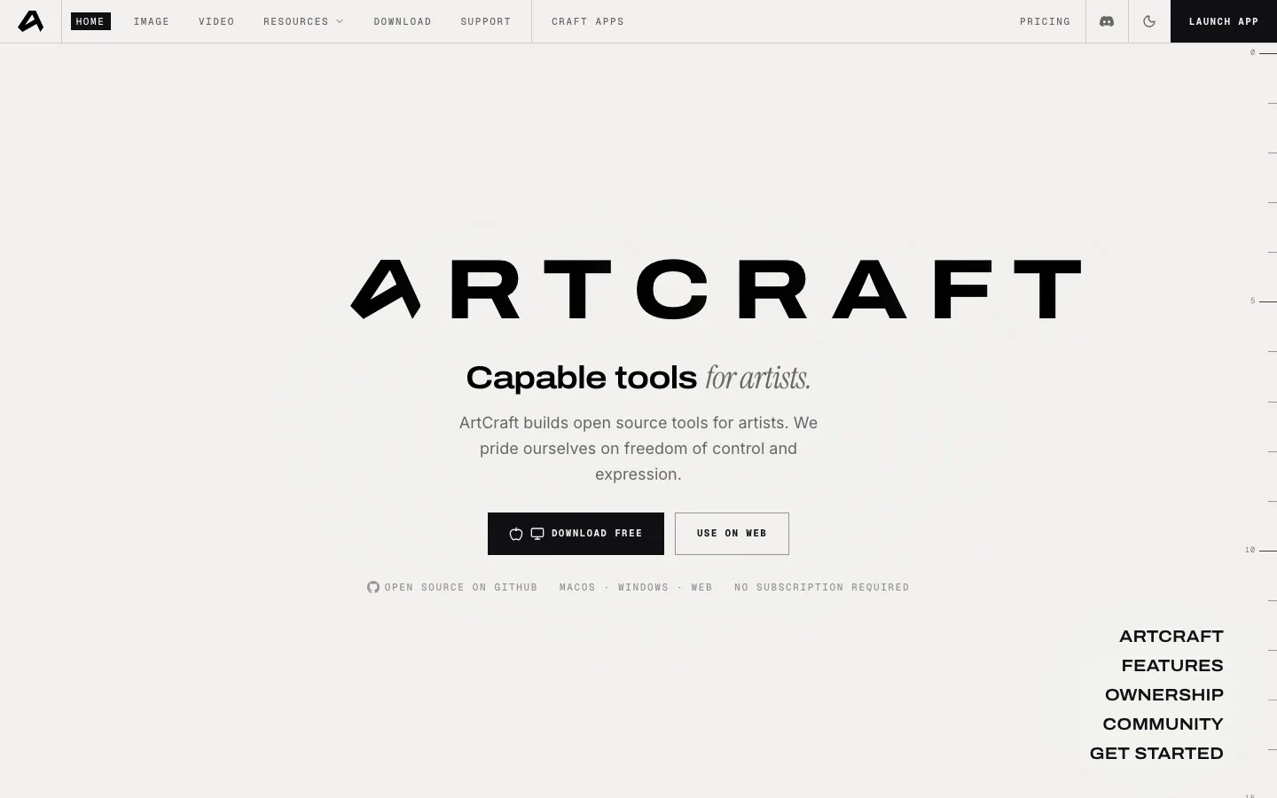
The dashed artboard grid with square corner handles, drawn faintly behind the hero content so the page itself becomes a canvas — a wordless statement of what the product is.
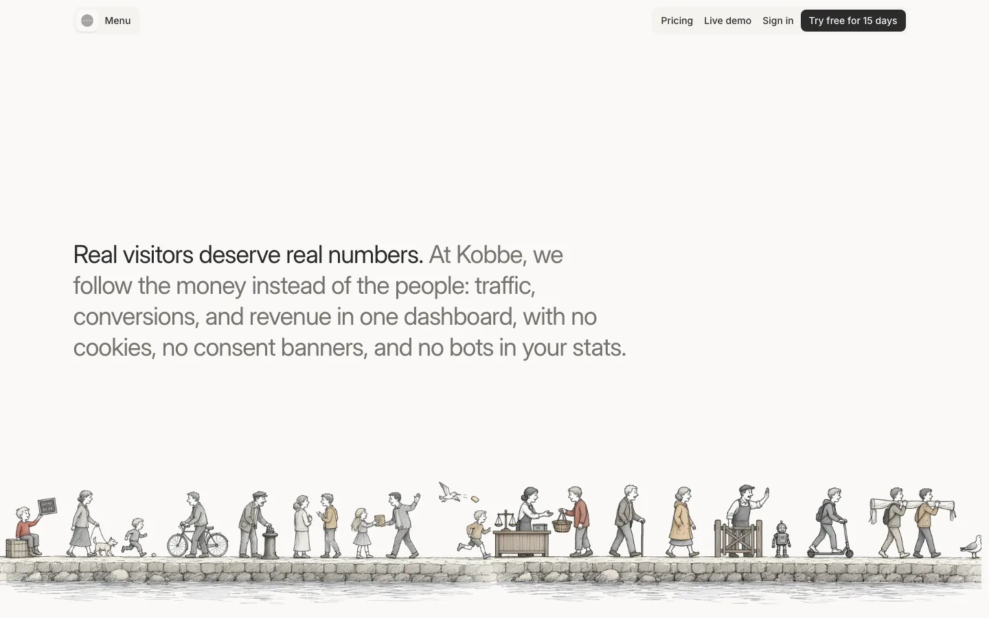
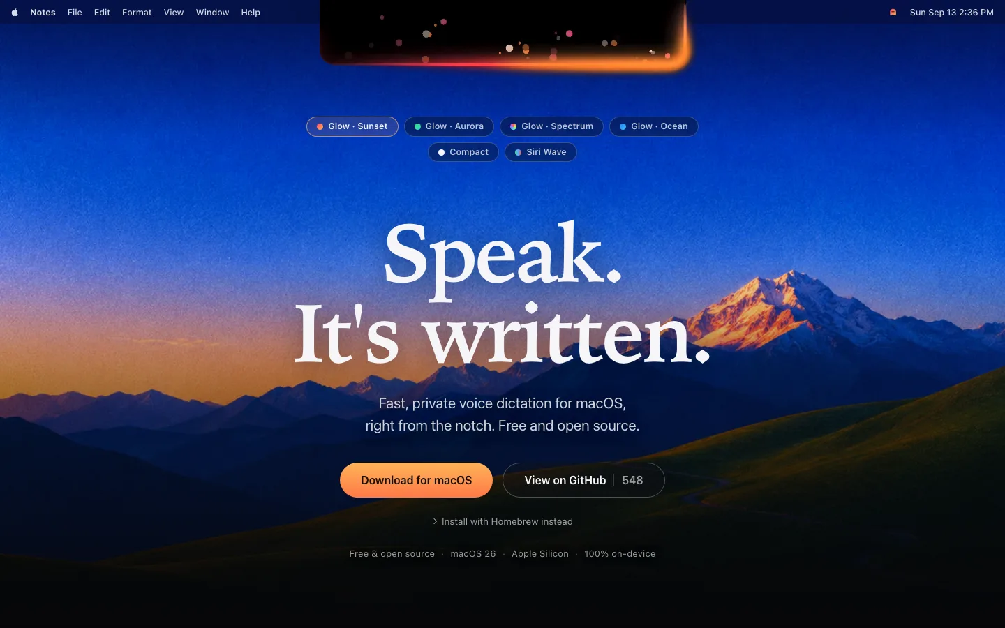
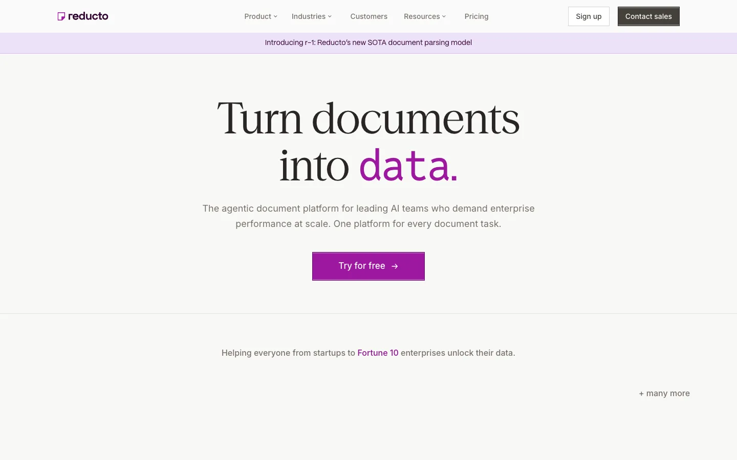
Serif display at weight 400 with negative tracking (44px / 55px / -0.88px) against a geometric sans body: editorial contrast without any bold weights on the page.
Product UI shown as fragments cropped by the viewport edge (editor drawer rising from the bottom, tokens panel bleeding off the right) instead of a framed screenshot — implies depth and scale.
The demo video's feathered, blurred top edge dissolving into the page ground rather than a hard bezel.
A tiny status strip under the video — green dot, "Updated 20hr ago", secondary "Watch product demo" button — tucked into the grid cell like a caption.
One italic word per section heading ("Starts from your live *product*") as the only rhetorical emphasis.
Inline code spans in a serif-adjacent mono with a soft gray chip behind them, treating repo/token names as first-class vocabulary in body copy.
A single 32px solid-black 6px-radius CTA at 14px/400 — small, quiet, unmistakable.
saas · landing · light · editorial, minimal · calm, elegant, technical, confident, trustworthy