batchbanana.com5views
Eleven details, nine pinned.
View as Markdown ↗Sized by coverage · click to copy.
Capture, edit, organize, and share in one place
TWK Everett Medium · 56/67 · 500 · -1.4px
Whatever's on your screen, capture it
TWK Everett Medium · 48/58 · 500 · -1.4px
Screenshots, exactly how you need them.
TWK Everett Regular · 28/34 · 400 · -1.4px
Beautiful screenshots, recordings, and more with private AI running on your Mac
Google Sans · 16/24 · 400 · -0.3px
Includes 7-day free trial
Google Sans · 12/18 · 600 · -0.36px
Specimens are the page's own words at their measured metrics; shown in Inter when the family is not loaded.
 123456789
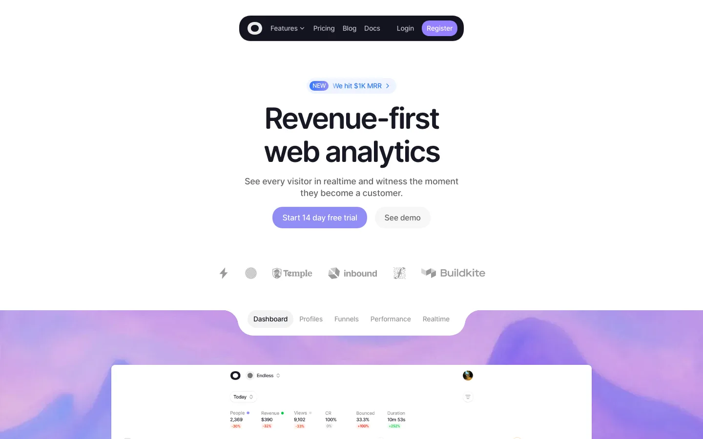
Dark capsule nav on every background: a centered, content-width #18160f pill with a soft shadow and a darker outer ring stays fixed down the page, reading equally well over the landscape, the white sections and the black footer because it carries its own ground.
Beveled sky-blue button: #00a7f5 fill with white text, a white Apple glyph, a lit inner edge and a slightly deeper rim, so the one saturated control on the page looks physically pressable, like a macOS control rather than a flat web rectangle.
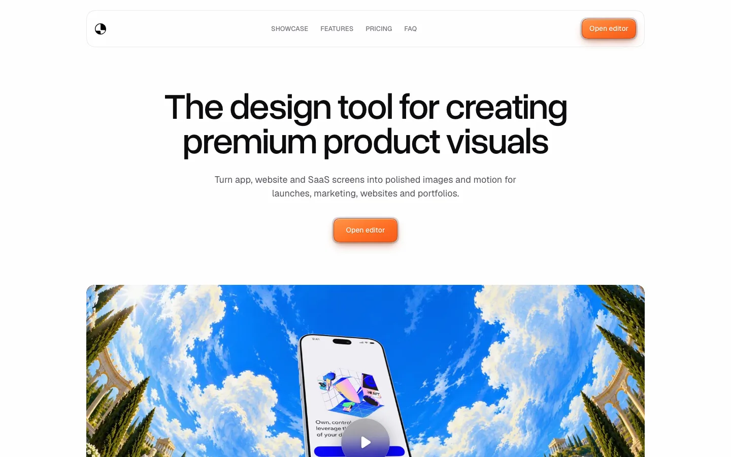
Landscape dissolving into the page: the mountain image has no bottom edge; it feathers to pure white behind the product frame, turning an expensive-looking full-bleed hero into a seamless handoff to the white content below.
Product frame straddling the fold: a wide, 16px-radius dark video window starts at 60% of the viewport height and overlaps the hero's fade, with its play button deliberately cut by the fold, so the first screen already asks for a scroll.
Objection-handling microline: under the CTA, two 12px weight-600 facts, "Includes 7-day free trial" and "No card required", each get a tiny glyph and a mid-dot separator at reduced white opacity, so they answer the objection without competing with the button.
Imagery melting into its card: inside #f8f7f7 tiles with a 30px radius, the portrait and 3D mockup fade into the tile's gray rather than sitting in a cropped frame, leaving a centered title and two-line description on what feels like one continuous surface.
Single loud moment inside a quiet tile: a ringed "9s" countdown in saturated red on a white disc overlaps the portrait's top edge; it is the only red in the section, so one product behavior gets all the attention.
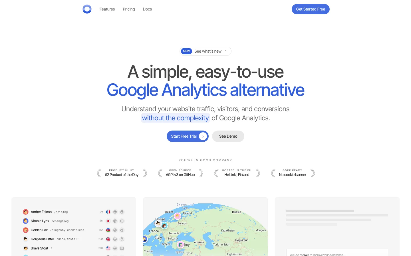
Gray pill eyebrow over every section: a one- or two-word label such as "Organize" or "Loved by many" in a 300px-radius gray capsule, medium-weight and small, repeats above each centered headline and gives a long page a steady rhythm without numbering or rules.
Social-post wall as testimonial masonry: four staggered columns of white cards with faint hairlines keep each quote's raw, lowercase voice, real handle and blue verified check, and full-color video reaction cards break up the text so the wall reads as live chatter rather than curated praise.
Display stand vanishing into the footer: below the closing product shot, a gray monitor stand fades into pure #000000, using one gradient to bridge the final image and a sparse footer of white-headed link columns.
One tracking value across the heading scale: -1.4px holds at 56px, 48px and 28px, which is relatively tighter as the type shrinks, so the smaller TWK Everett Regular subheads stay as compact and deliberate as the display lines.
saas · landing · light · minimal, bento, corporate-clean · premium, calm, confident, friendly, human