melius.com2views
Eight details, eight pinned.
View as Markdown ↗Sized by coverage · click to copy.
TASTEFULLY CRAFTED AI IMAGE MODELS
ABC Gravity Condensed · 76/68 · 900 · normal
EXCEPTIONAL PROMPT UNDERSTANDING
ABC Gravity Condensed · 72/68 · 900 · normal
Style It Once, Every Image Matches: Introducing V4 Styles
Geist · 16/21 · 500 · -0.32px
Specimens are the page's own words at their measured metrics; shown in Inter when the family is not loaded.
 12345678
One word per headline set in the italic cut of the same condensed face, everything else roman — a stress beat that costs no color, size or weight change and repeats as a system down the page
Negative leading on the display type: 76px glyphs on a 68.4px line-height (0.9), so a two-line headline locks into a single rectangular mass rather than reading as two sentences
Acid lime #d2fc31 with black #000000 labels, 8px radius, 12px text, reserved for exactly two buttons (nav and hero); the secondary sits in near-white #f0f1f2 at the same size, so the pair reads as one primary and one alternative, never two CTAs
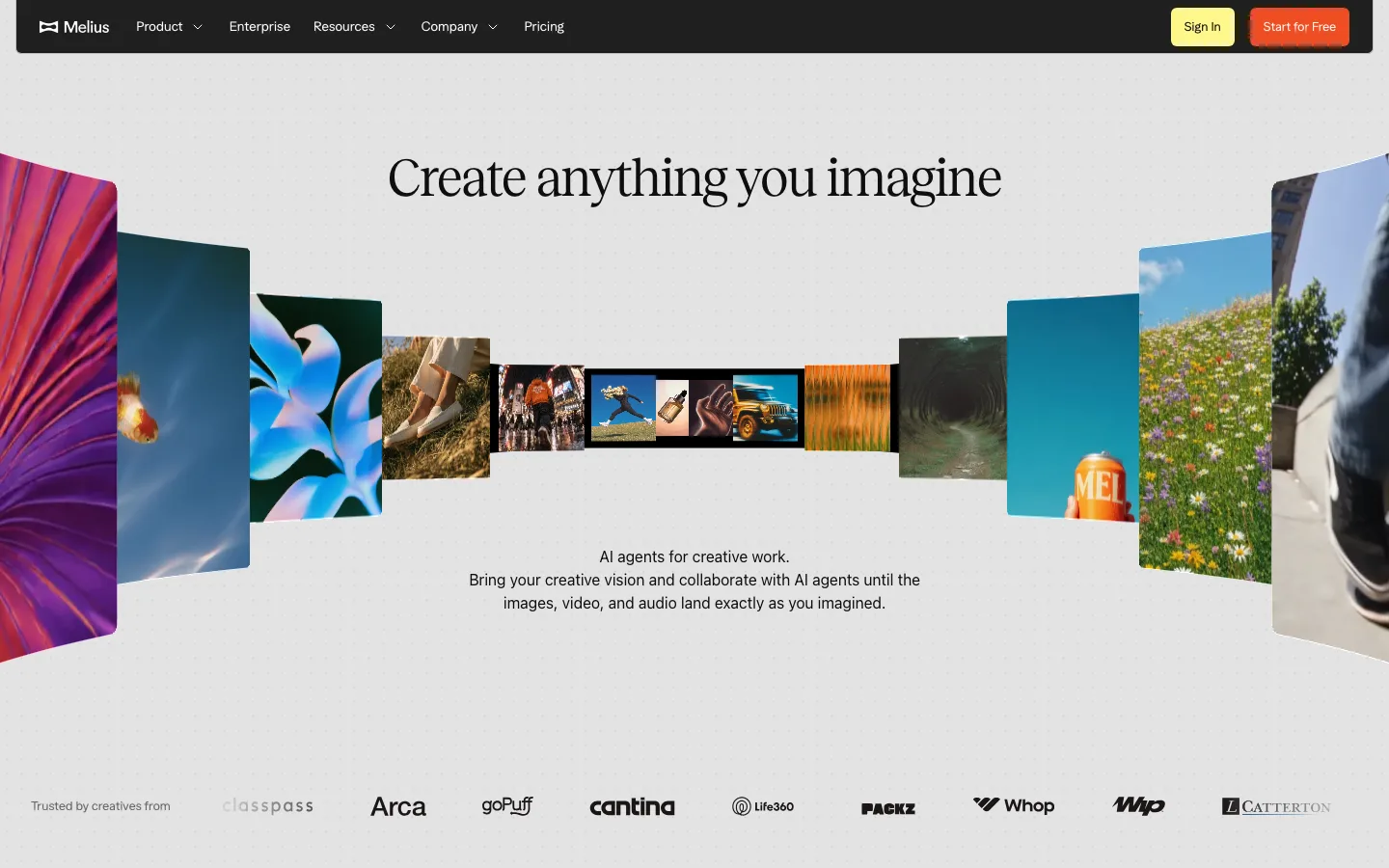
The hero is not full-bleed: it is a ~15px-radius media card inset 72px from the page edge, so the black page frames the picture like a mount instead of bleeding into it
Carousel arrows are parked in the black gutter outside the media card as circular chips, while the dot pagination sits inside the bottom of the image — controls that never sit on the artwork they move
Slides are sliced by the viewport edge — a sliver of the previous and next image on each side — and captioned underneath in 16px Geist rather than titled above, so each row reads as an endless strip with a museum label
A single violet #bc7dfd full-bleed bar between nav and hero carries a square badge, one sentence and an underlined "Learn more" — the only chrome above the fold and the only place that color appears in the header
The footer ends with the wordmark blown up to the full page width in the display face and clipped by the bottom edge, so the last thing on the page is a letterform, not a link
saas · landing · dark · editorial, dark-techno · confident, edgy, premium, energetic