stuart.re7views
Seven details, five pinned.
View as Markdown ↗Sized by coverage · click to copy.
Rauno Freiberg is an Estonian interaction designer working with Vercel and Devou
X · 32/normal · 500 · normal
Make it fast. Make it beautiful. Make it consistent. Make it carefully. Make it
X · 75/normal · 400 · normal
Specimens are the page's own words at their measured metrics; shown in Inter when the family is not loaded.
 12345
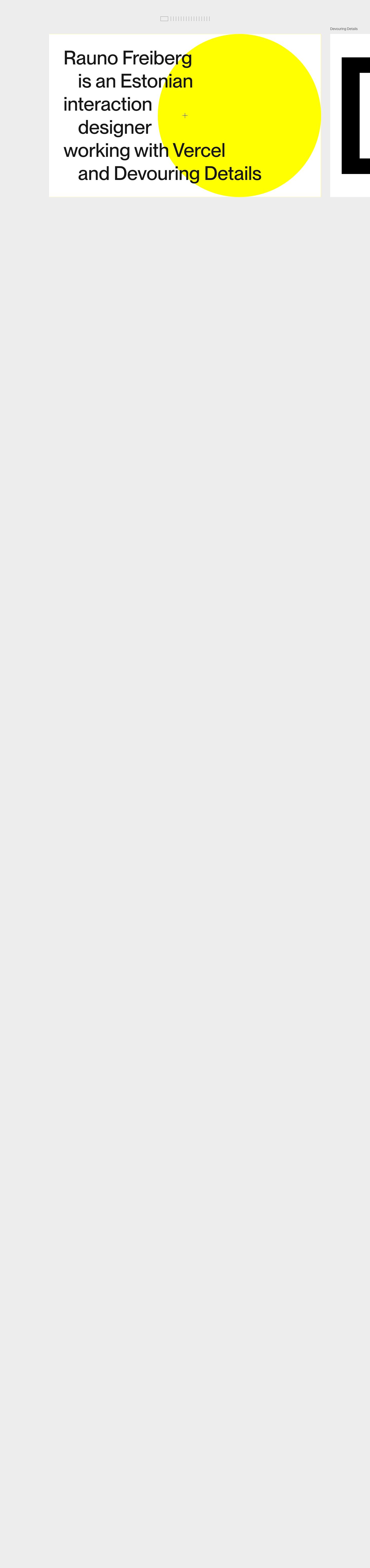
Tick-mark minimap as navigation: a row of 1px gray vertical ticks with one outlined rectangle marking the current card. It is a scrollbar, a progress bar and a table of contents in about 200px.
Bio set in alternating indents: every other line starts about 56px in, so one plain sentence reads as a typographic composition with no extra styling, color or weight.
A single flat circle of pure #ffff02 sits behind the type, its right edge flush with the card's edge, and the text runs straight over it. One shape and one color do all the branding.
A hairline crosshair replaces the cursor in the viewport's center, the only sign that the cards are interactive. It is a precise, tool-like touch suited to a designer's site.
The next card peeks in at the right edge, its caption ("Devouring Details") floating above it in small gray text. The partial card tells you to keep scrolling without any arrow.
Each project card gets its own single flat color (yellow, orange, ink black, pixel blue) and one oversized graphic or cropped word, so the reel stays varied while the card frame never changes.
Scroll-jacked horizontal strip: the page is about 6,100px tall but holds no vertical content, because vertical scroll only moves the cards sideways.
portfolio · landing · light · swiss, minimal · confident, technical, playful, calm