dannpetty.com4views
Eight details, seven pinned.
View as Markdown ↗Sized by coverage · click to copy.
Washington, DC
Geist · 12/18 · 500 · normal
Specimens are the page's own words at their measured metrics; shown in Inter when the family is not loaded.
 1234568
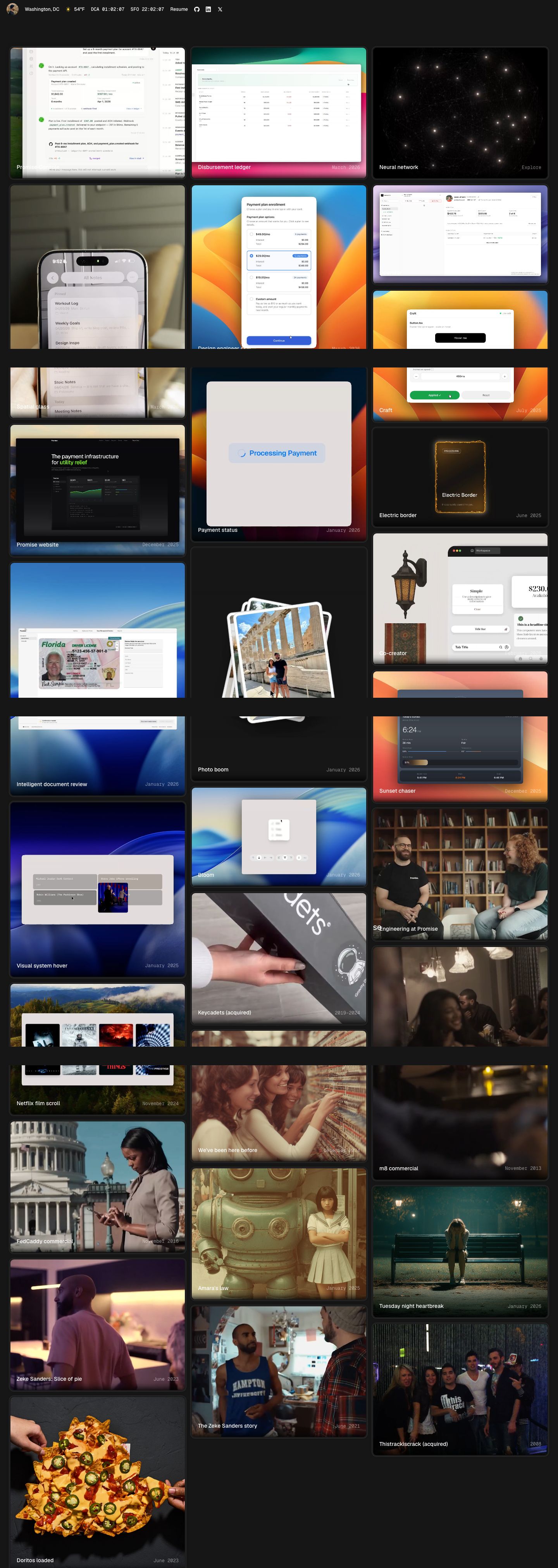
Status-bar header instead of a hero: avatar, "Washington, DC", a sun glyph with 58°F, then "DCA 22:24:31" and "SFO 19:24:31" as live monospace clocks, followed by Resume and three 16px icon links, all at 12px/500 on one baseline with ~16px gaps. It says who, where and when in a single row and leaves the fold to the work.
Airport codes as time-zone labels — "DCA" and "SFO" in monospace read as a terminal or a departures board, a far more characterful way to show two cities than "EST / PST".
Floating segmented filter docked bottom-left: a dark #1a1a1a capsule with a hairline border holding All · Interaction · Product · Film · Writing at 11px/500; the active segment is a solid white #ffffff pill with #1a1a1a text, 8px radius, 4px 12px padding. It stays fixed over the scrolling grid, so filtering never needs a toolbar.
Two-voice card caption overlaid on the media: title bottom-left in white Geist 14px/500, metadata bottom-right in gray (#74706e-ish) monospace ("Explore", "January 2026", "2019–2024"), over a soft bottom scrim. Sans for the name, mono for the data, no card footer.
Beveled media cards: each tile is a 12px-radius frame with a 1px hairline (#2a2a2a-ish) and the media inset about 3px inside it, so every clip sits in a thin dark bezel like a screen in a device rather than bleeding to the card edge.
Blurred skeleton tiles while clips load: empty cards keep their bezel and show a faint blurred caption ghost in the lower-left, so the grid holds its masonry shape before any media arrives.
Staggered masonry with uneven tile heights across three ~456px columns and ~12px gutters, so no row lines up and the grid reads as a contact sheet, not a template.
Desktop wallpapers as stage backdrops: UI experiments are shot as a light panel floating on a macOS-style gradient wallpaper (orange, blue swoosh, landscape), which gives a monochrome page its only color and makes each component demo feel staged.
portfolio · landing · dark · bento, minimal, dark-techno · technical, confident, calm, premium, human