emilkowal.ski3views
Seven details, six pinned.
View as Markdown ↗Sized by coverage · click to copy.
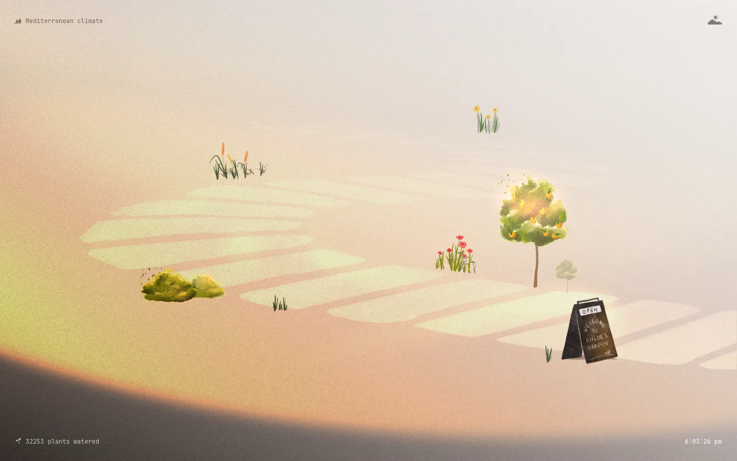
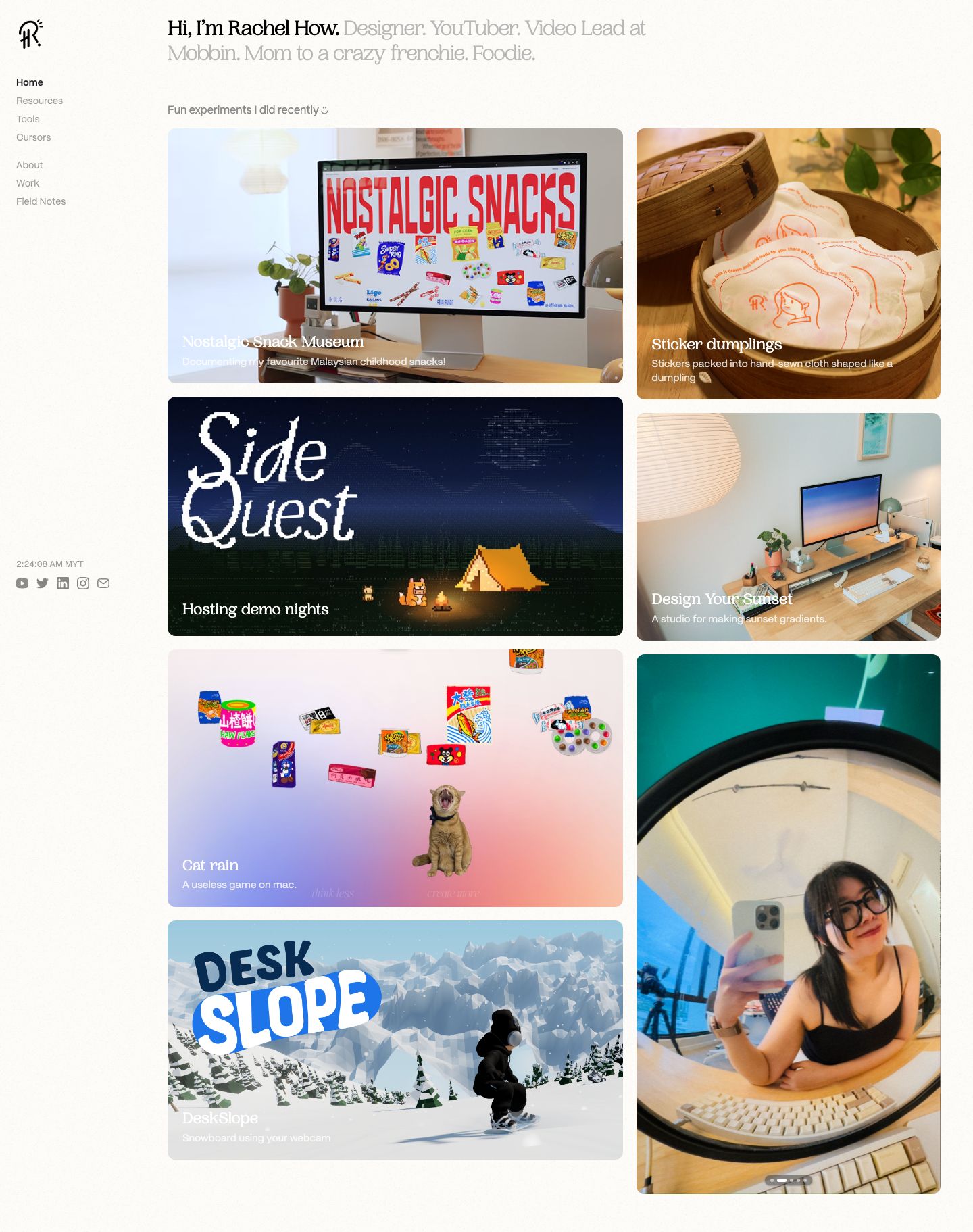
Nostalgic Snack Museum
PP Woodland · 23/28 · 400 · normal
Documenting my favourite Malaysian childhood snacks!
PP Mori · 15/20 · 400 · normal
2:24:07 AM MYT
PP Mori · 13/20 · 400 · normal
Specimens are the page's own words at their measured metrics; shown in Inter when the family is not loaded.
 123456
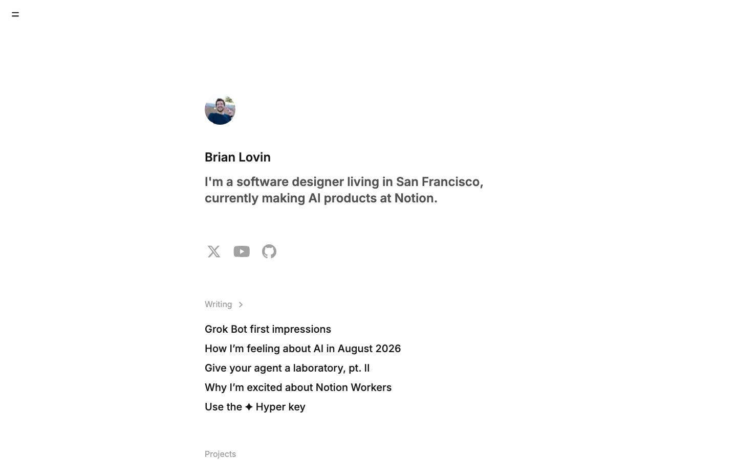
Two-tone intro sentence: the name in ink (#0c1521), then the rest of the bio in pale taupe (#b7afac) at the same size and weight, so one line works as both a greeting and a subtitle with no second text block
Fixed left rail instead of a top nav: an icon monogram, two small link groups (Home/Resources/Tools/Cursors, then About/Work/Field Notes) split by one extra gap, with the active link in ink and the rest in gray, and no dividers or fills
Live local clock ("2:24:06 AM MYT") pinned at the bottom of the rail above a row of gray social glyphs, a quiet "a real person in a real time zone" signal
Casual sentence-case section label ("Fun experiments I did recently") in 15px sans with a tiny hand-drawn glyph, in place of a formal H2
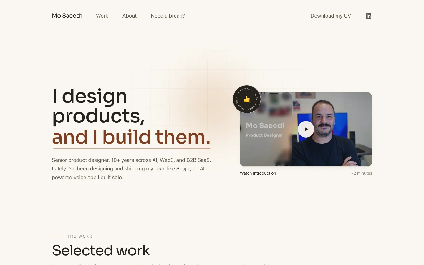
Serif title and sans subtitle sit directly on the photo in white, with no scrim or gradient. It trusts the image's own lower third to give enough contrast
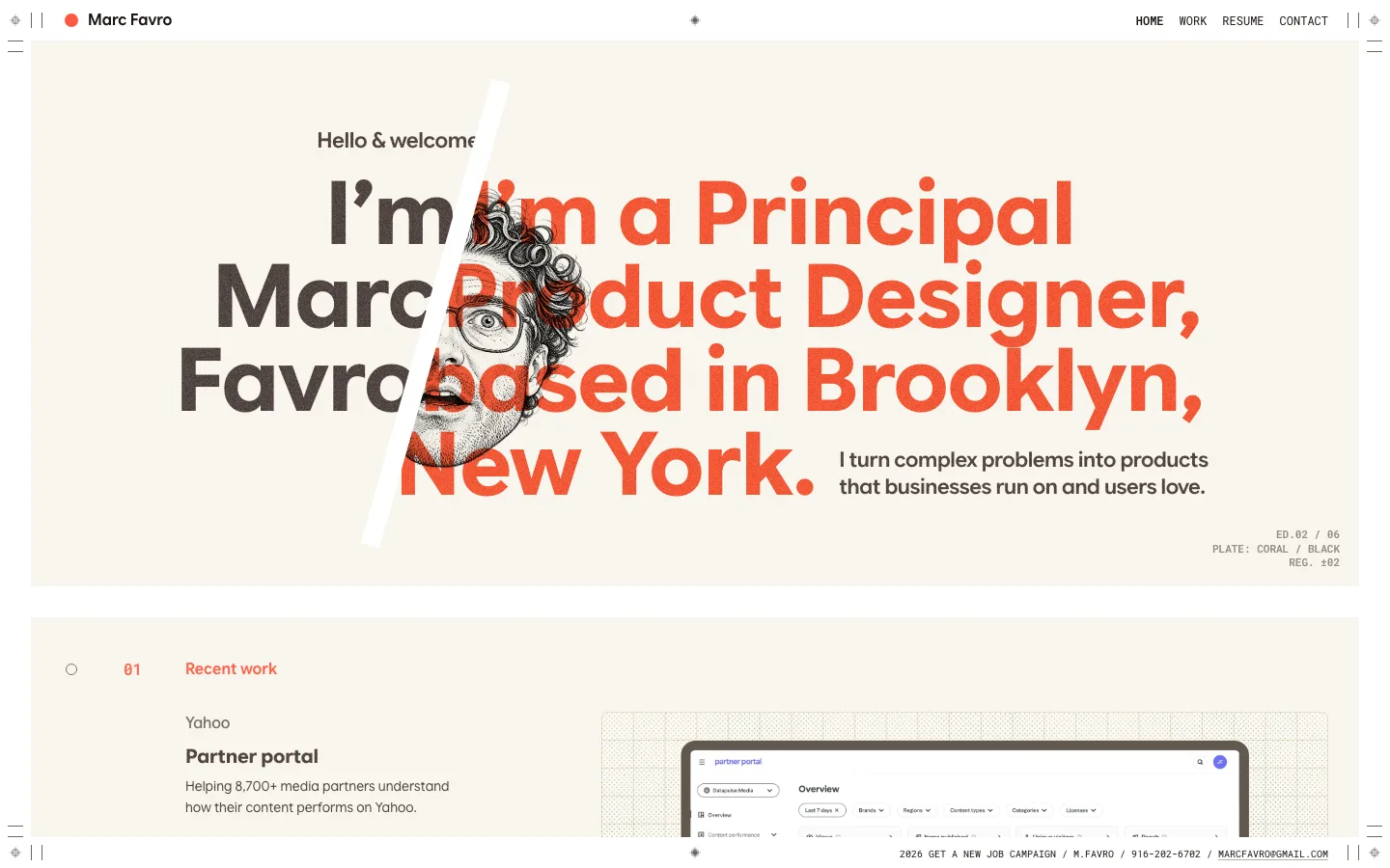
Asymmetric two-column grid (a wide card of about 3fr beside a narrow one of 2fr) whose heights differ per column, so the rows stagger like a masonry wall without any masonry library
Two-value radius system: 12px on every card, 999px on any pill. Nothing in between
portfolio · landing · light · minimal, editorial · human, warm, calm, playful, friendly