skale.solutions0views
Eight details, eight pinned.
View as Markdown ↗Sized by coverage · click to copy.
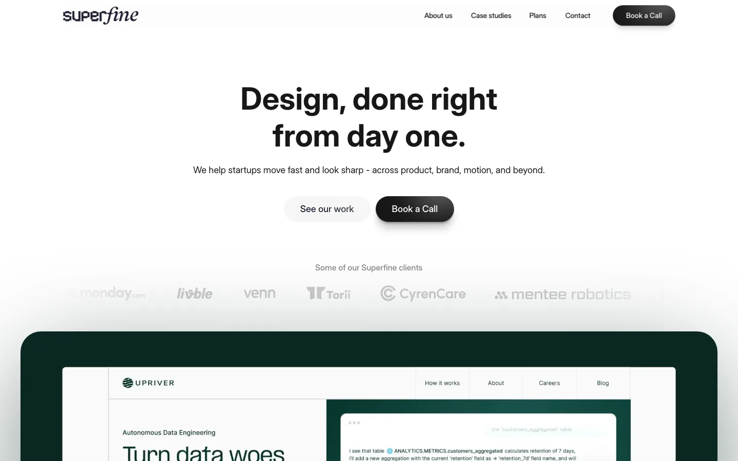
Blazing fast brand sprints for startups
Suisse Int'l Regular · 110/110 · 400 · -4.4px
At Primary, we believe exceptional branding is possible without the wait. So we
Suisse Int'l Regular · 60/69 · 400 · -1.8px
"From understanding our ambitions, to crafting the direction, to executing with
Suisse Int'l Regular · 44/53 · 400 · -0.88px
slots left for
Suisse Int'l Regular · 10/10 · 400 · 0.1px
Specimens are the page's own words at their measured metrics; shown in Inter when the family is not loaded.
 12345678
Display type set solid — 110px size against a 110px line-height, tracking pulled to -4.4px (-0.04em), weight 400 not bold. Two lines stack with zero visual gutter, which is what makes a regular-weight headline read as loud
The nav is two separate hairline pills, not one segmented container — "Work" and "Pricing" each get their own 999px outline and their own padding, floating centered with no bar, no fill and no border under the header
The primary CTA is a scarcity booking pill: a filled circle icon (lightning) hard against the left edge, then a two-line stacked label — 14px "Reserve your spot" over a 10px gray "3 slots left for November". The subline does the selling; the button is only the frame
The wordmark sits over a hairline rule that stops short — it runs from the left margin to about 18% of the viewport and simply ends, standing in for a header border without drawing one
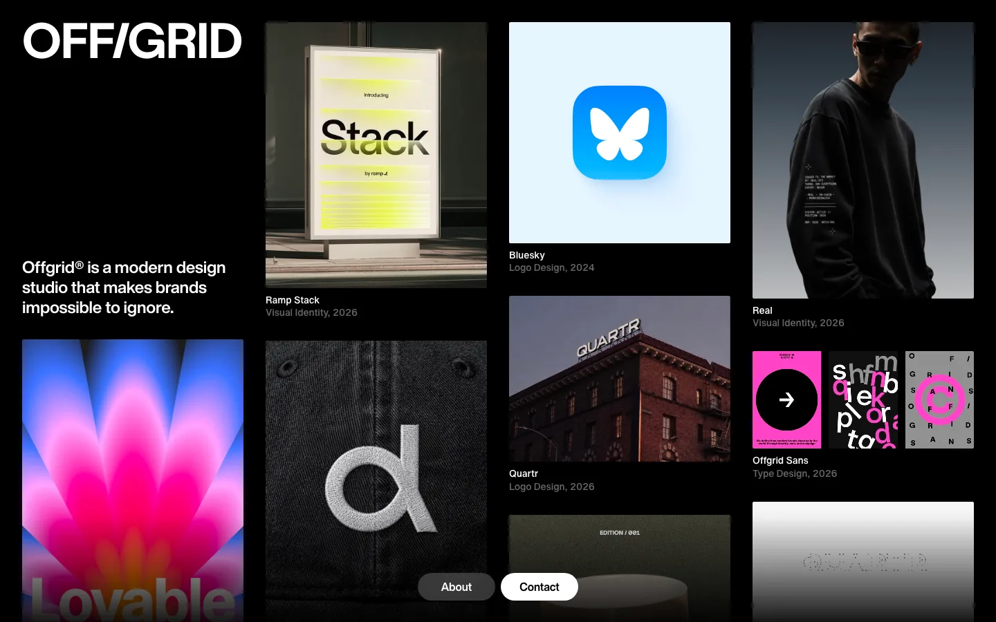
The portfolio band is overlapping full-bleed panels at staggered bottoms, and each one's caption is a "→ LABEL" chip in 12px caps notched into the page ground at its bottom-left corner. Nothing sits on top of a photograph, so no scrim and no dimming is ever needed
Sections are closed by a labeled progress rail: a 1px hairline with a small square tick at each end and a 10px gray label above each tick ("Kickoff / Full Brand", "2004 / Now"). The same component is reused as a section footer to encode duration and history without a diagram
The competitive claim is drawn as a two-bar lime chart with the labels inside the bars — a short "THEM" bar over a near-full-width "YOU" bar, both #c8ff54, no axis, no numbers, no legend. An argument rendered as a measurement
Emphasis is a full-bleed inverted panel, not a card: the page ground flips to #120a06 edge to edge, the 44px quote sits at roughly 60% column width in the same regular weight, and attribution goes white name over gray role. The closing CTA does the same thing with a 999px pill outlined in a 1px white stroke at ~70% viewport width
agency · landing · light · swiss, minimal · confident, energetic, premium, trustworthy