zernio.com0views
Nine details, eight pinned.
View as Markdown ↗Sized by coverage · click to copy.
Build support your own way
ABC Favorit Regular · 80/80 · 400 · -1.6px
Tools add
ABC Favorit Regular · 48/50 · 400 · -0.96px
Start fast. Scale fearlessly.
ABC Favorit Medium · 24/28 · 500 · -0.48px
Your customers are talking to you in Slack, MS Teams, email, and inside your pro
ABC Favorit Regular · 18/24 · 400 · -0.18px
Channels
ABC Favorit Regular · 12/16 · 400 · -0.12px
Specimens are the page's own words at their measured metrics; shown in Inter when the family is not loaded.
 12345678
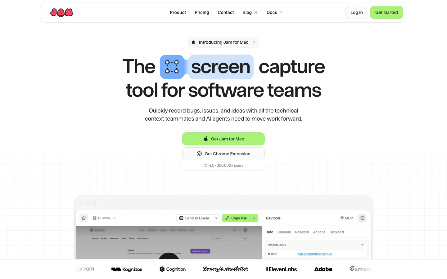
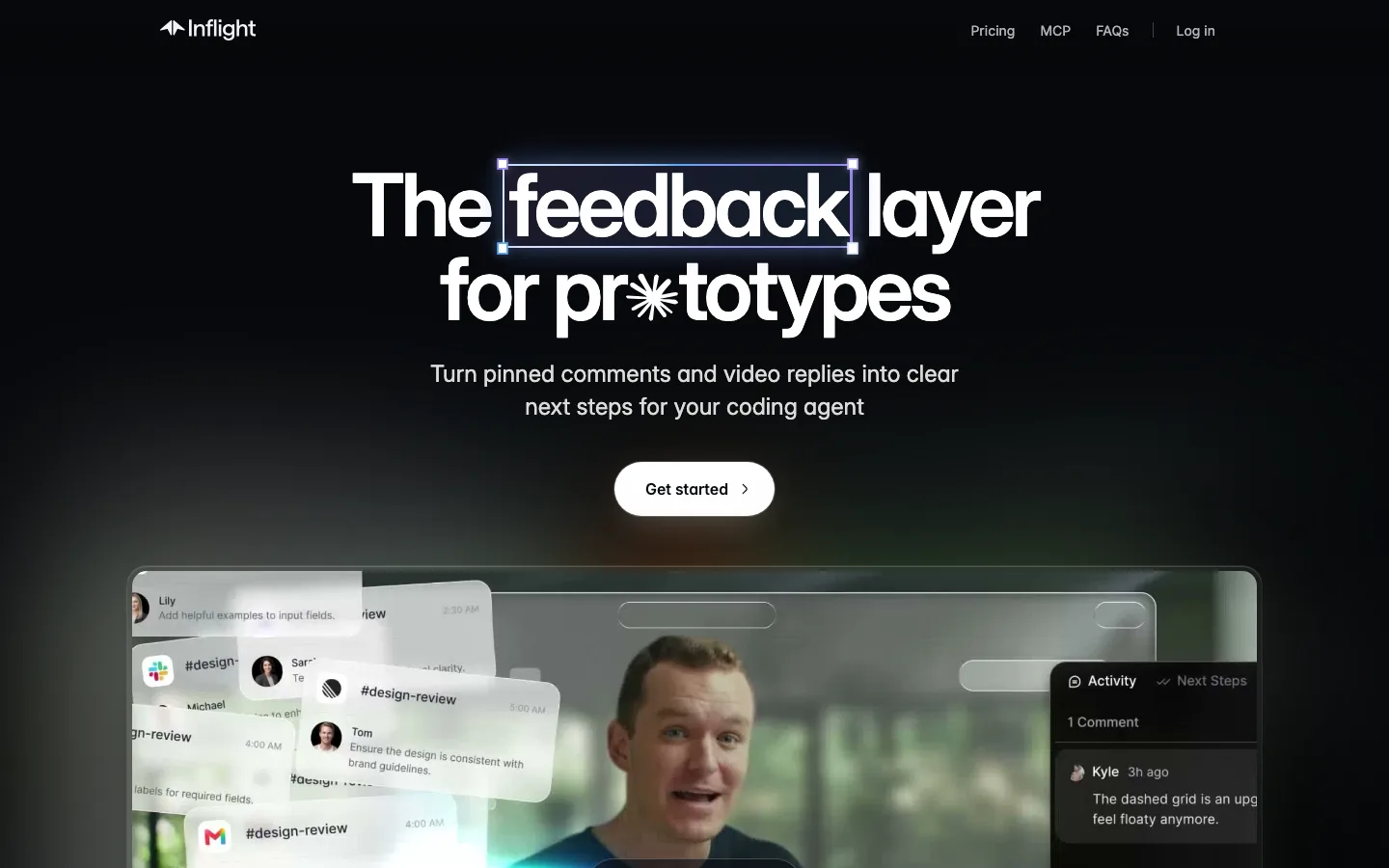
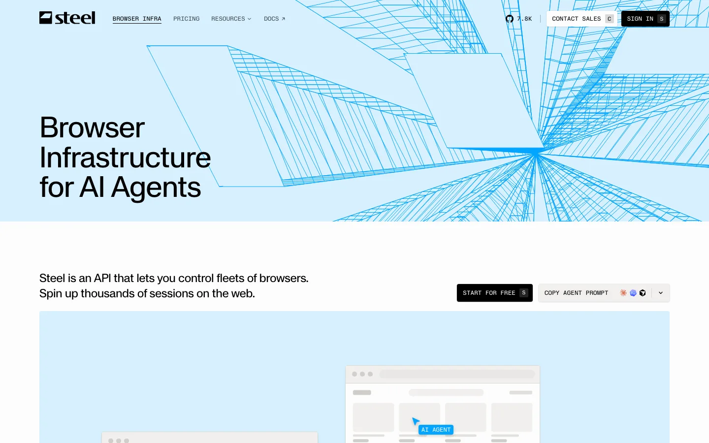
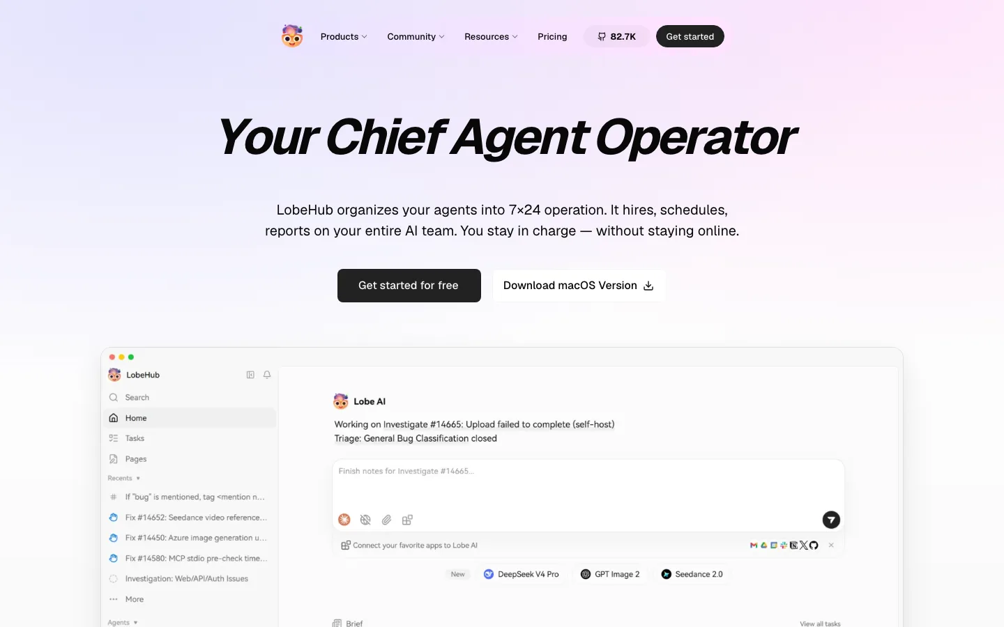
Two-tone stacked headline: the first line in brand green, the second in near-black forest ink, same size and weight, no other emphasis, so color alone carries the hierarchy
Monospace uppercase CTAs: "BOOK A DEMO" / "START A TRIAL" set in a mono face with wide tracking at 12px, solid green fill paired with a 1px green outline twin, 6px radius; the type is the brand, not the shape
Hero product frame on a pale mint card (#d7f5df tint, ~12px radius) crossed by thin dashed and solid green curves, like transit routes converging on the UI; decoration that also implies "routing"
Customer logo strip pinned to the bottom edge of the first viewport, monochrome and evenly spaced, so social proof is visible before any scroll
Inline logo cluster inside a headline: "Tools add [a row of tiny app icons] distance", where the icons replace words mid-sentence and make the problem literal
Forest-green band holding a 3×2 grid of dark cards with thin mint hairlines and small line-art illustrations, each with a tiny mono eyebrow above a medium-weight title
"Speed, meet power" comparison section as a two-column definition list on forest green: scenario on the left with a green mono link beneath, a long candid paragraph on the right, separated by one thin divider
Timeline section ("29 mins and 59 secs") that pins three timestamps across a horizontal line and lists what you achieve by each, turning onboarding speed into a scannable chart
Arrow links done as long hairline arrows trailing a mono label ("DISCOVER AGENTS ⟶"), the stroke as long as the word, instead of a chevron glyph
saas · landing · mixed · minimal, bento · calm, technical, confident, optimistic, trustworthy