validata.so0views
Eight details, eight pinned.
View as Markdown ↗Sized by coverage · click to copy.
Extraordinary customer experiences with AI agents
PP Neue Montreal · 48/58 · 500 · normal
Used every day by the world's best companies
PP Neue Montreal · 24/29 · 500 · normal
One brain, every channel
PP Neue Montreal · 24/29 · 400 · normal
Resolve 77% of support across chat, email, voice, and outbound, instantly, and s
Inter · 18/27 · 400 · normal
Automate everything™
Inter · 12/16 · 500 · normal
Specimens are the page's own words at their measured metrics; shown in Inter when the family is not loaded.
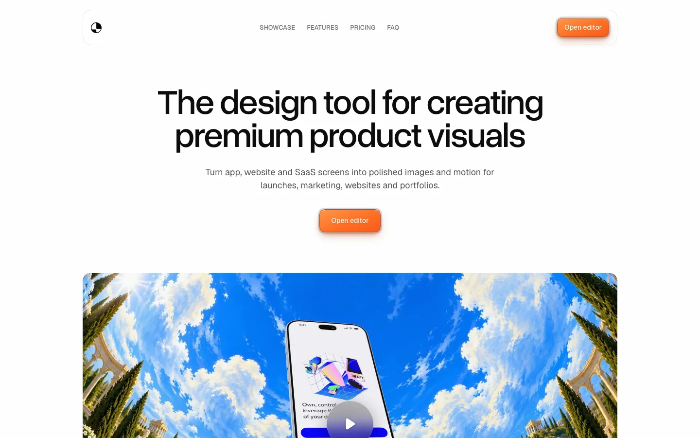
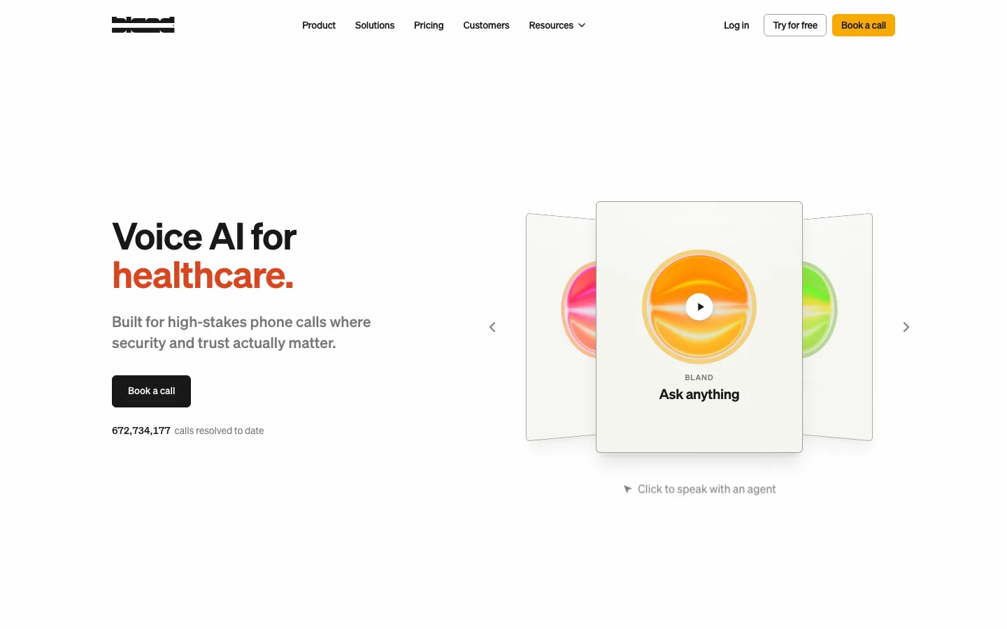
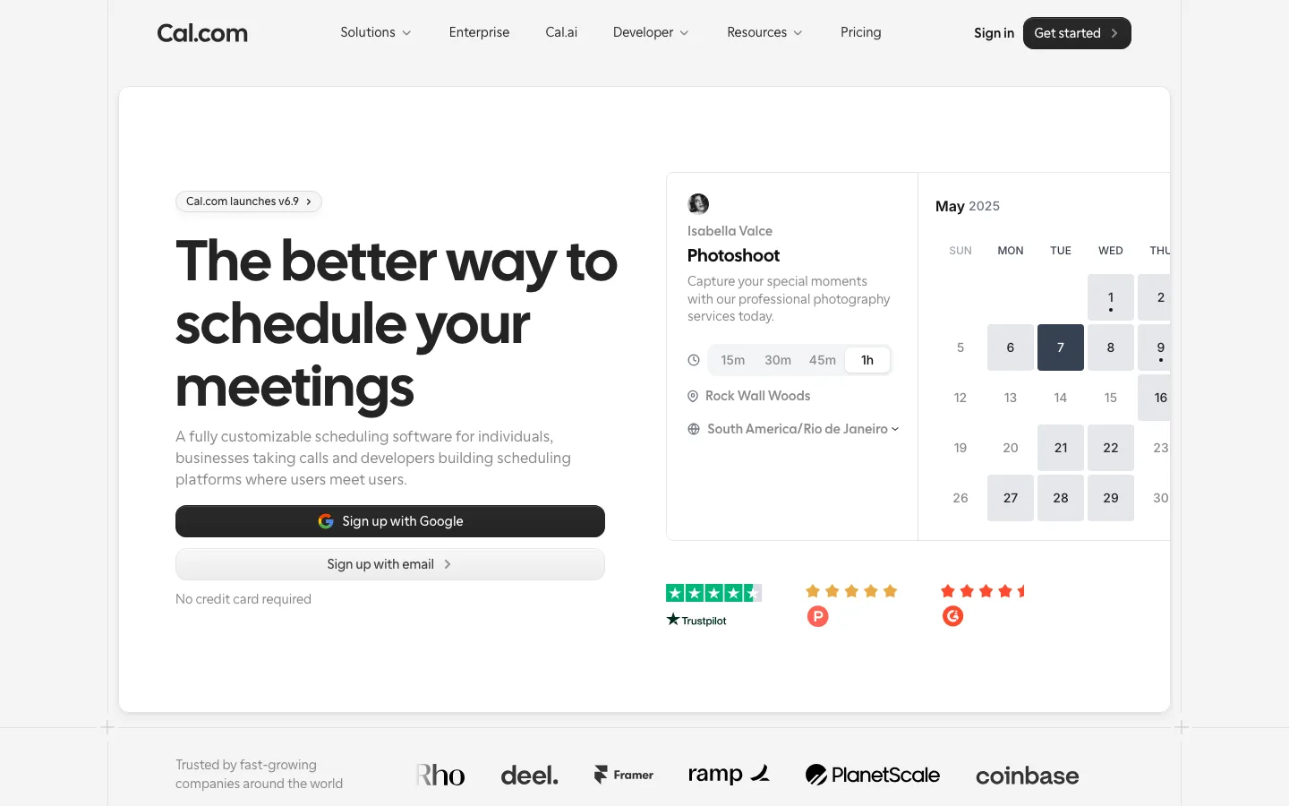
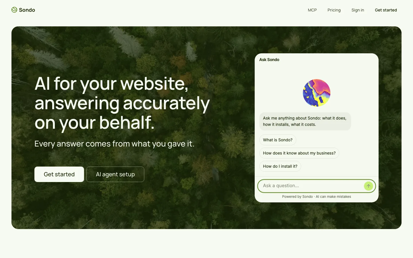
 12345678
Chromeless sticky header — no bar fill, no bottom border, no backdrop blur; the wordmark, four nav links and the pill CTA simply float over whatever section scrolls beneath, including the full-bleed black one
Two-typeface split doing all the hierarchy: PP Neue Montreal 48px/500 at 1.2 for the headline, Inter 18px/400 at 1.5 for the subhead directly under it — no size jump larger than the family change already implies
The CTA pair at the two ends of the radius scale: a solid #0d0d0d pill and a white pill with a hairline border and a small play triangle, both 44px tall, 14px/500 Inter, 8px/24px padding, fully round — the secondary reads as equal weight, not as a demoted link
Hero media as one wide rounded card (18px) holding a real person against a warm beige studio gradient, with a small black "Watch video" pill floating over the center of it — the page's only warm color arrives as photography, not as a brand token
Logo wall built as a hairline grid of equal 6px-radius cells — four rows of five, every customer mark centered in its own box — instead of the usual free-floating row, so twenty logos of wildly different aspect ratios read as one tidy block
Each feature card puts a small round expand icon button in its top-right corner instead of a "Learn more" link, so the card itself is the affordance and the copy stays uninterrupted
Scheme inversion reserved for one claim: a full-bleed black band with the guarantee headline in white PP Neue Montreal, a gold-lit render below it, and white 6px cards laid over the black — the only tonal shift in 8400px, spent on the single hardest promise
Compliance drawn rather than listed: five etched circular seals (SOC 2, ISO 27001, GDPR, EU AI Act) over 12px uppercase letter-spaced captions, between two full-width hairlines, with a green-dot "All systems operational" line in the legal row
saas · landing · light · minimal, corporate-clean · confident, trustworthy, calm, premium