meodai.color.pizza8views
Seven details, four pinned.
View as Markdown ↗Sized by coverage · click to copy.
Creative human with a focus on 3D image creation, motion design and interactive experiences.
ui-sans-serif · 12/13 · 400 · normal
Specimens use the page title and description at the captured metrics; shown in Inter when the family is not loaded.
 1236
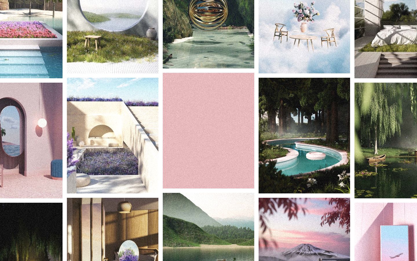
The identity card is just another tile in the grid — same size, same gutters, flat pink instead of an image — so the intro sits inside the work instead of above it
Global film-grain overlay across photos and flat fills alike; it softens 3D renders, unifies mismatched palettes and keeps the flat pink from looking digital
Columns offset vertically by roughly a third of a tile (columns 2 and 4 sit lower than 1, 3 and 5), so the edge-to-edge wall reads as masonry with no ragged layout logic
Name set as two stacked lines of a tight italic Didone-style serif at ~80px, leading under 1, against a microscopic ~11px uppercase grotesque bio — the scale gap is the whole typographic system
Social links as white, fully rounded pill chips floating over an image at the bottom of the viewport, uppercase 12–13px, no icons
The accent is pulled from the work itself — the dusty rose of the pink interiors and sunset skies — so the one UI color never fights the renders
Zero chrome: no header, no nav bar, no footer, no corner radius on any tile; the page is one 100vh composition
portfolio · landing · light · editorial, luxury · calm, elegant, premium, nostalgic