mackenziechild.me1view
Seven details, seven pinned.
View as Markdown ↗Sized by coverage · click to copy.
I design products, and I build them.
Sora · 66/67 · 500 · -0.984px
Selected work
Sora · 48/48 · 400 · -1.2px
Snapr
ui-sans-serif · 20/28 · 400 · -0.5px
Senior product designer, 10+ years across AI, Web3, and B2B SaaS. Lately I’ve be
ui-sans-serif · 18/29 · 400 · normal
THE WORK
ui-sans-serif · 12/16 · 500 · 2.88px
Specimens are the page's own words at their measured metrics; shown in Inter when the family is not loaded.
 1234567
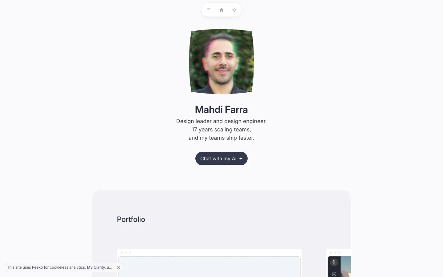
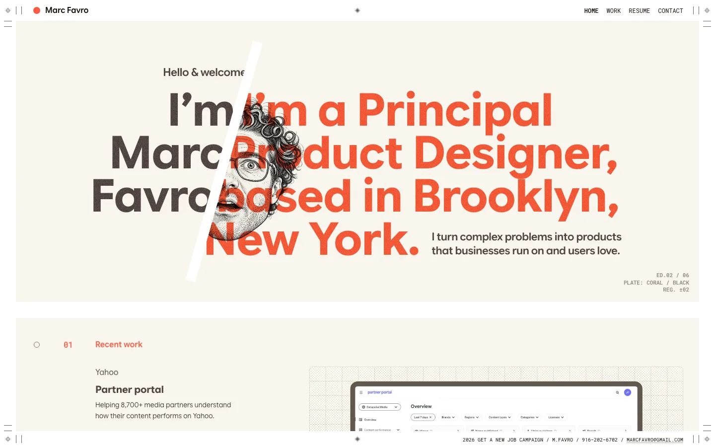
Three-line hero where only the payoff line takes the accent color, plus a thin brushed underline beneath it — emphasis by color, not by weight or size.
Faint background grid that fades out radially, with a warm peach glow behind the headline — texture that stays under the type.
Circular rotating "OPEN TO WORK · 🤙" sticker badge overlapping the corner of the intro video, like a sticker on a laptop.
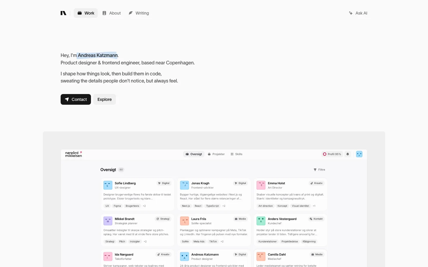
Section eyebrow pattern: short accent hairline + letterspaced small caps ("THE WORK") above a large regular-weight heading.
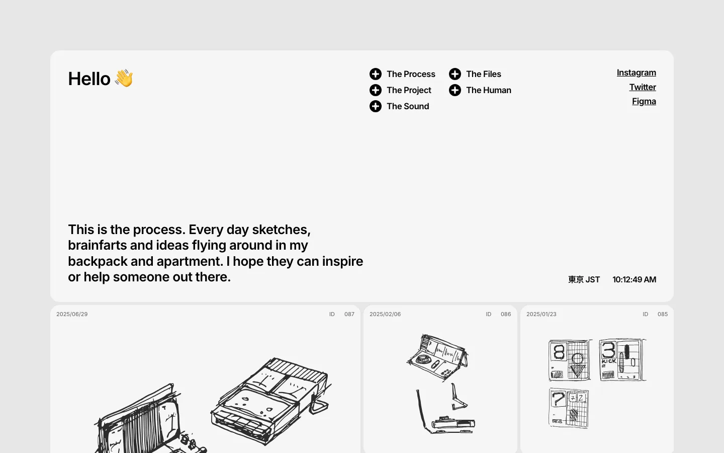
Project cards with a numbered pill (01, 02…) floating over the artwork, and a row of tiny bordered pill tags for role/stack — dense metadata that stays quiet.
Ghost-flat pill CTA ("Email Mo↗") in the page's own cream — buttons dissolve into the ground rather than shout.
Video card caption row: label left, "~2 minutes" right, in muted gray — sets expectations without a UI element.
portfolio · landing · light · minimal, retro-warm · warm, human, confident, calm, friendly