getclera.com1view
Eight details, three pinned.
View as Markdown ↗Sized by coverage · click to copy.
The best startups run sales on Monaco.
Season Serif · 63/63 · 400 · -0.6294px
Everything you need, all in one place.
Season Serif · 43/47 · 400 · -0.4328px
"Monaco solves go-to-market risk for founders without sales backgrounds."
Inter · 17/24 · 400 · -0.3342px
Specimens are the page's own words at their measured metrics; shown in Inter when the family is not loaded.
 123
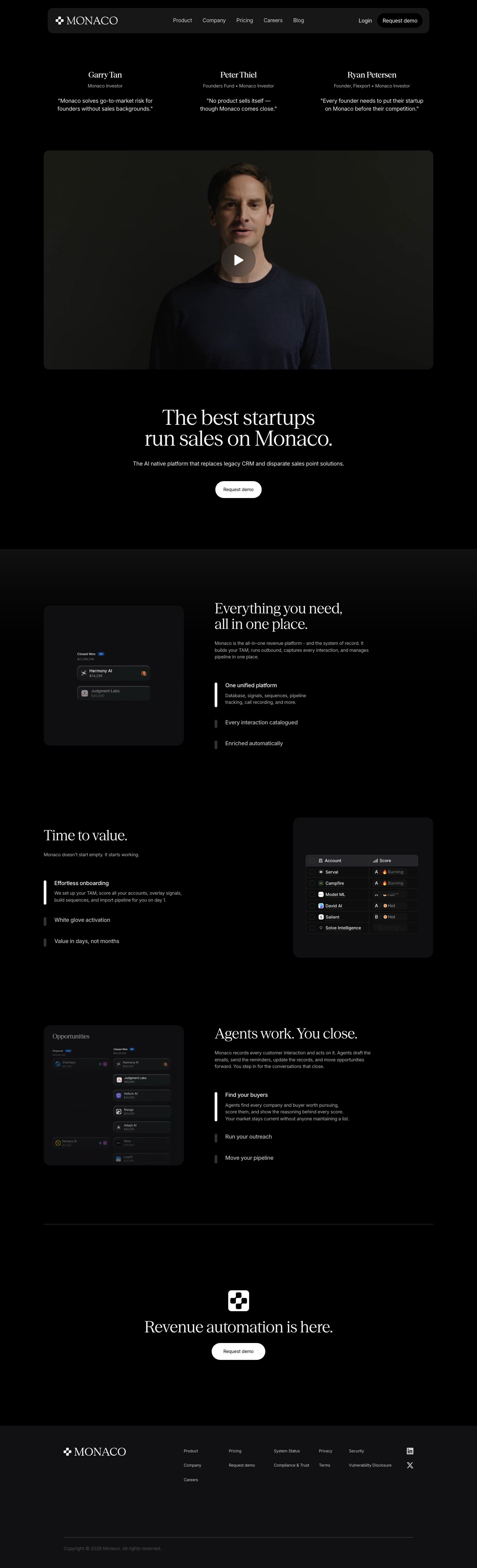
Floating blurred nav pill — a 1152px-wide, ~76px-tall slab with a 16px radius, a translucent charcoal fill and backdrop blur, so scrolled headlines dissolve behind it instead of colliding. The CTA inside it is a black pill, a quiet inversion.
Investor quotes as the proof block — three centered columns, each a serif name at ~26px, a small gray role line with a bullet separator, then a plain Inter quote. No avatars, logos or cards, so the names carry the weight.
Founder video as a quiet panel — a 12–20px radius dark card, full content width, with one muted circular play button (translucent taupe fill, white triangle) over a dim portrait.
Serif headline, sans everything else — Season Serif 62.8px/1.0 at weight 400 with -1% tracking for the H1 (43px for H2), Inter 16.8px/1.4 for body. One weight, and the contrast is the hierarchy.
Active-row indicator in feature lists — each list item is a title plus gray description, and the current one gets a bright white vertical bar and an expanded description while the others collapse to a dim title with a short gray stub.
Product UI shown small inside tonal panels — a rounded 20px panel one step lighter than the page holds a miniature of the app (a pipeline grid, a chat) with animated cursors, left half of a two-column split with the serif headline on the right. The screenshot is deliberately small and dim so it never outshouts the type.
Short, assertive serif headlines as the section system — "Everything you need, all in one place." and "Agents work. You close." Full stops, no question marks, one line of Inter below at ~16px in a muted gray, then the list.
Pill geometry on buttons only — the primary CTA is a fully rounded white pill at 44px height with 11px 16px padding and no border, while panels step through 12/16/20px radii, so only the interactive element is round.
saas · landing · dark · luxury, editorial, minimal · confident, elegant, premium, serious, calm