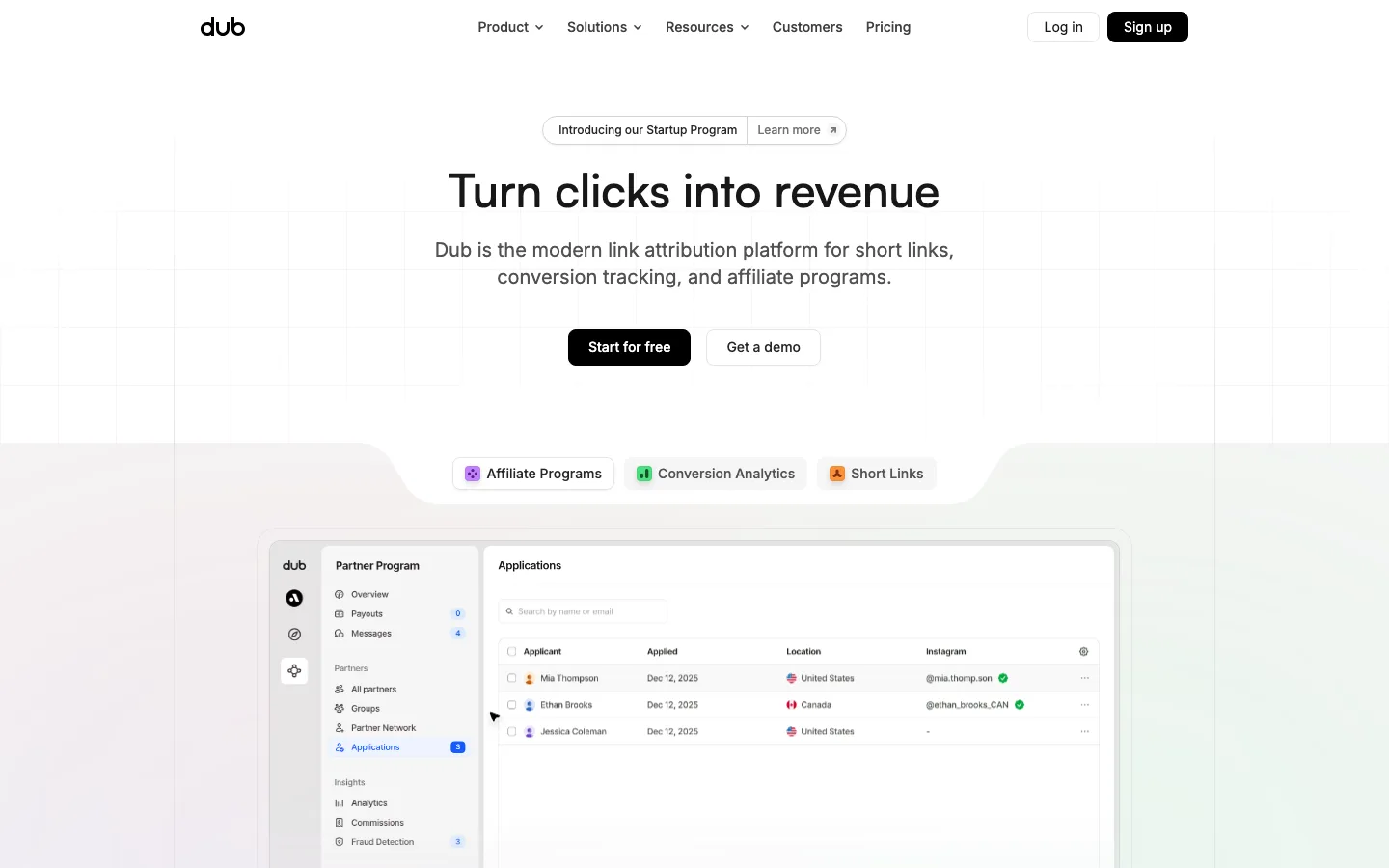
dub.co0views
Seven details, seven pinned.
View as Markdown ↗Sized by coverage · click to copy.
Discover real-world design inspiration.
M Saans 652 · 80/80 · 652 · -0.6px
A growing library of
M Saans 652 · 24/30 · 652 · normal
Video
M Saans 600 · 20/26 · 600 · normal
Featuring over 1,000 iOS & Web apps, and 200 sites — New content weekly.
M Saans Variable Light · 20/26 · 300 · normal
Specimens are the page's own words at their measured metrics; shown in Inter when the family is not loaded.
 1234567
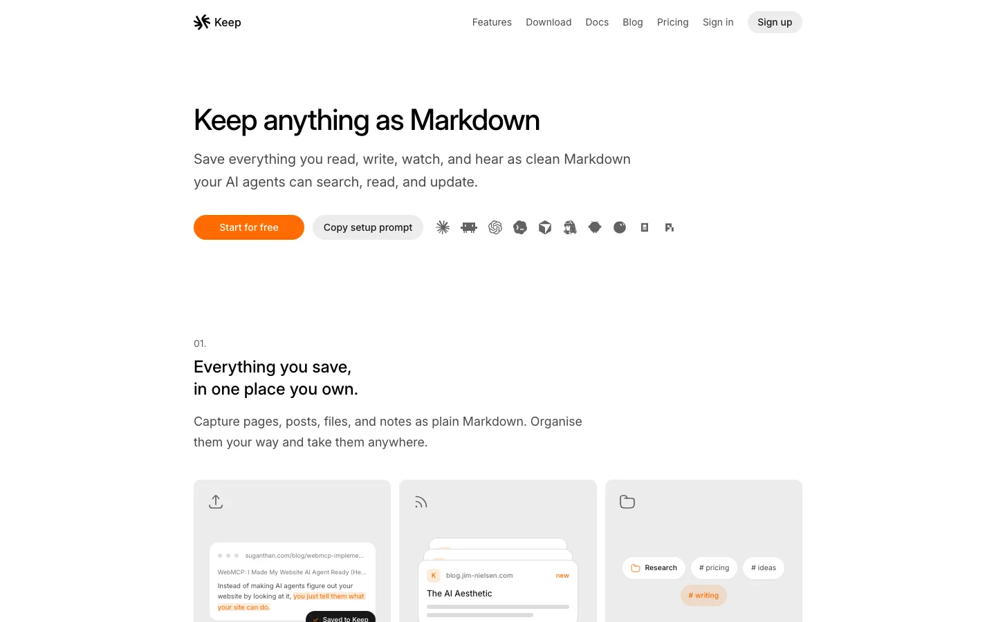
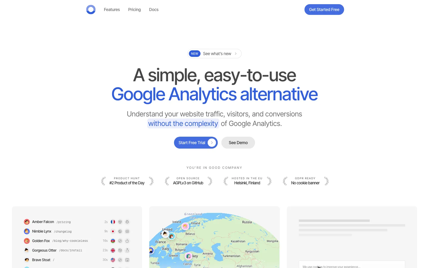
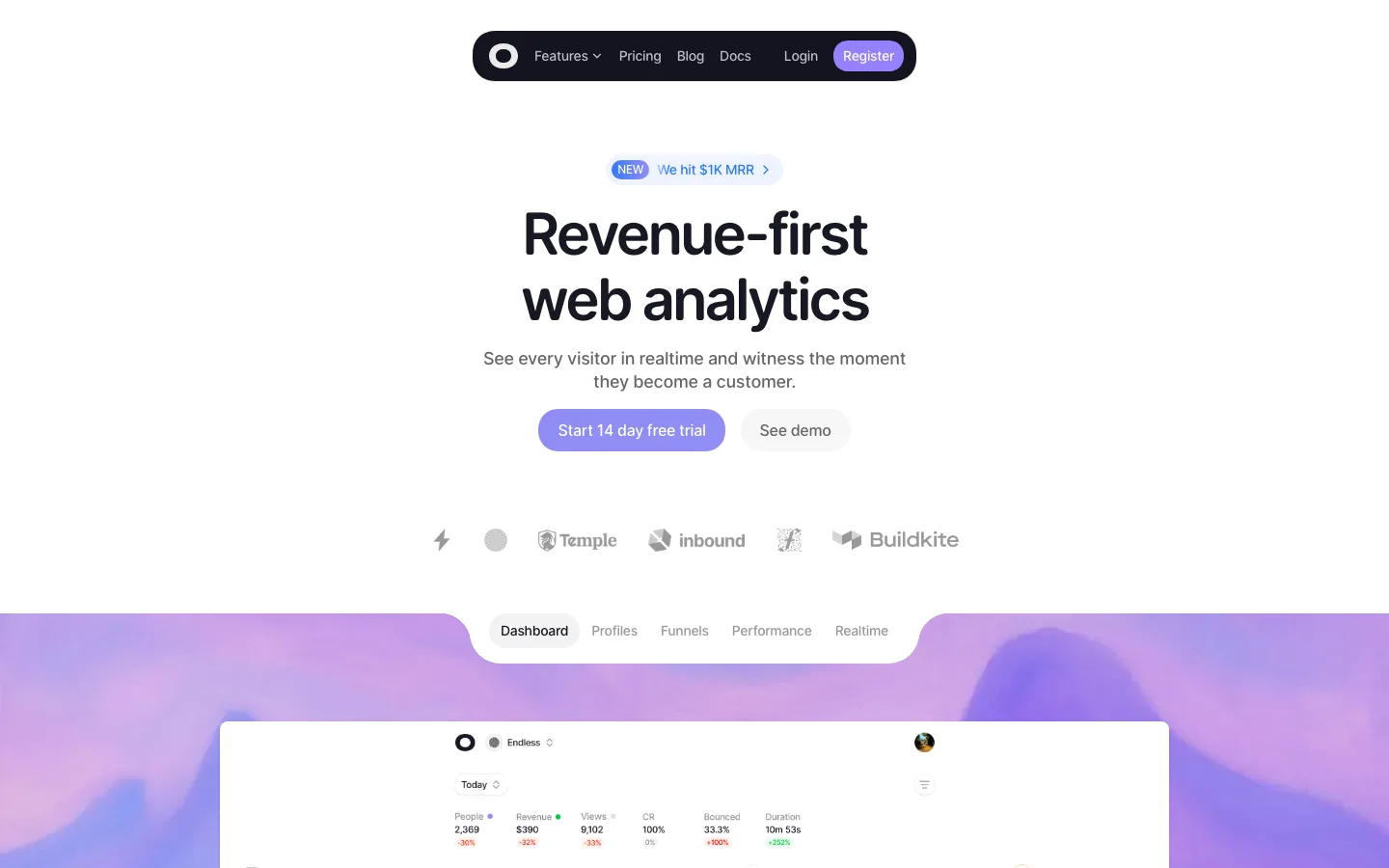
Floating pill navbar (24px radius, light gray ground) that is sparse at rest and grows a black "Join for free" pill on scroll — the CTA arrives when intent does.
Hero type does the whole job: 80px/80px, weight ~650, −0.6px tracking, near-black on white, no gradient, no illustration beyond a small gray squircle icon.
Primary vs secondary CTA expressed by fill alone — solid #141414 pill next to a hairline-outlined pill with an arrow — same height (44px), same radius (999px).
Grayscale logo strip ("Trusted by design teams at") keeps third-party marks from competing with the hero.
A stats section that scatters real, full-color app icons as squircles around giant centered numerals; the gray page ground makes borrowed brand color feel intentional rather than noisy.
Numbers as headline copy (1,428 apps / 621,500+ screens / 323,900 flows) in the same display face as the hero — the library's size is the pitch.
Consistent 24px radius on every container (92 occurrences) with 999px reserved for pills — two radii, no exceptions.
saas · landing · light · minimal, corporate-clean · calm, confident, trustworthy, friendly