danielsun.space1view
Nine details, nine pinned.
View as Markdown ↗Sized by coverage · click to copy.
I’m Marc Favro
googleSansFlex · 91/86 · 700 · -0.730664px
Recent work
googleSansFlex · 16/24 · 600 · normal
Partner portal
googleSansFlex · 20/30 · 700 · -0.2px
I’m a Principal Product Designer, based in Brooklyn, New York.
googleSansFlex · 91/86 · 700 · -0.730664px
2026 GET A NEW JOB CAMPAIGN / M.FAVRO / 916-202-6702 / [email protected] COPY
Roboto Mono · 10/20 · 400 · normal
Specimens are the page's own words at their measured metrics; shown in Inter when the family is not loaded.
 123456789
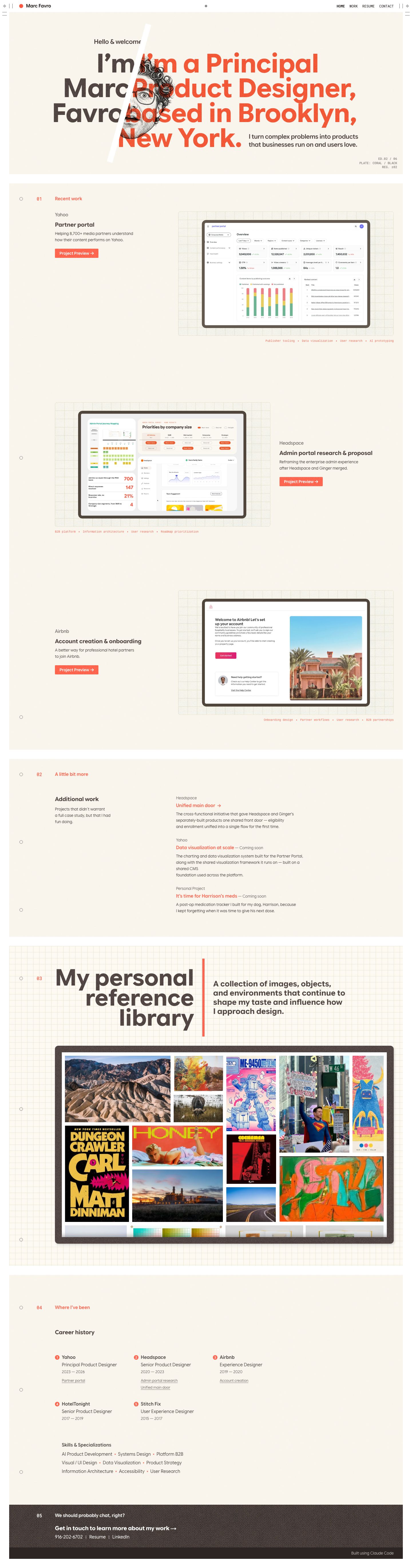
Two-plate overprint headline: the name in umber and the role in coral are set at the same size and tracking so their lines interleave and collide, and the misregistration becomes the hero.
A hard white diagonal slash knocks out the headline and the portrait like a die-cut, splitting "who" from "what" with a single gesture.
A printer's colophon in 10px Roboto Mono gray, right-aligned under the hero ("ED.02 / 06 · PLATE: CORAL / BLACK · REG. ±02"), names the palette as print plates.
Fixed page chrome drawn as a print sheet: crop-mark ticks at each corner, double-bar gutters, and diamond registration marks at top and bottom center frame every scroll position.
A persistent mono slug line pinned to the bottom edge carries the contact details (phone and an underlined email) as a "campaign" credit, so contact is always one glance away.
Section headers are a hollow ring in the left gutter, a coral mono index ("01") and a coral 16px/600 label. Together they form a quiet three-column rail that repeats down the page.
Each case study sits on a dotted-grid mat inside a thick umber device bezel, with a coral mono tag row ("B2B platform • Information architecture • …") set under the mat like a caption.
The reference-library section uses a full graph-paper background, a right-aligned display stack, a thick vertical coral rule, and a bold 28px statement to its right. It reads as a magazine spread opener.
The career history is a three-column grid of coral numbered dots, each followed by company, role and years, with case-study links underlined beneath. It replaces a résumé timeline.
portfolio · landing · light · editorial, retro-warm, swiss · warm, human, playful, confident