offgrid.inc0views
Nine details, nine pinned.
View as Markdown ↗Sized by coverage · click to copy.
BRAND MATTERS
Zwizz · 70/70 · 400 · -2px
WHAT OUR CLIENTS SAY
Inconsolata · 15/20 · 400 · 2px
We build brands for companies that
Recklessneue · 28/38 · 100 · normal
“I believe great design is a competitive advantage. Lunour's portfolio speaks fo
Zwizz · 16/24 · 400 · normal
Nate Cavanaugh
Inconsolata · 13/18 · 400 · normal
Specimens are the page's own words at their measured metrics; shown in Inter when the family is not loaded.
 123456789
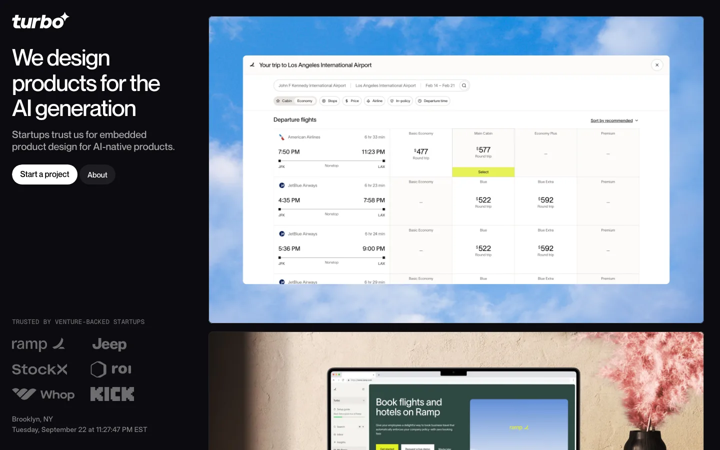
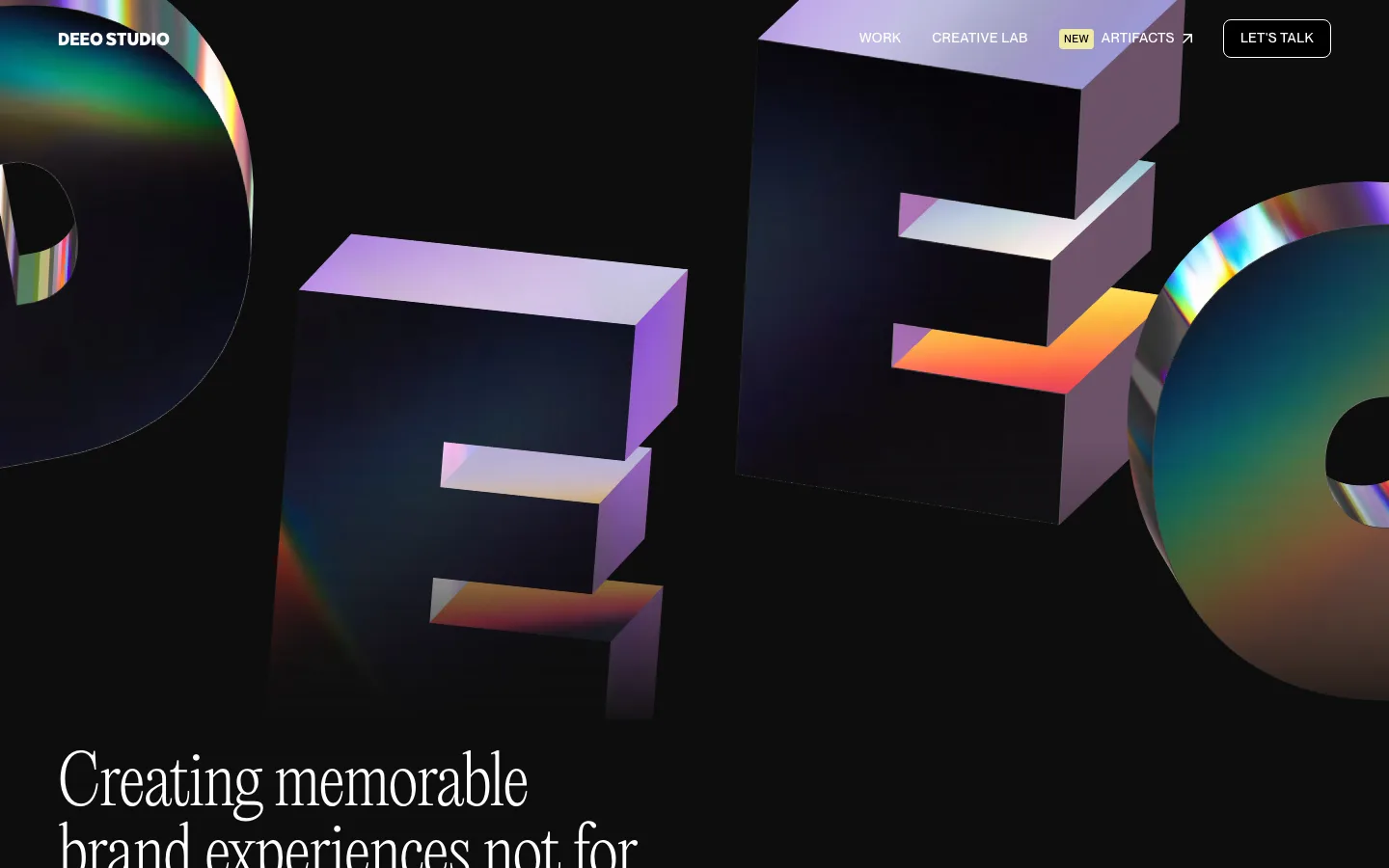
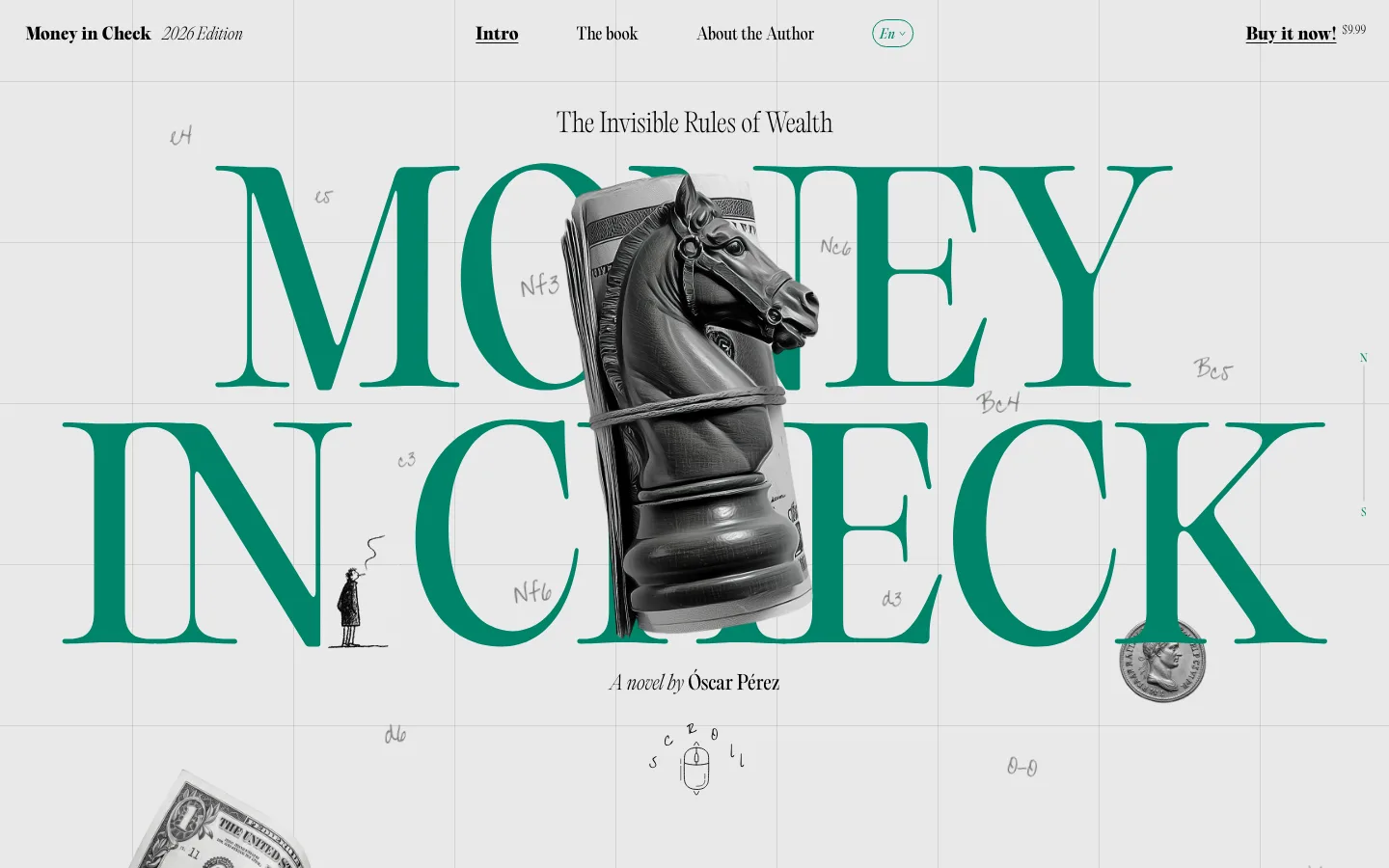
Wordmark as the hero headline — the logo set at ~250px in Zwizz across two-thirds of the width, nothing else competing
Hairline serif subline (Reckless Neue weight 100, 28/38px) ending in a typed "_" cursor, a thin humane counterweight to the heavy grotesk
One coral pill (#ff7d50 fill, #171717 text, 32px tall) beside a ghost pill with a 1px bone outline — the only saturated color above the fold, parked right-aligned on the wordmark's baseline
Wide-tracked monospace nav (Inconsolata, uppercase, ~2px tracking) in mid-gray with only the active item in bone, no bar, no logo on the left
Monospace caption lines as section headers: project name in bone, description and "[Coming soon]" bracket tags in gray, one line, no heading size at all
Case-study rows that bleed off the right edge — three full tiles and the sliver of a fourth signal a horizontal scroll without any arrow UI
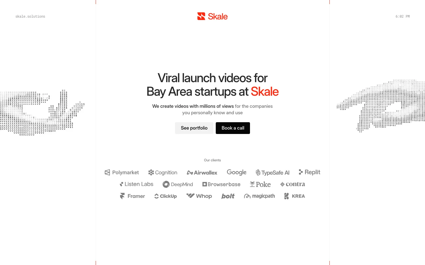
Logo strip in pure white at equal optical size, spaced across the full width with no label or divider
Testimonial trio in small body copy under a 15px mono "WHAT OUR CLIENTS SAY" label, kept deliberately quiet
"BRAND MATTERS" set in a centered hairline display before the journal cards, a second big-type moment echoing the hero
agency · landing · dark · minimal, editorial, swiss · confident, premium, serious, calm