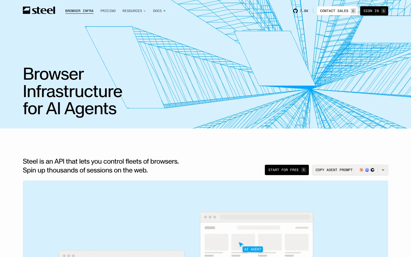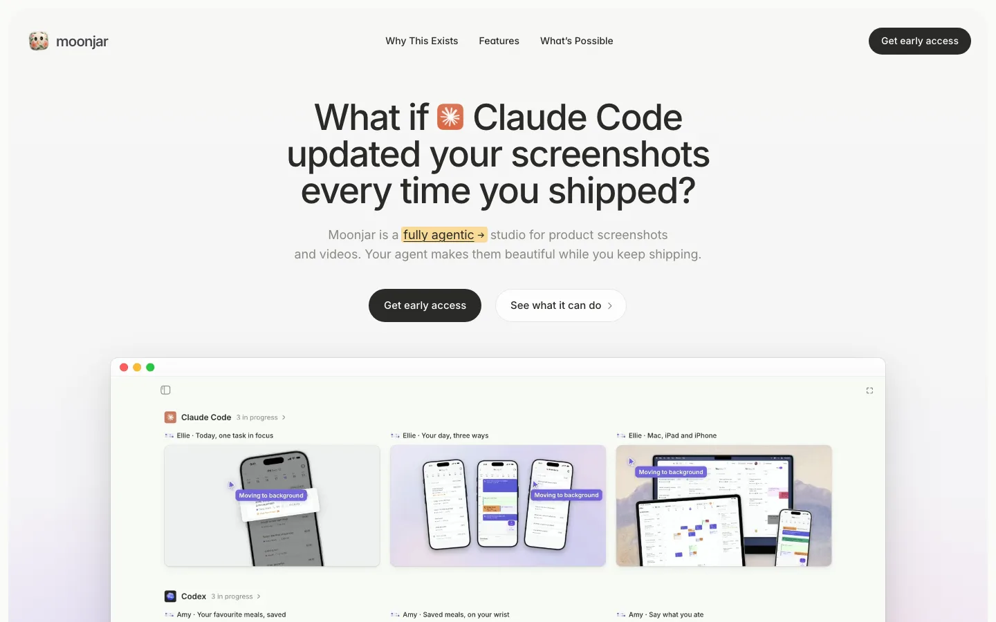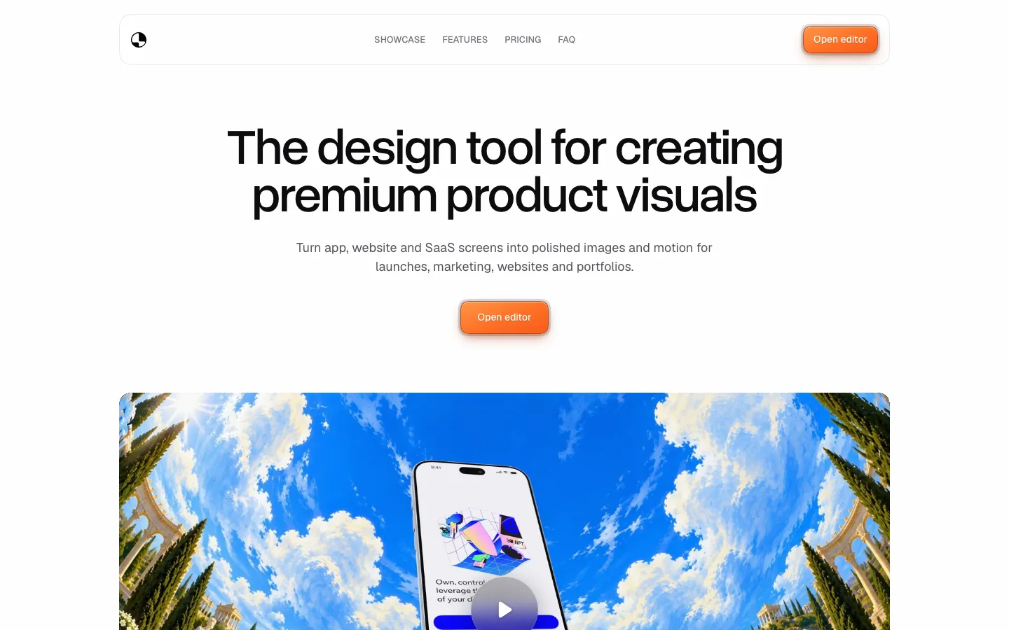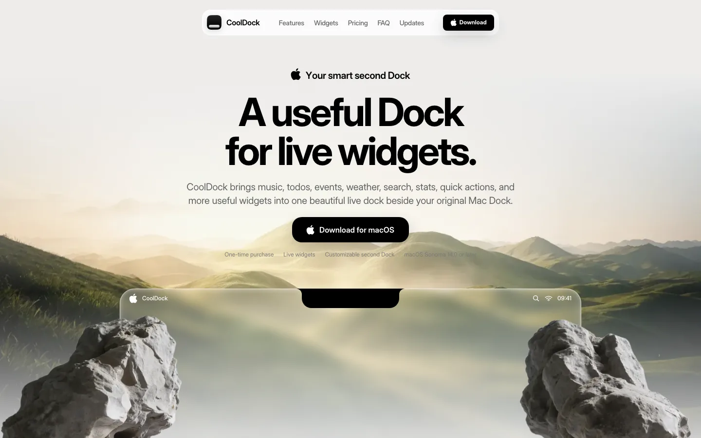
sohna.dev/waterlemon0views
Eight details, eight pinned.
View as Markdown ↗Sized by coverage · click to copy.
Y o u r C h i e f A g e n t O p e r a t o r
Geist · 28/44 · 500 · normal
Operate
Geist · 14/20 · 500 · normal
Trusted by teams worldwide
Geist · 20/32 · 400 · normal
LobeHub organizes your agents into 7×24 operation. It hires, schedules, reports
Geist · 20/30 · 400 · normal
Specimens are the page's own words at their measured metrics; shown in Inter when the family is not loaded.
 12345678
Header with no header — no bar fill, no border, no blur plate; the logo, four nav items, a stat pill and the CTA simply float centered on the gradient, so the hero wash runs uninterrupted to the top edge
GitHub stars as a nav item — an 82.7K count in a tinted 999px capsule sits inline between the links and the CTA, turning social proof into navigation chrome instead of a logo wall
Oblique display headline — the hero line is the only italic on the page, 700 weight with -1.92px (≈ -0.04em) tracking, sized to fill one line edge to edge; the body under it is 20px/30px at 400 with normal tracking, so the contrast is weight, slant and tracking rather than size alone
Pastel corner wash on a flat ground — lavender bleeding from the top-left, pink from the top-right, both resolved into #f8f8f8 within roughly 500px; the entire rest of the page is neutral, which is what lets this read as brand rather than decoration
Product shot cut by the fold — the app window is inset ~145px from each margin with a 12px radius and a hairline border, and the viewport crops it mid-screenshot so it continues below the scroll line instead of being framed and finished
Section eyebrow as a tinted capsule — every block opens with a small pill (Operate, Create, Collaborate, Evolve) in its own pastel tint, above a 40px+ heading; the pill color is the block's identity and nothing else in the block repeats it
Colored plate under the screenshot — inside each bento hero card the UI sits on a gradient panel whose exposed left strip (yellow, purple, blue by section) is a few pixels wide, giving the white card one saturated edge instead of a saturated surface
Testimonial mosaic that clips at the edges — three dense rows of quote cards run wider than the container and fade out at both ends, with no arrows and no dots; the overflow itself is the signal that there are more
saas · landing · light · minimal, bento, playful · confident, calm, technical, optimistic