screenity.io0views
Nine details, nine pinned.
View as Markdown ↗Sized by coverage · click to copy.
People + AI: Succeeding Together
Matter · 72/65 · 500 · -1.73261px
High-performing teams are built here
Matter · 47/42 · 500 · -1.1262px
Performance
Matter · 22/24 · 500 · -0.519782px
Join 5,000+ forward-thinking teams using Lattice’s HR and AI tools to manage peo
Matter · 22/28 · 400 · normal
2026
Matter · 13/16 · 400 · normal
Specimens are the page's own words at their measured metrics; shown in Inter when the family is not loaded.
 123456789
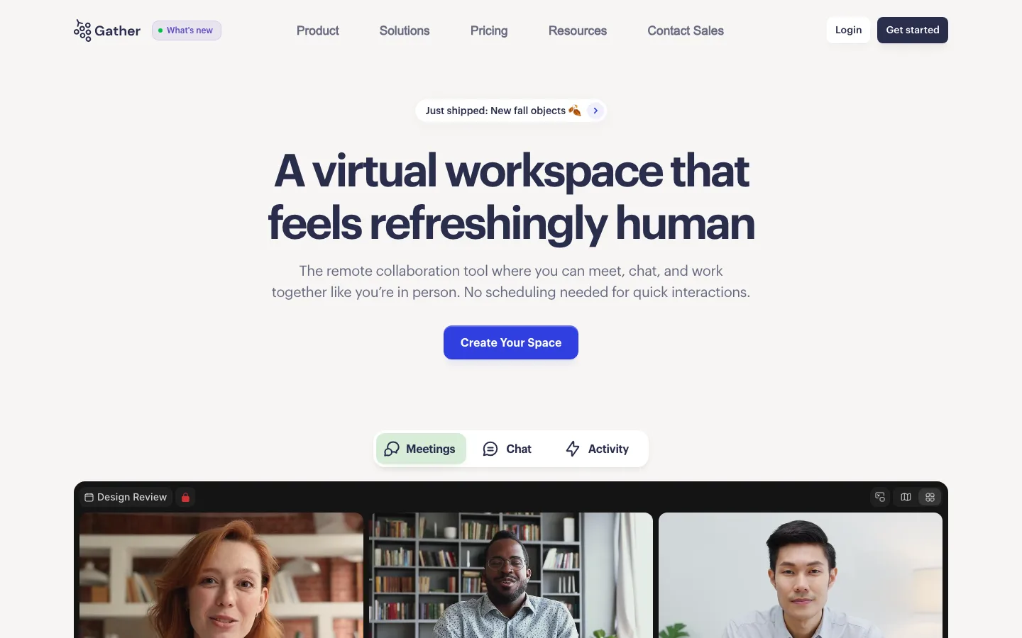
Display heading set at 0.90 line-height (72.2px type on 64.97px leading) with -1.73px tracking, so a three-line headline compresses into a single typographic mass rather than three sentences
Primary CTA is deep green #046645 with a pale lime label #cdface rather than white — a two-tone button that reads as brand rather than default, at 38px tall, 11.55px radius, 14.4px/500 with 10/17px padding
The primary/secondary pair shares one geometry: same height, same radius, same label size; the secondary is just a pale mint fill with dark green text, and a soft lime halo bleeds out from behind the primary to mark which one is the default
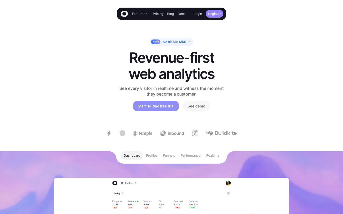
Media chrome is a gradient pad, not a border: the white video card sits inside an ~18px-radius block of lime → mint → lilac → cyan mesh with roughly 45px of gradient visible on every side
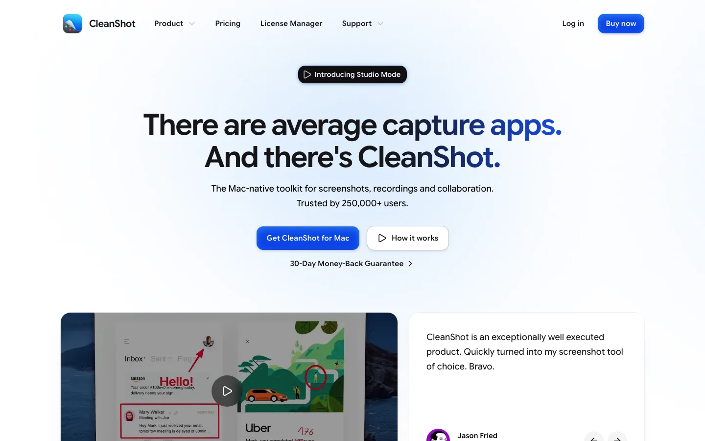
Every section opens with the same capsule label — a pale tint of that section's color, 14px/500 text, and a filled circular arrow disc pinned to the right end of the pill
Customer logos are flattened to a single mid-gray and set on one baseline, so the proof strip reads as texture and never competes with the CTA above it
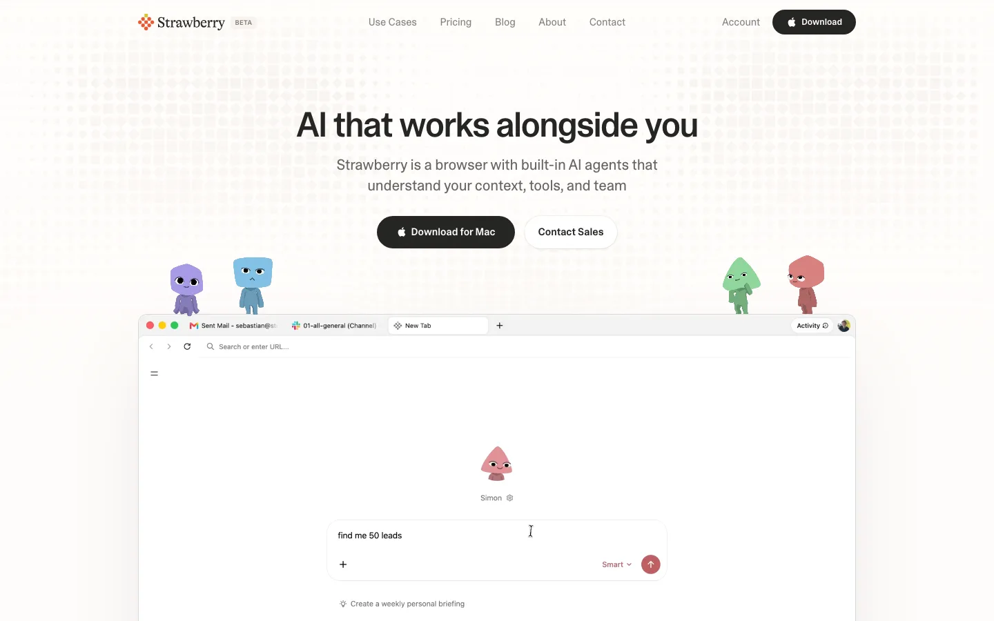
Feature bento where each cell carries its own pastel ground, a matching colored icon, and a + disc in the top-right corner — a wide cell paired with a narrow one on the first row, three equal cells on the second — while the screenshots inside stay plain white UI
Full-bleed color slabs are inset ~16px from the page edge and rounded at the top corners, so the white ground still frames them; one lilac, one blue-to-violet with white type and white app tiles
Testimonial carousel deliberately peeks: cards bleed past both viewport edges at partial opacity and the pagination uses circular dots with the active one stretched into a colored pill
saas · landing · light · corporate-clean, bento, playful · friendly, optimistic, trustworthy, energetic