brianlovin.com1view
Twelve details, nine pinned.
View as Markdown ↗Sized by coverage · click to copy.
Hey, I'm Andreas Katzmann. Product designer & frontend engineer, based near Cope
lausanne · 16/25 · 400 · -0.176px
About
lausanne · 14/21 · 500 · -0.14px
Nørgård MikkelsenAn AI-driven skills directory
lausanne · 15/23 · 400 · -0.15px
I shape how things look, then build them in code, sweating the details people do
lausanne · 16/25 · 400 · -0.176px
Yosemite
lausanne · 12/12 · 500 · -0.12px
Specimens are the page's own words at their measured metrics; shown in Inter when the family is not loaded.
 123456101112
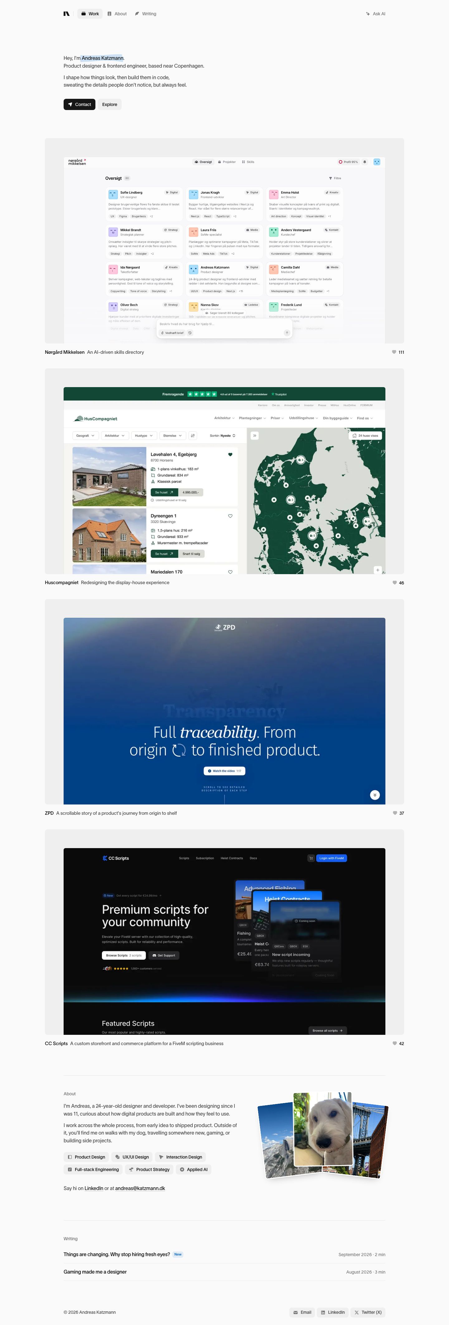
Highlighter-marker accent — a hand-skewed #c2e7f9 swipe behind the name only, the single dose of brand color on the page
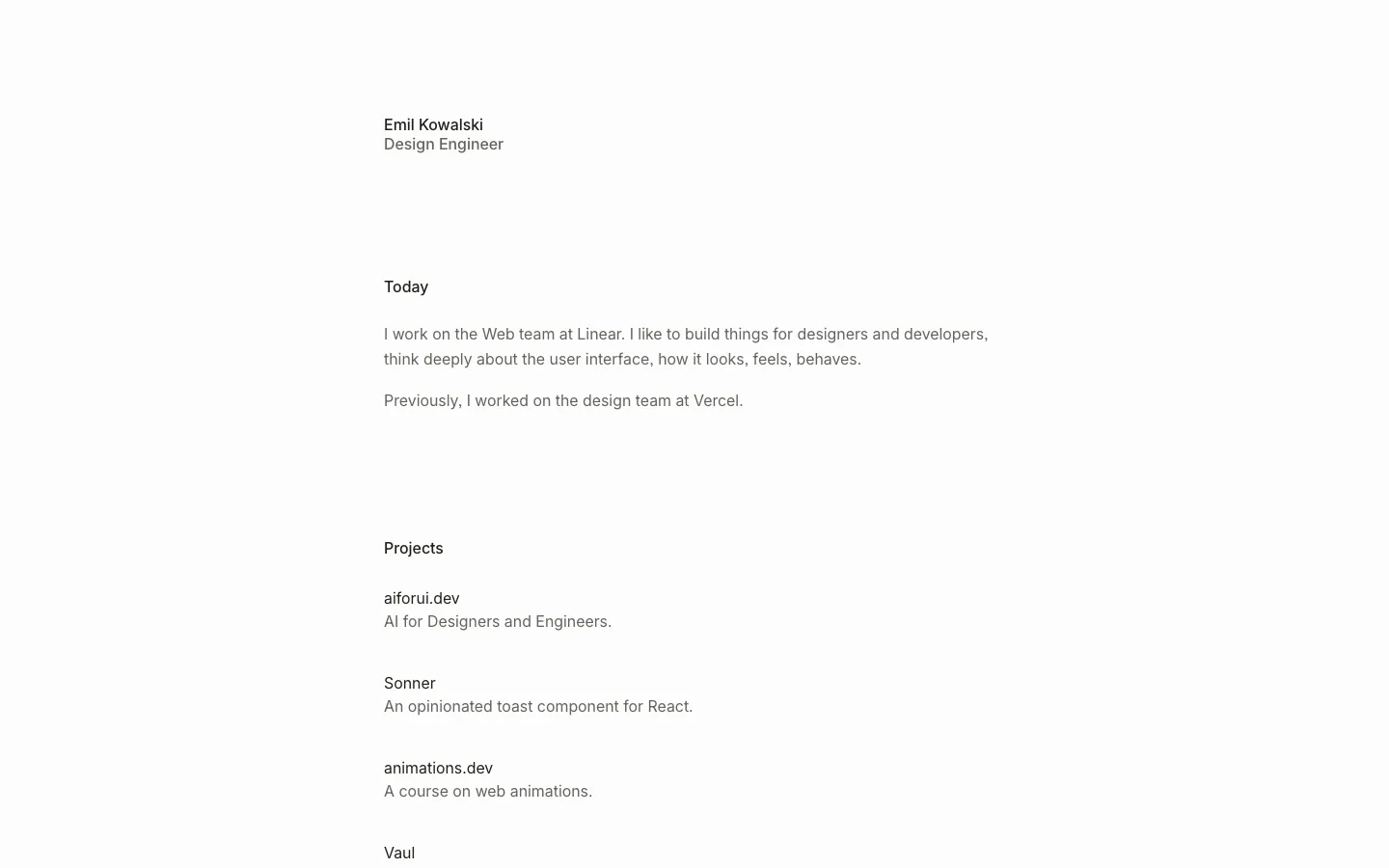
Body-size hero — the h1 is 16px regular, two short lines plus a two-line credo; confidence by understatement instead of a display headline
Icon-led tab nav with a filled active state — Work / About / Writing, each with a small glyph, the active tab on a #efefef 8px pill, a hairline divider after the logomark
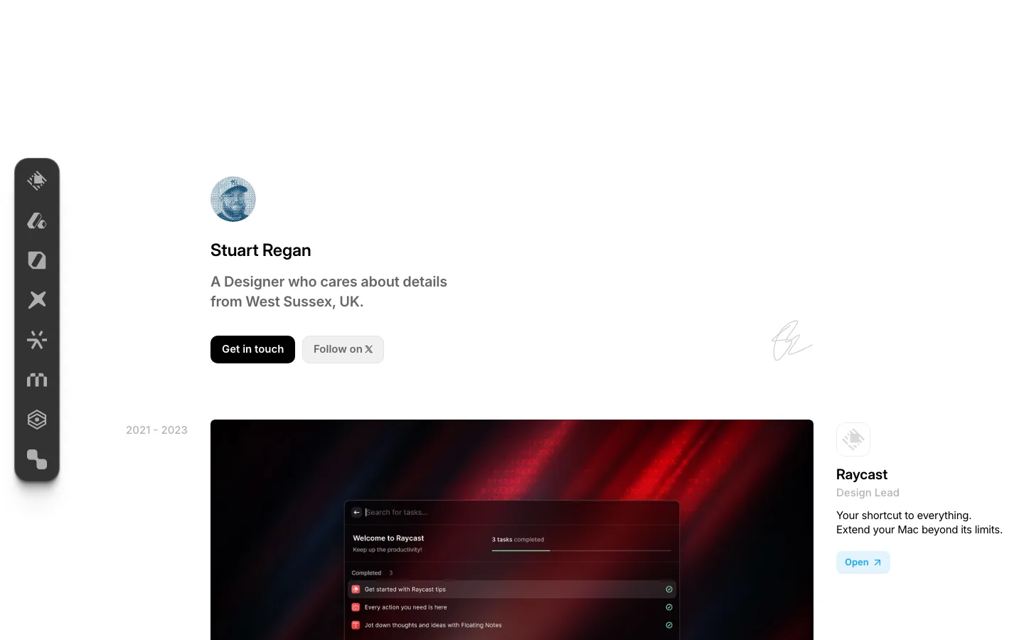
Paired CTAs of equal height (36px) — black #141414 Contact with a paper-plane icon beside a borderless #efefef Explore, both 8px radius, 14px/500
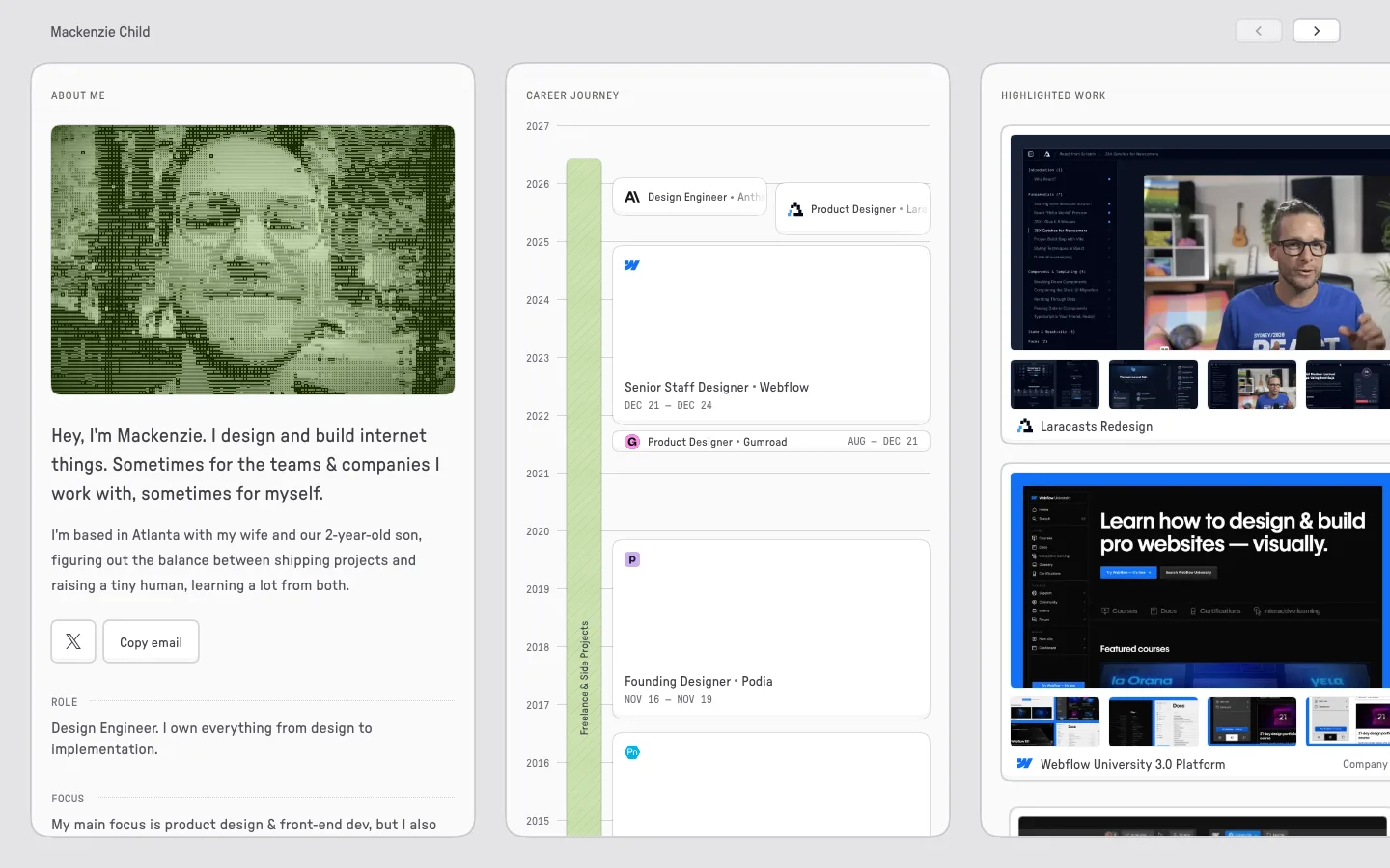
Work in a tray — each project's screenshot sits inset ~60px inside a large #efefef rounded panel, cropped at the panel's bottom edge so it reads as a live window, not a thumbnail
One-line project caption under each tray: bold client name, gray one-sentence description, a heart and like count flush right
On scroll the header splits into two floating pieces — the tab pill on the left in a frosted white capsule and a standalone black Contact button on the right
Persistent "Ask AI" chip, black and centered at the bottom of the viewport, as a conversational way into the portfolio
Left-edge tick rail — a column of short hairlines where the current section's tick grows longer, a quiet scroll-position indicator
Fanned photo stack in the About section — three rotated personal photos (landscape, dog, bridge) overlapping like prints on a table
Skill chips with leading icons in #efefef 6px pills, set as a two-row wrap under the bio
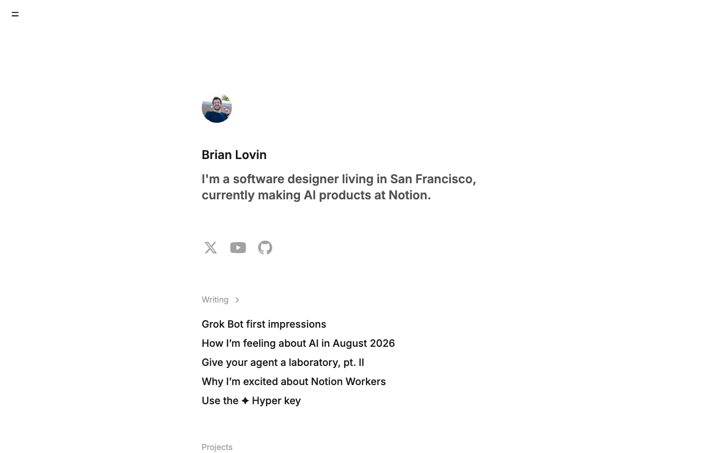
Writing list as plain hairline-separated rows, title left, date and read time right, with a tiny blue "New" badge
portfolio · landing · light · minimal · calm, human, confident, technical