dub.co0views
Seven details, seven pinned.
View as Markdown ↗Sized by coverage · click to copy.
Keep anything as Markdown
Inter · 42/50 · 500 · -1.05px
Everything you save, in one place you own.
Inter · 24/32 · 500 · normal
You save it
Inter · 18/28 · 500 · normal
Save everything you read, write, watch, and hear as clean Markdown your AI agent
Inter · 20/33 · 400 · normal
Claude
Inter · 12/12 · 500 · normal
Specimens are the page's own words at their measured metrics.
 1234567
Body copy at 20px/32.5px in Inter 400 next to a 42px/500 headline — a modest heading-to-body ratio that makes the whole page feel readable rather than shouty.
Numbered section markers ("01.", "04.") in small muted gray above each headline, and headlines deliberately broken across two lines ("Everything you save, / in one place you own.").
Feature cards as flat light-gray panels (10px radius, no border, no shadow) with a small line icon top-left and a miniature white "app card" sitting inside the lower half, cropped by the panel edge — the mockup peeks out rather than being fully framed.
One brand orange used three ways: solid pill CTA, plain coloured text labels, and as pale tints ( highlight, ) inside the mock UI — so the accent recurs without ever becoming a second surface color.
Primary + secondary CTA pair: orange solid pill "Start for free" next to a neutral pill "Copy setup prompt", followed by a row of monochrome integration logos at the same optical height.
Nav is a plain text row with a single gray pill "Sign up"; the logo is a small black glyph plus the word "Keep" — no chrome, no border under the header.
Micro-details inside mockups (an orange-underlined "Saved to Keep" toast, an orange progress bar labelled "Fetching transcript", monospace README excerpts) carry product credibility without a screenshot.
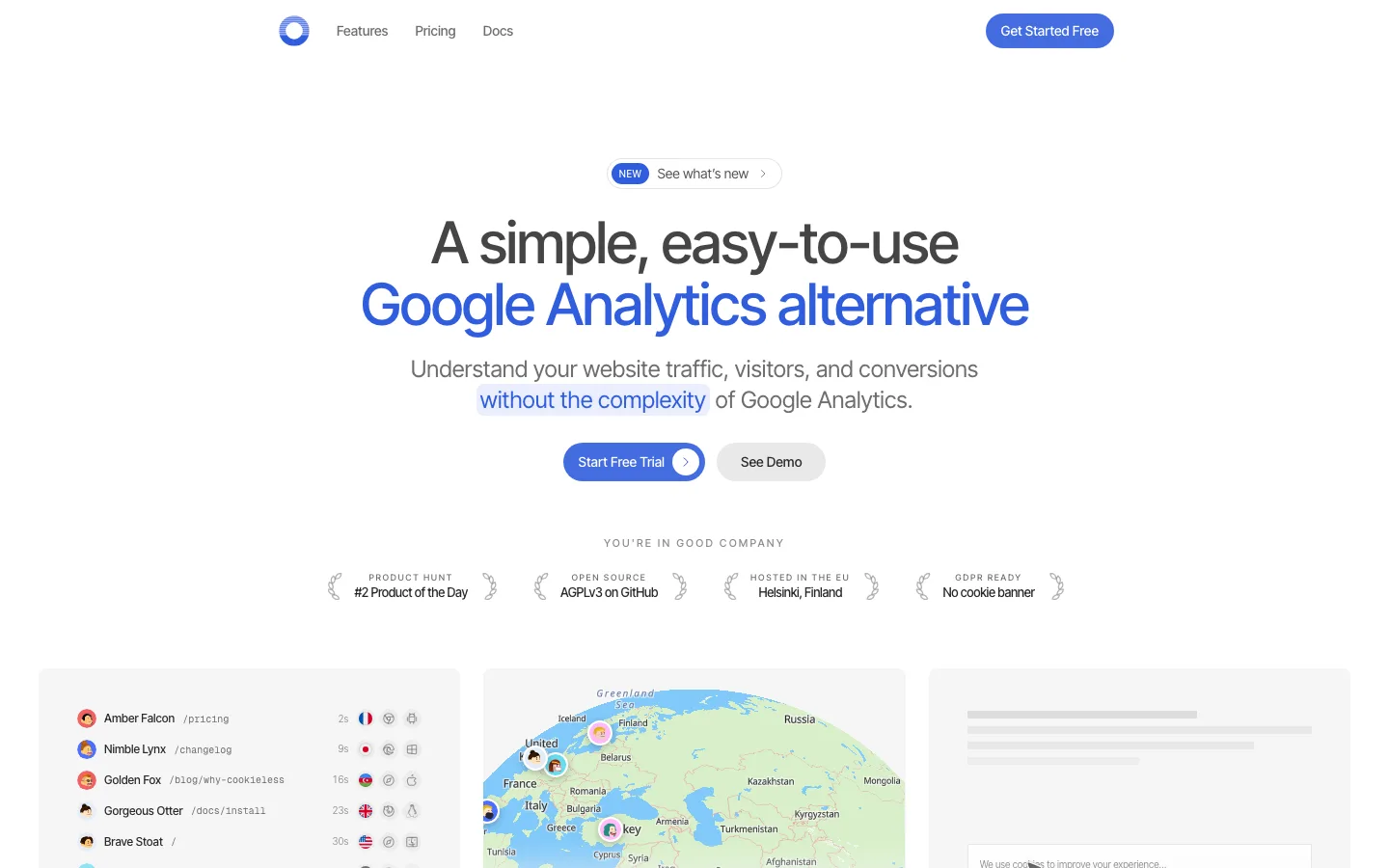
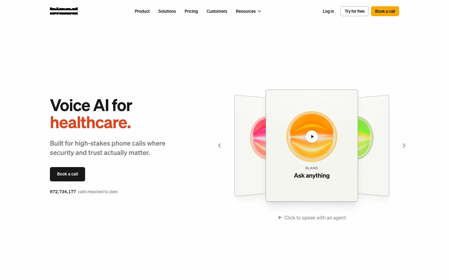
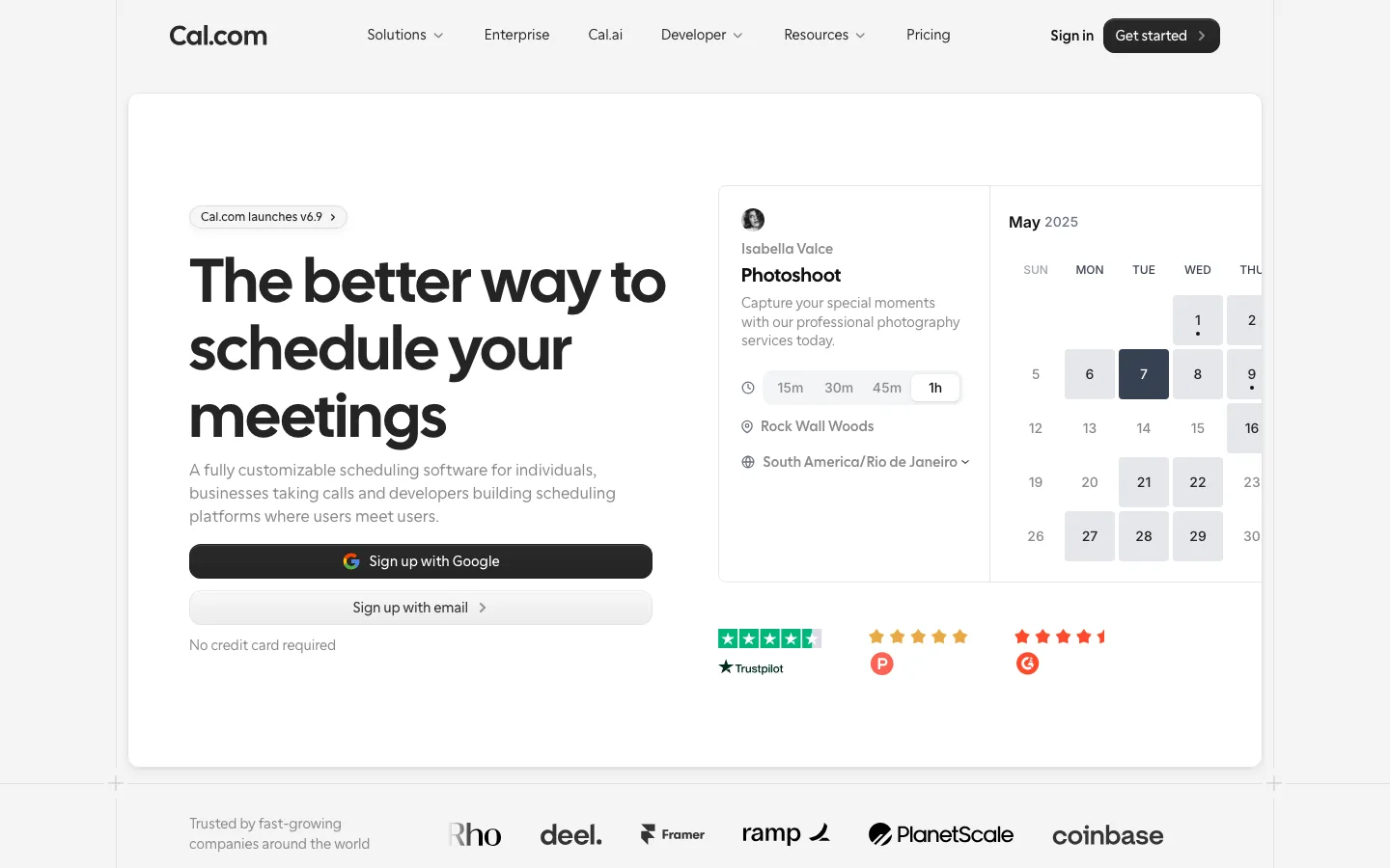
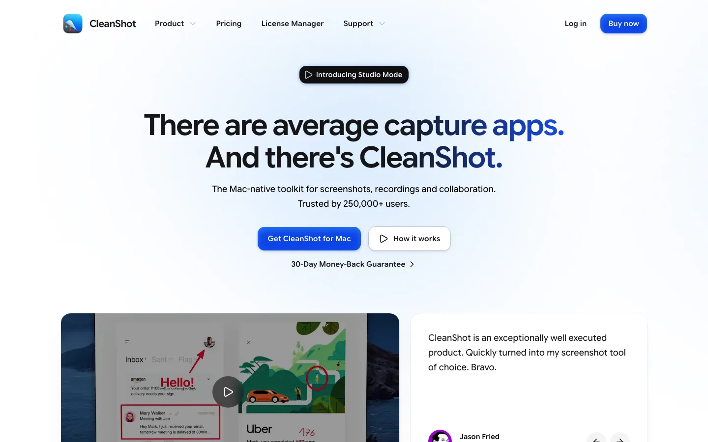
saas · landing · light · minimal, corporate-clean · calm, technical, friendly, trustworthy, confident