superfine.studio0views
Eight details, seven pinned.
View as Markdown ↗Sized by coverage · click to copy.
A design and engineering partner for scale-ups and enterprise products.
Geist · 52/56 · 700 · -1.56px
Services
Geist · 36/42 · 700 · -1.08px
Branding
Geist · 18/24 · 700 · -0.54px
We act as an elite extension of your in-house team, shipping high-fidelity produ
Geist · 16/24 · 500 · normal
Recent Work
Geist · 13/22 · 500 · normal
Specimens are the page's own words at their measured metrics; shown in Inter when the family is not loaded.
 2345678
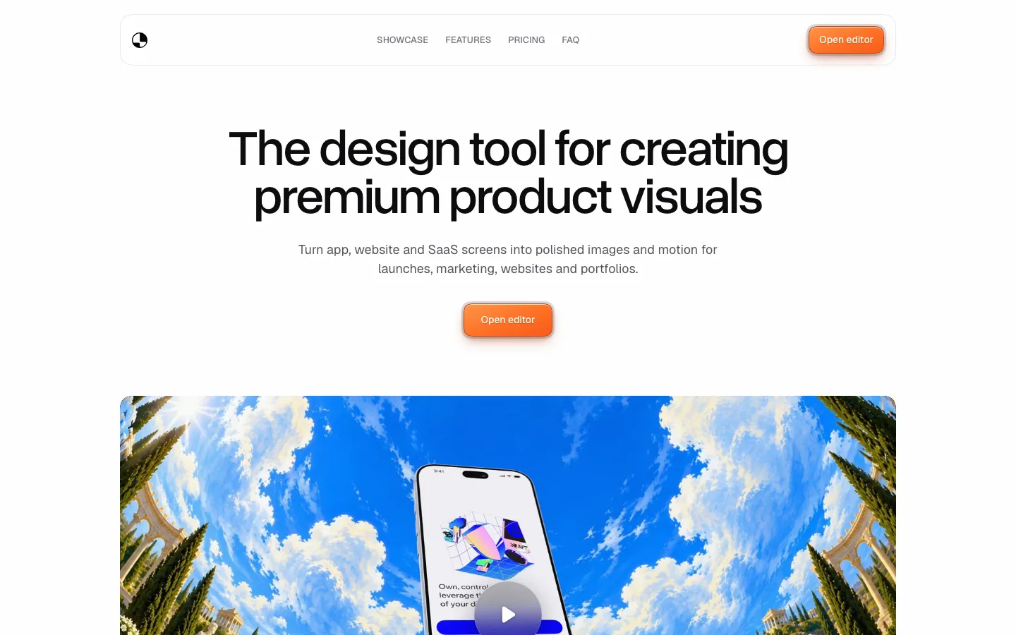
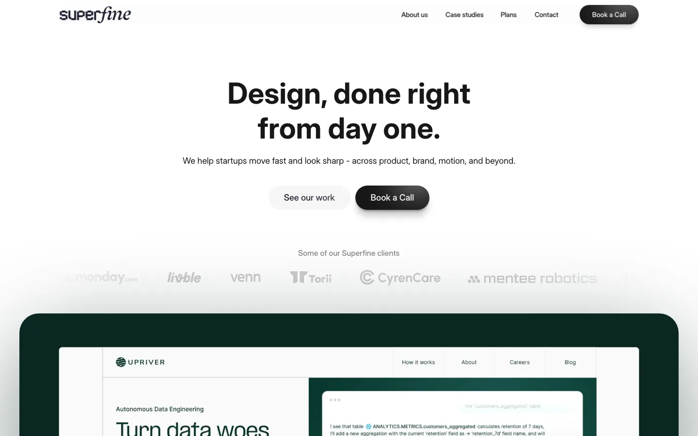
Floating pill navigation — the bar is detached from the top edge and split into three capsules (a square logo chip, a 9999px link group, a filled CTA pill), so the header reads as an object hovering over the page rather than a band across it
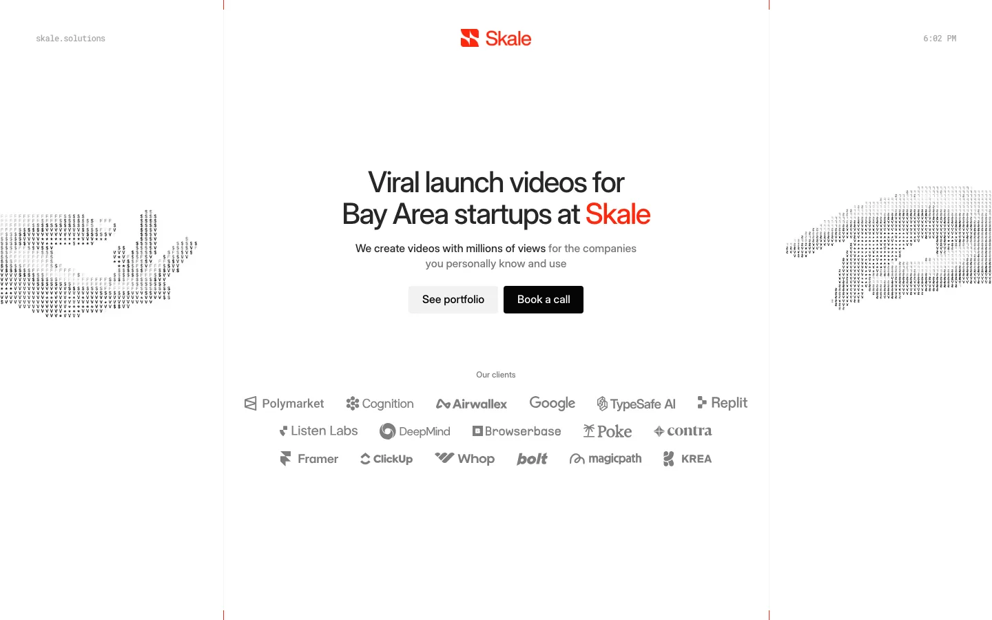
Availability pill above the headline — a 13px capsule reading "Accepting 3 more projects this quarter" with a single green dot; it is the only saturated pixel on the page and it converts scarcity into a status indicator rather than a banner
Headline tracking tuned to the size — 52px/700 with line-height 55.64px and letter-spacing −1.56px (−0.03em); the sub-1.1 leading plus negative tracking is what turns three centered lines into one dense typographic block
Paired pill CTAs at one height — a solid #151515 primary beside a #ffffff secondary, both 9999px, both 42px tall, both 13px/600 labels, set edge to edge with no gap so they read as a single segmented control
Oversized logo watermark behind the hero — the studio mark blown up to ~120px and dropped to a barely-there tint of the background, sitting behind the availability pill so it reads as texture, not branding
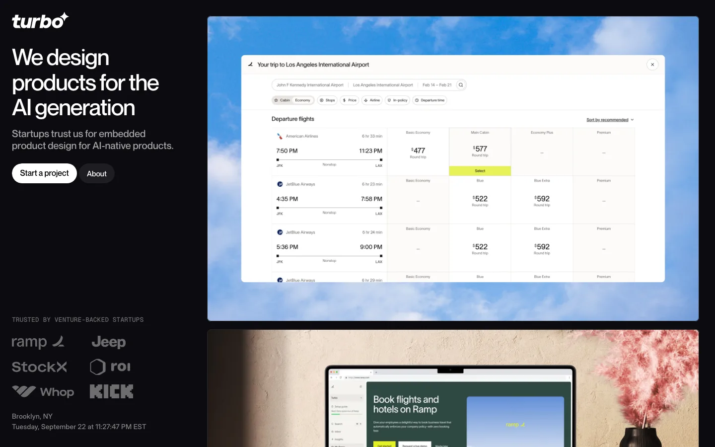
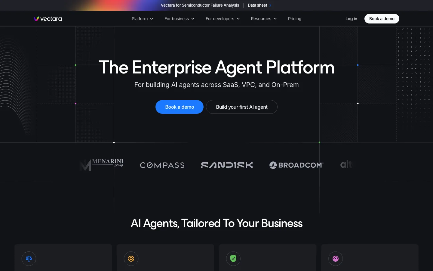
Near-black slabs as chapter markers — the Services and Project spotlights sections are full-width #151515 panels at a 36px radius inset from the page edges, with their own nested 18/24px cards; the page changes register without changing hue
Total grayscale discipline on imagery — client logos, the 13 team portraits and the tool row are all desaturated and set at low opacity, so nothing competes with the product screenshots inside the dark slabs, which are the only full-color images on the page
Anchored price in the headline — the offer sets the number inside the h2 itself with the original struck through beside it, so the discount is typographic rather than a badge or a ribbon
agency · landing · mixed · minimal, corporate-clean · confident, premium, technical, calm