jkane.co1view
Eight details, eight pinned.
View as Markdown ↗Sized by coverage · click to copy.
l
SF Pro Rounded Heavy · 72/83 · 400 · normal
Projects
SF Pro Rounded Bold · 10/12 · 400 · normal
Featured work
SF Pro Rounded Semibold · 18/21 · 400 · normal
Optimizing Libby’s search to give users an effortless browsing and borrowing exp
SF Pro Rounded Semibold · 18/21 · 400 · normal
Specimens are the page's own words at their measured metrics; shown in Inter when the family is not loaded.
 12345678
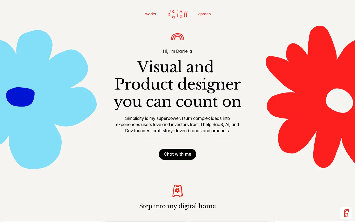
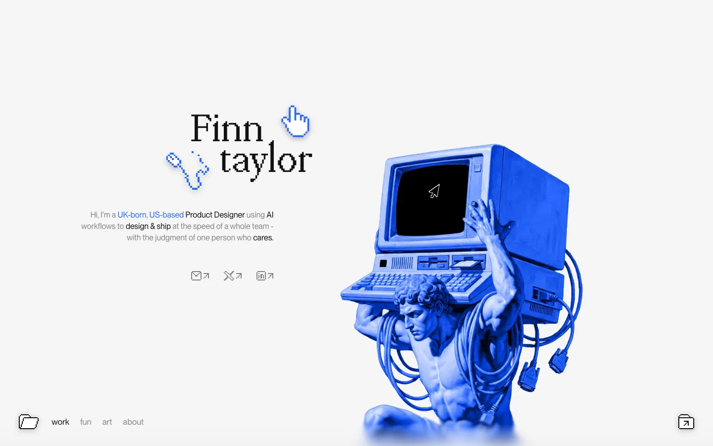
Headline as the entire hero — 72px/82.8px SF Pro Rounded Heavy, centered, four lines, no subhead, no CTA, no image; the job title *is* the pitch and nothing competes with it
Glossy 3D blobs set inline in the sentence at cap height — a lime dome after "designer", an orange flower before "scrappy" — so they behave as typographic characters, not decoration parked in the margin
Tiny circled plus-marks scattered at irregular offsets around the headline — ~14px, pale gray ring, yellow glyph; they cost nothing and make a plain white field feel like a canvas
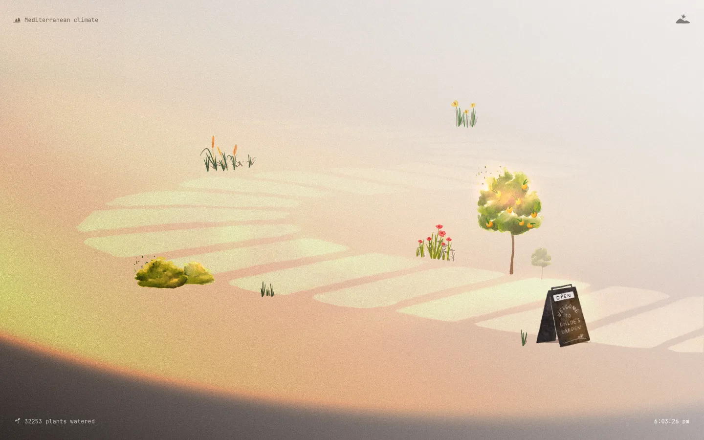
One pearl-like glass sphere pinned in the top-right as the page's only chrome — the site's whole identity mark, in place of a logo and a nav
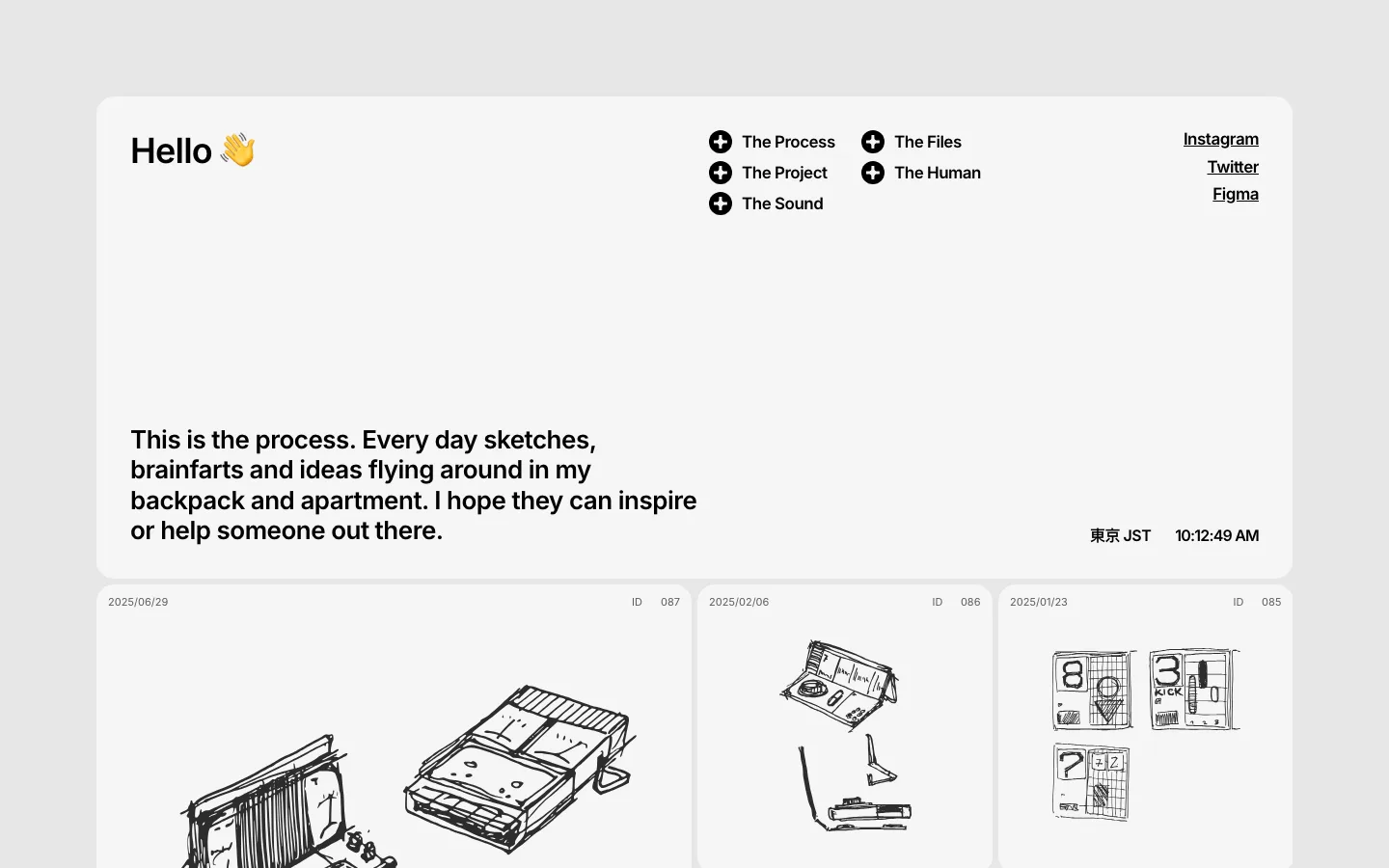
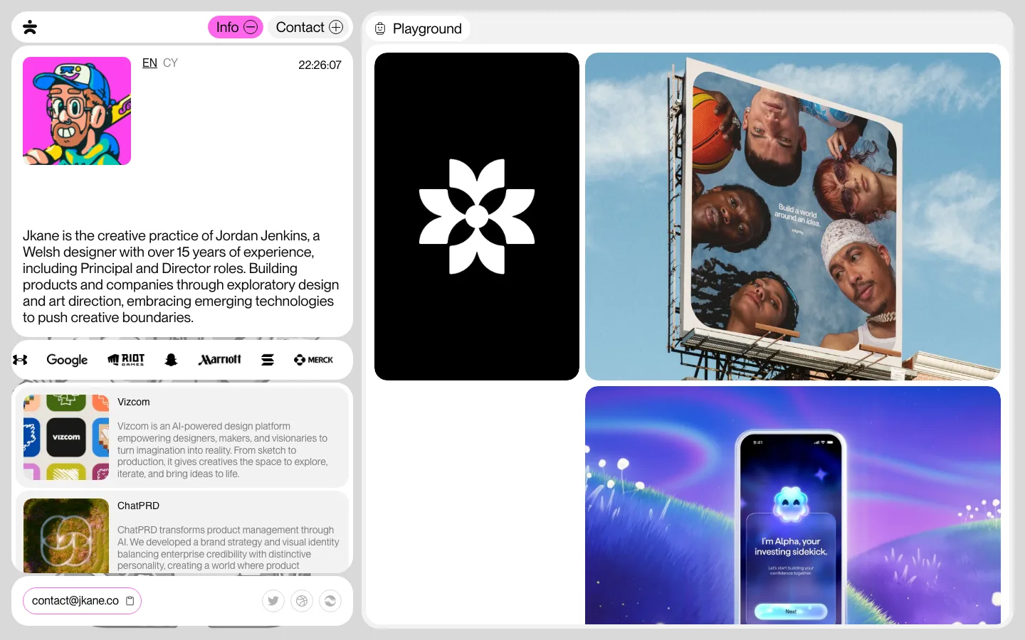
The card's ground carries the color, not the image: a 24px-radius, roughly square panel in acid lime #BDFE40 or warm gray #F0EBEA with the screenshot floating inside it under a soft drop shadow — one swatch per project does all the differentiating
Caption stack under every card instead of inside it: a two-line 18px semibold sentence describing the outcome, then a gray 18px "Discipline / Year" line — no project titles anywhere
Section headings are a heavy title over a small semibold sub-line, and one takes an emoji as a drop cap — a saturn overlapping the "E" of "Extras" — so the section marker is a picture, not a rule or a badge
An odd card count is left odd: the last card sits alone in the left column with the right slot simply empty, never centered or stretched to fill
portfolio · landing · light · playful, minimal · playful, friendly, optimistic, confident