Eight details, seven pinned.
View as Markdown ↗Colors8 colors · ground #F8F8F8
ground#f8f8f8·37.53%#d1d5d8·15.32%#020202·9.06%#8bb5ce·8.04%#5255d8·4.26%#817be3·3.90%#7d8e9b·3.52%#b2b1ae·2.19%
Sized by coverage · click to copy.
Typography1 family · 2 styles · PPNeueMontreal
H2
Playground
PPNeueMontreal · 20/24 · 400 · normal
Body
Join my newsletter to get updates on new projects and happenings.
PPNeueMontreal · 20/23 · 400 · normal
Specimens are the page's own words at their measured metrics; shown in Inter when the family is not loaded.
ButtonsSubscribe2 styles
Shape5 radii · 196 uses
18px172 uses · 88%
9999px10 uses · 5%
24px6 uses · 3%
12px6 uses · 3%
11px2 uses · 1%
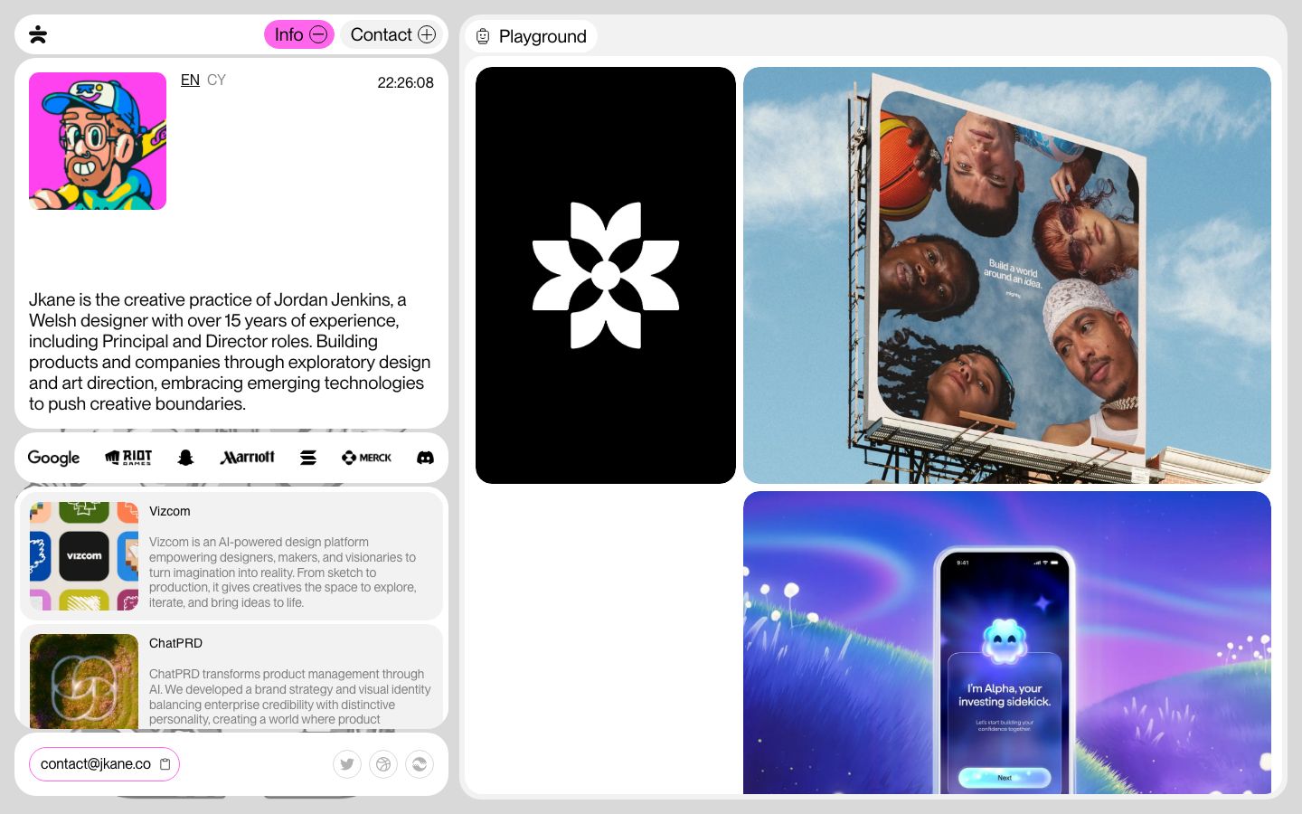
AnalysisJordan Jenkins's studio site is a one-viewport, app-like desk: a pale gray ground (#f8f8f8) with white, 18px-rounded panels tiled across it like windows — a narrow left column (nav strip, bio card…
Style recipeBuild the page as fixed-height panels on a desk, not as a scrolling document.
Details8 worth noting
 1234567
- 1Panels that scroll inside themselves
The whole site fits one viewport and behaves like a window manager: the document is fixed at 900px, and the project list and playground each scroll inside their own rounded panel with the content cropped at the panel edge.
- 2Pill nav with open/closed glyphs
Nav as pill toggles with ⊖ / ⊕ glyphs: the open section ("Info") is a filled pink pill with a minus, closed ones ("Contact", "Playground") are gray pills with a plus — state and affordance in one 36px control.
- 3One type size, tone for hierarchy
A single type size (20px, weight 400) across headings, body and nav; project descriptions drop to a mid gray (#7d8e9b-ish) instead of a smaller size, which keeps the grid quiet without any scale hierarchy.
- 4Avatar, language switch, live clock
Bio card pairs a loud cartoon avatar (the only illustration of the author) with an EN/CY language switch and a ticking local clock in the same top row — personality plus a small live signal.
- 5Client logo strip as its own bar
Client-logo strip as its own slim white bar between the bio and the work list, monochrome black marks at equal optical weight.
- 6Three tonal layers, no borders
Project rows are soft gray (#f0f0f0-style) sub-cards inside the white panel: square 112px thumbnail left, name + two-tone description right — three tonal layers deep (ground → panel → row) with no borders anywhere.
- 7Pink-outlined email chip
Contact bar: the email sits in a pink-outlined pill with a copy icon; social links are three thin-ring icon buttons pushed to the right.
- 8Mobile keeps the card radii and gutters
On mobile the left column becomes the page and the panels stack with their radii and gutters intact, so the "cards on a desk" idea survives the reflow.
portfolio · landing · light · bento, minimal, playful · playful, confident, friendly, energetic, human
More like this