mackenziechild.me6views
Ten details, eight pinned.
View as Markdown ↗Sized by coverage · click to copy.
Hi I'm Jane Hou! I care about people and use systems thinking and initiative to
TeX Gyre Heros · 14/19 · 400 · normal
Making product motion reel as easy as storyboarding
TeX Gyre Heros · 20/25 · 700 · -1px
Brand, Community, RGD Student Awards Honourable Mention
TeX Gyre Heros · 14/19 · 400 · normal
Specimens are the page's own words at their measured metrics; shown in Inter when the family is not loaded.
 12456789
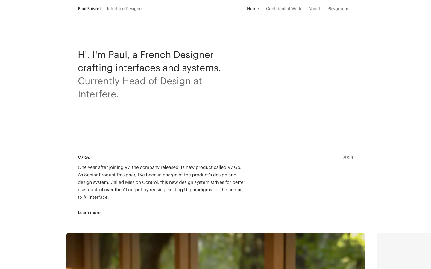
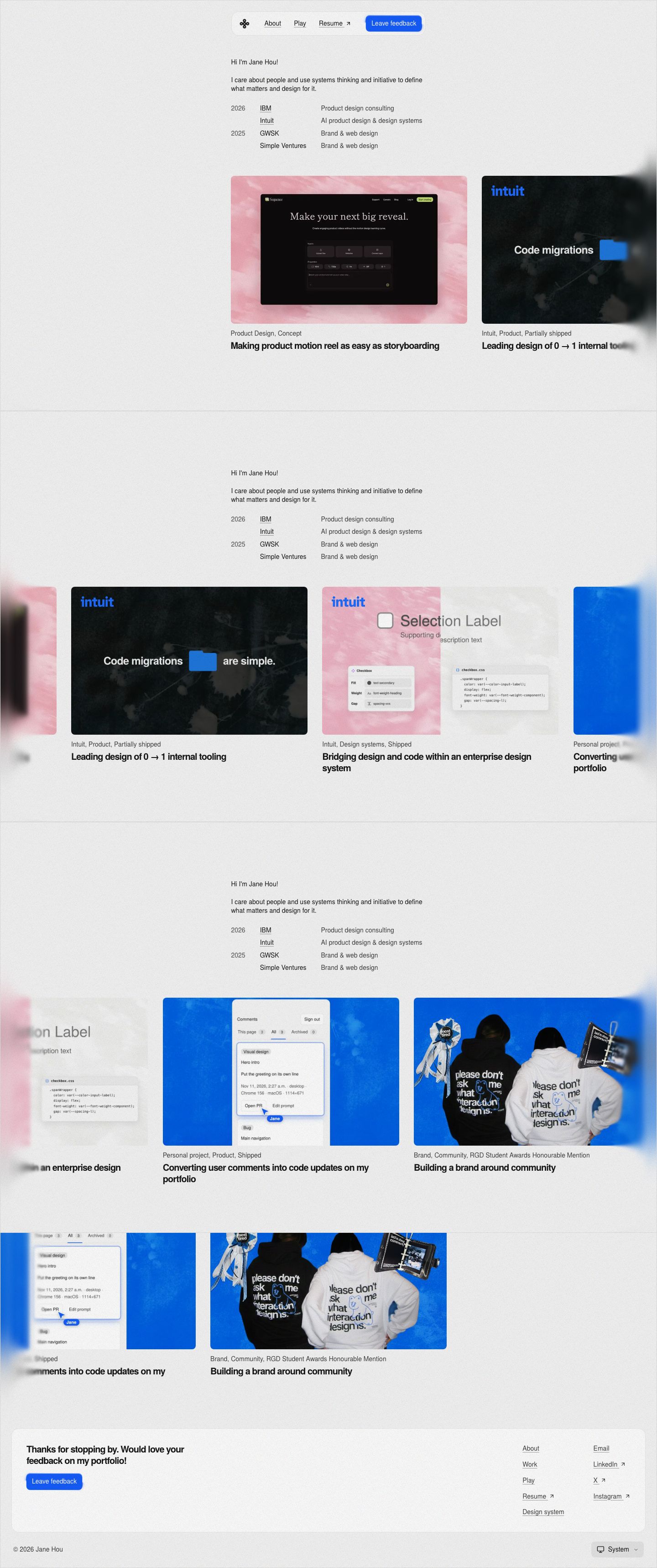
Floating pill nav — a compact centered capsule (logo glyph, three underlined text links, one solid blue button) sitting on the page with a faint hairline and soft fill instead of a full-width header bar
The intro is a three-column career table — year, underlined company, role — in plain 14px text, years only on the first row of each group; a résumé compressed into four lines that replaces any hero headline
H1 at body size — the "Hi I'm Jane Hou!" heading is 14px/400, identical to body copy; hierarchy comes from spacing and position, and the only bold type on the page is the 20px/700 card titles at -1px tracking
Horizontal project rail pinned to the narrow column's left edge and bleeding off the right side of the viewport, scrubbed by vertical scroll, so the case studies glide sideways while the intro stays put
Progressive blur at both viewport edges — cards entering and leaving the rail smear into a soft gaussian haze instead of a hard crop or a gradient fade
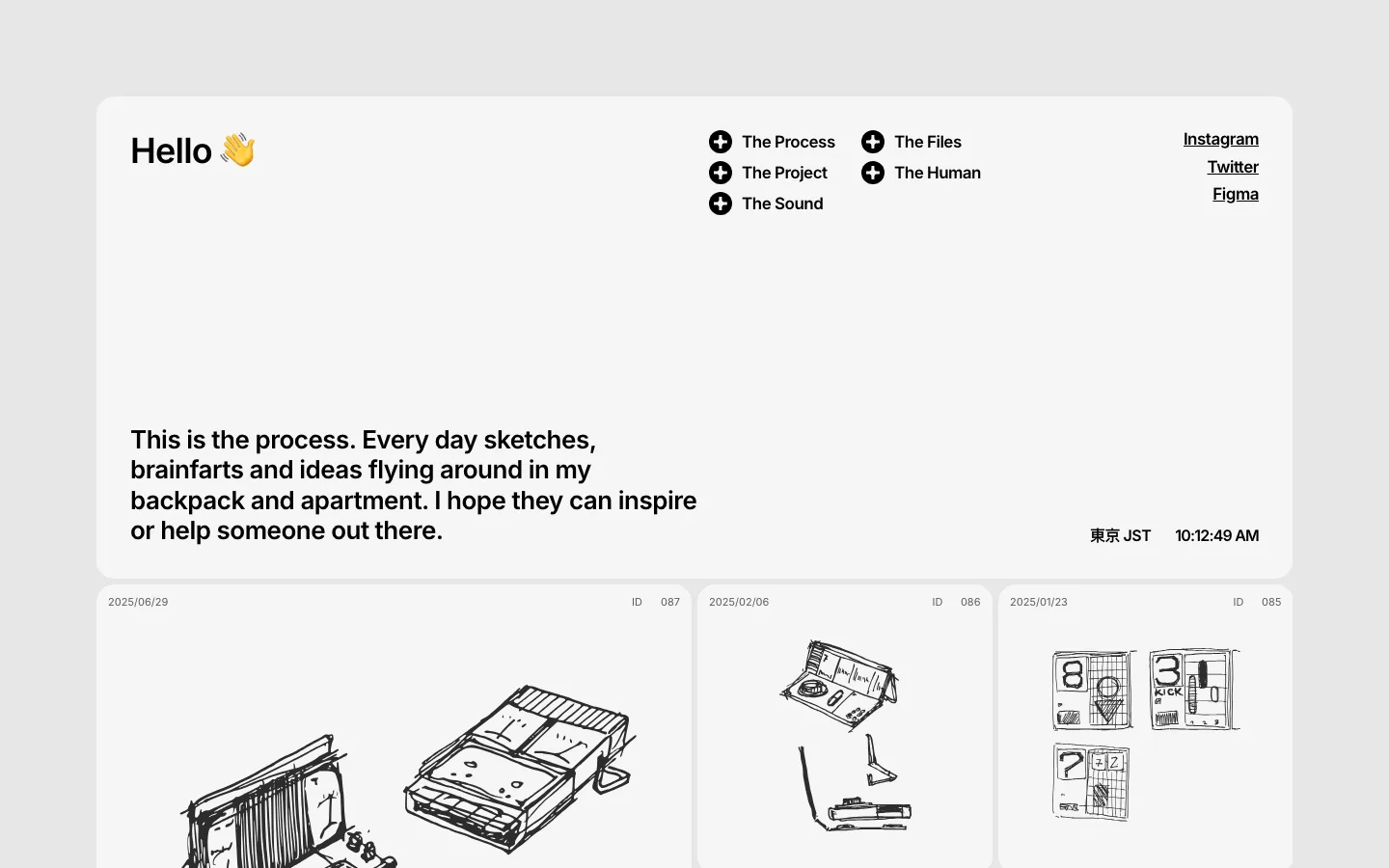
Cover art on painterly textured backgrounds — a pink brushstroke wash, a blue ink-mottled wash, a dark flower photo — with crisp UI screenshots floated on top, so every thumbnail shares a tactile, hand-made ground
Meta line above title under each card — "Intuit, Design systems, Shipped" in muted 14px, then the bold title; the shipping status is honest metadata a recruiter scans first
Footer as a rounded card — a soft-fill panel with a feedback ask and blue button on the left and two columns of underlined links (↗ for external) on the right
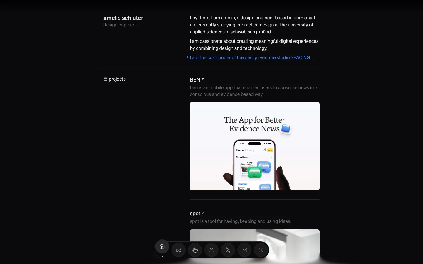
A small "System" theme select in the bottom-right corner below the footer card, a quiet nod that the site ships a dark mode
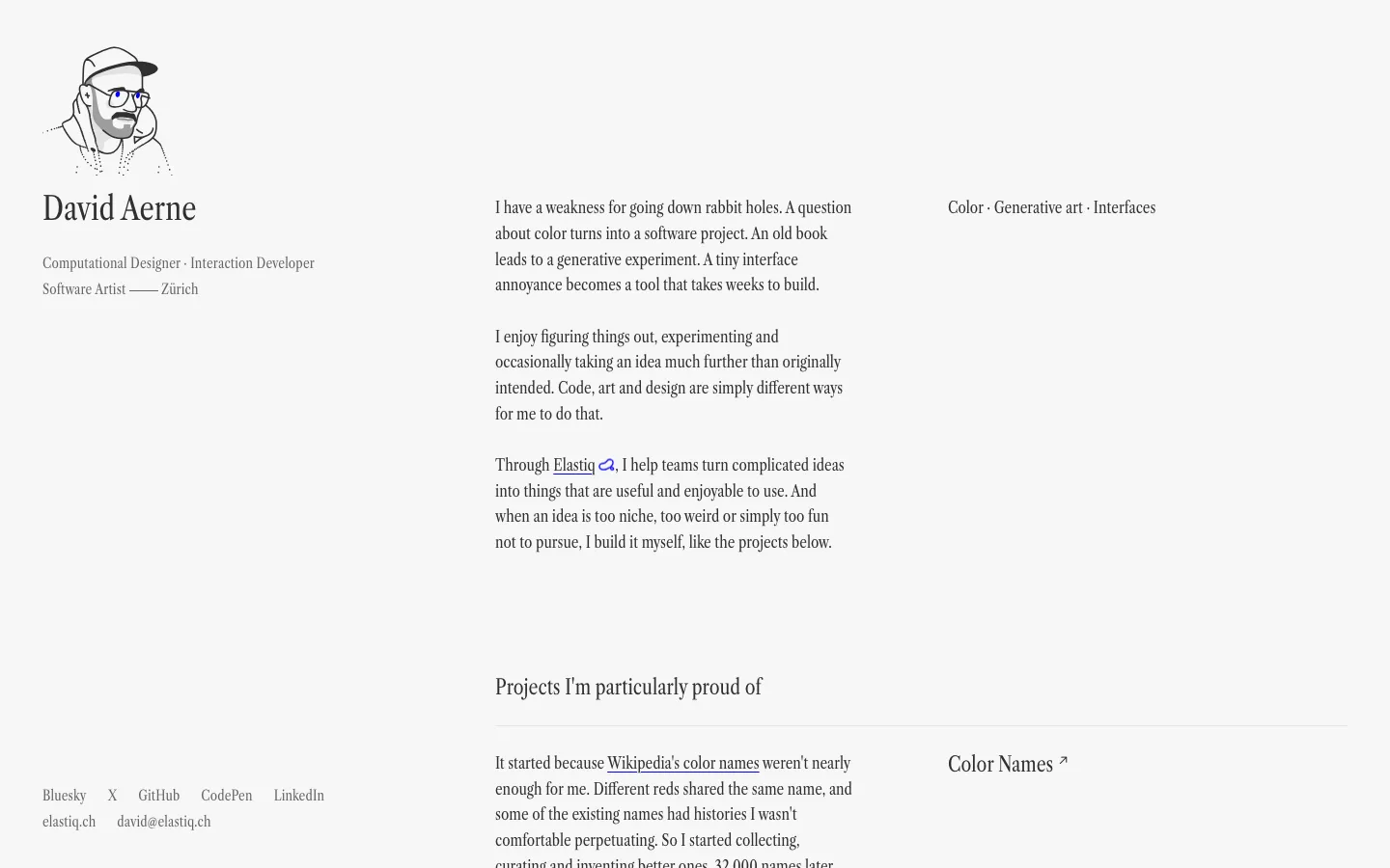
Full-bleed paper grain over the whole background, subtle enough to read as warmth rather than texture
portfolio · landing · light · minimal, swiss · calm, human, confident, friendly