inflight.co2views
Twelve details, twelve pinned.
View as Markdown ↗Sized by coverage · click to copy.
The
Onsite Standard Medium · 64/64 · 500 · -2.56px
Capture the moment. Share the full story.
Onsite Standard Medium · 40/48 · 500 · -0.8px
Capture feedback as it happens
Onsite Standard Medium · 20/28 · 500 · -0.4px
Quickly record bugs, issues, and ideas with all the technical context teammates
Onsite Standard Regular · 18/26 · 400 · normal
Specimens are the page's own words at their measured metrics; shown in Inter when the family is not loaded.
 123456789101112
Inline icon chip inside the headline. A blue rounded square holding a selection-marquee glyph sits flush against a pale-blue pill wrapped around the word "screen", so one word of the H1 reads like a highlighted UI selection.
Stacked CTA card. The primary lime button and a white outline secondary sit inside one hairline-bordered card at 12px radius, with a "4.5 · 300,000+ users" star rating underneath, so the decision and the social proof read as one object.
Floating nav pill. The header is a white rounded rectangle (about 18px radius) with a 1px #e5e5e5 hairline, inset from the viewport edges. Log in is a bordered ghost button and Get started is lime, both 40px tall.
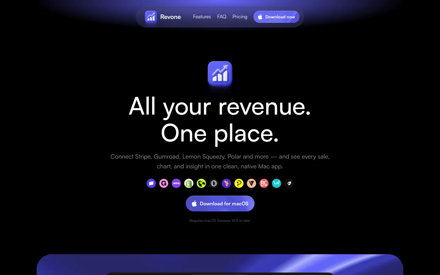
Announcement chip above the H1. It is a small bordered pill with an Apple glyph, medium-weight text and a trailing ↗ arrow, the lightest possible way to say "new".
A faint graph-paper grid fades in behind the product mock and dissolves toward the hero copy, adding texture to a white page without adding tone.
The product window mock has macOS traffic lights on a translucent gray outer frame, with the real app UI nested inside a second white frame, a double-bezel window.
A grayscale logo marquee is pinned to the fold line and separated by a single hairline. The first and last logos are clipped at the edges to suggest motion.
Feature cards use a #f7f7f5 fill, a 1px hairline and roughly 29px radius. A small row of faded gray browser icons sits above each title, and the product mock bleeds off the card's right or bottom edge.
Colored micro-tags (purple, lime, yellow pills) sit above small feature blurbs. Each one is a single splash of hue in an otherwise gray grid.
A full-bleed near-black (#0a0a0a) section with a subtle grid holds the SDK and agent story. Its cards are #1a1a1a with monospace data rows, green IDs and purple JSON, and a lime eyebrow ("Jam for agents") ties it back to the CTA color.
Testimonial cards come as color-blocked pairs, one deep blue and one deep green, each with a large quote and a company wordmark, breaking the gray rhythm right before the close.
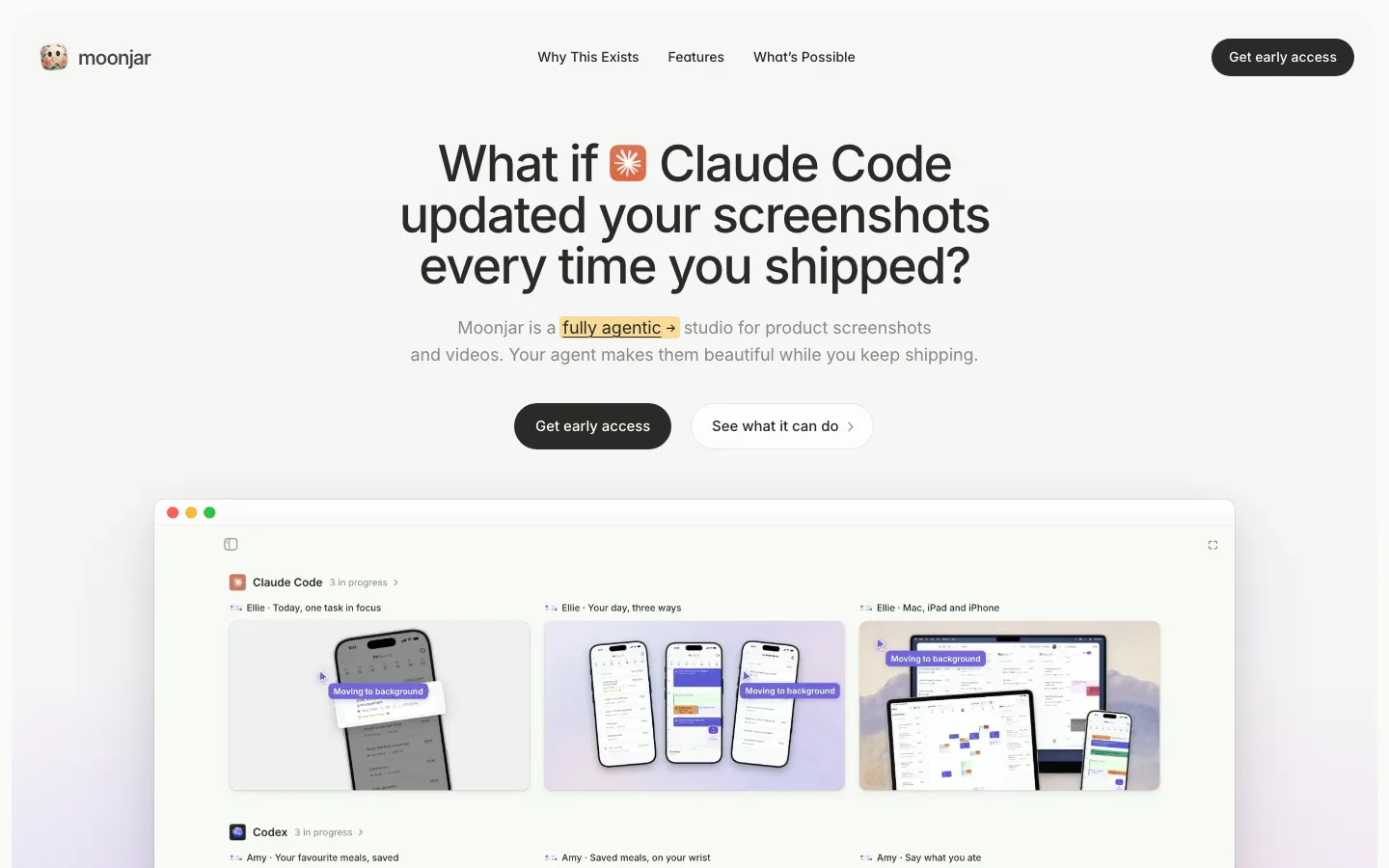
Cursor-style name tags (pink, yellow, blue pills) hang off the page edges beside the hero and the final CTA, a multiplayer-presence decal that hints at collaboration.
saas · landing · mixed · minimal, bento, dark-techno · friendly, technical, confident, optimistic