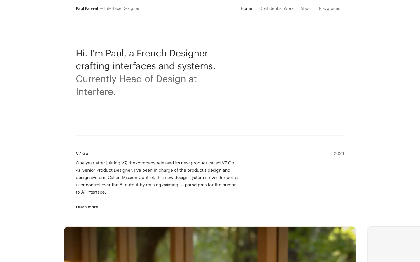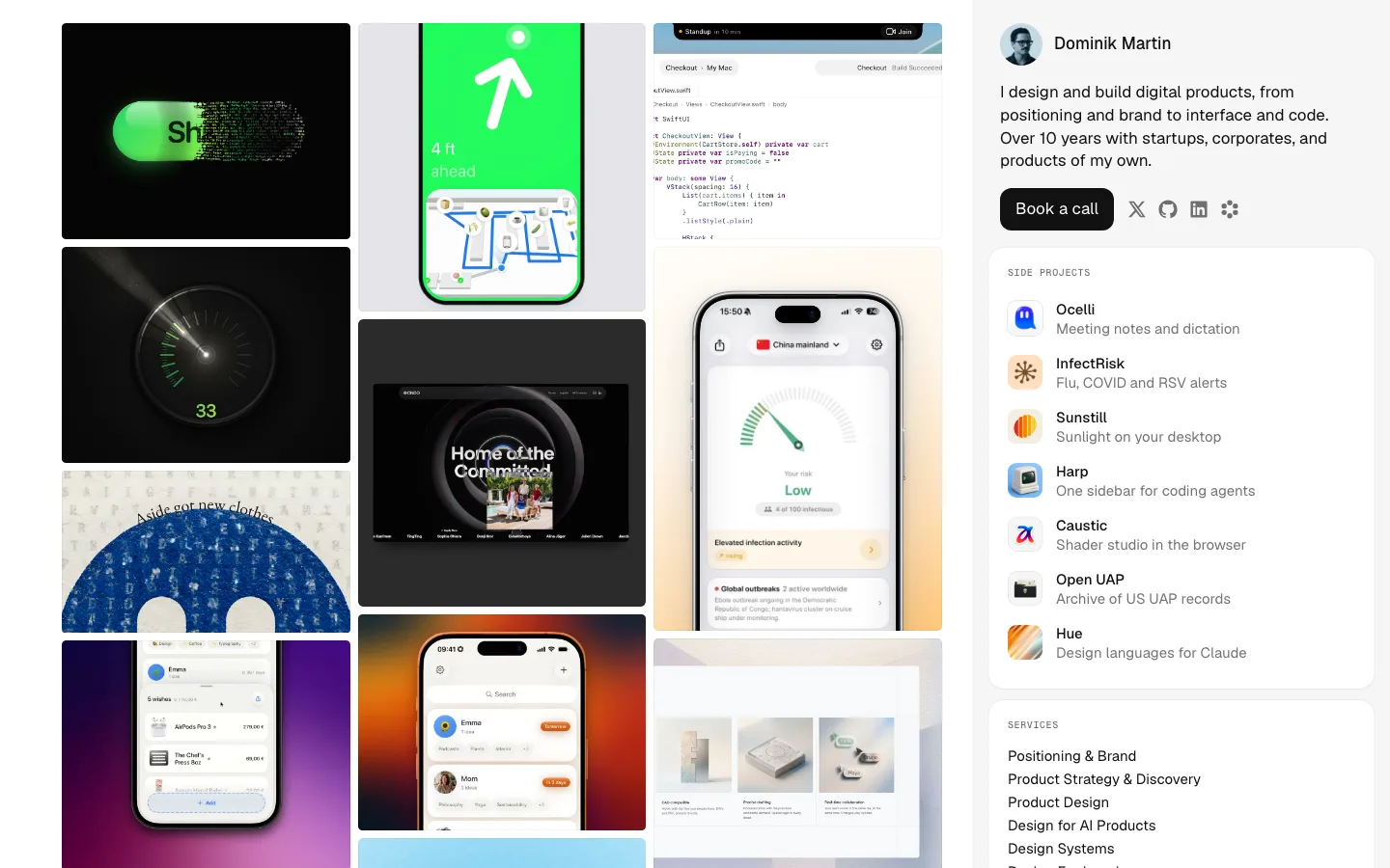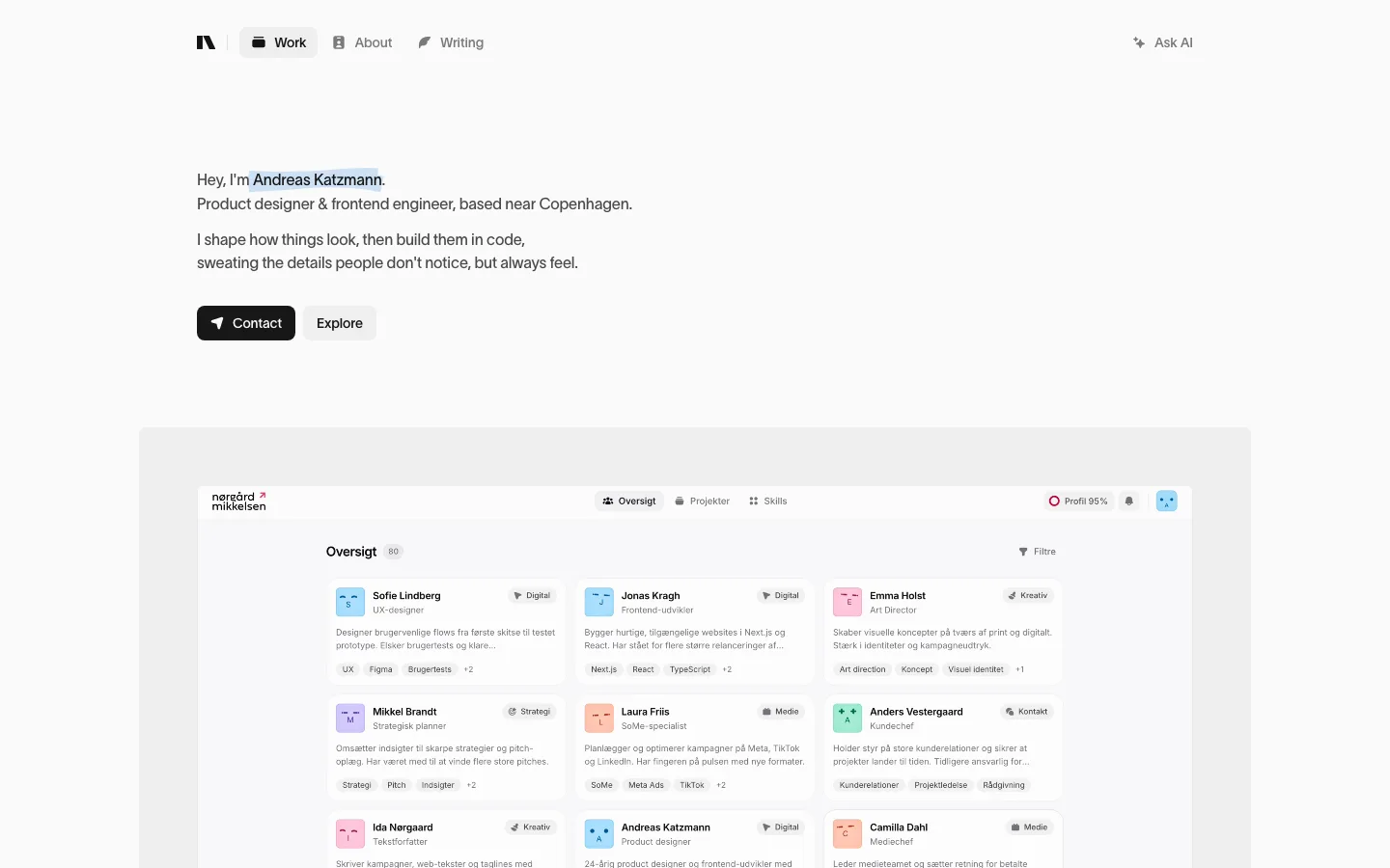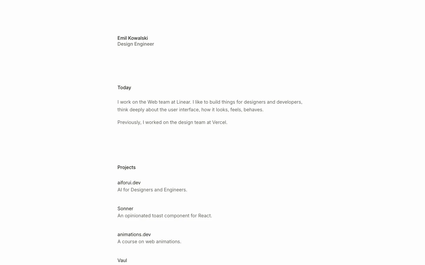
meodai.color.pizza8views
Eight details, eight pinned.
View as Markdown ↗Sized by coverage · click to copy.
Jakub Krehel
inter · 17/28 · 500 · normal
Projects
inter · 17/28 · 500 · normal
I’m a founding design engineer at Interfere (opens in a new tab) , the internet’
inter · 17/28 · 400 · normal
Specimens are the page's own words at their measured metrics; shown in Inter when the family is not loaded.
 12345678
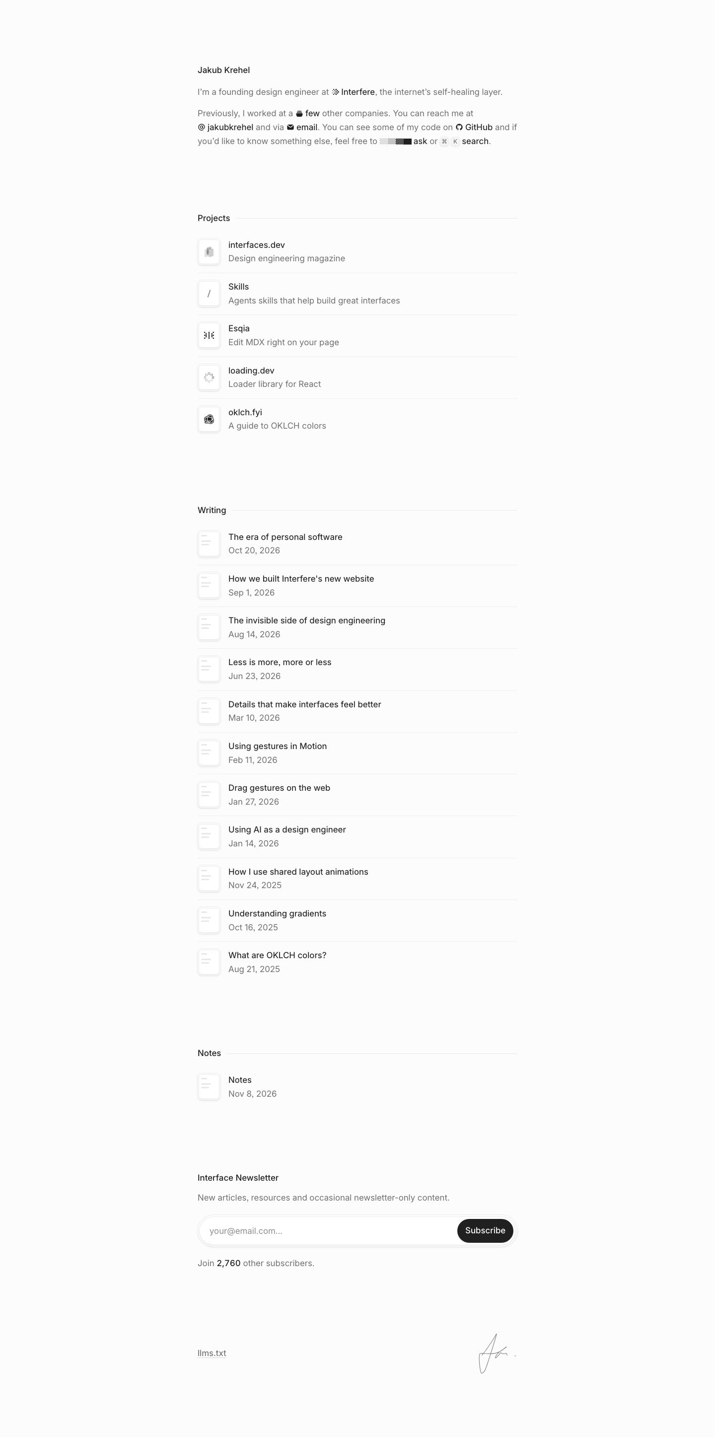
Inline glyph links — instead of underlines, each link in running prose is the ink color (#202020 against #6b6b6b body) prefixed by a 12–14px monochrome icon (logo mark, @, envelope, GitHub cat), so the bio paragraph doubles as the site's nav and contact block
Dithered "ask" affordance — a ~64px strip of pixel dither ramping from light gray to solid black sits before the word "ask", a texture-as-icon that hints at AI without a sparkle emoji or any color
Keycaps in a sentence — "⌘ K search" renders the shortcut as two tiny gray-filled keycap chips inline with the text, making the command palette discoverable in the copy itself rather than in a header
Section label with trailing hairline — "Projects" at 17px/500 followed by a 1px #e5e5e5 rule that runs to the column's right edge, the only section heading treatment on the page; no size jump at all
Soft icon tiles — every row opens with a ~44px square tile, 8–10px radius, white fill, 1px light-gray border plus a faint bottom shadow so it reads as a slightly raised keycap; writing rows reuse one generic "document lines" glyph, so the list stays uniform
One list pattern for everything — projects, articles and notes share the exact same two-line row (title #202020/500-ish, meta #6b6b6b/400, ~84px row pitch, hairline divider), so the page reads as one continuous index
Inset pill newsletter field — the email input is a full-width 9999px pill with a hairline border and soft outer ring, and a near-black pill Subscribe button nested inside its right end; the only solid fill on the page
Handwritten signature as footer — a thin hand-drawn signature sits bottom right opposite an underlined "llms.txt" link, a human mark closing an otherwise mechanical page
portfolio · landing · light · minimal · calm, technical, human, elegant