joshmillgate.co.uk5views
Eleven details, ten pinned.
View as Markdown ↗Sized by coverage · click to copy.
/skills
inter · 24/32 · 600 · normal
/upskill
inter · 17/28 · 550 · normal
Checkout fails
inter · 14/20 · 500 · normal
A set of agent skills that help with various aspects of building great interface
inter · 17/28 · 400 · normal
Connection
inter · 12/16 · 500 · normal
Specimens are the page's own words at their measured metrics; shown in Inter when the family is not loaded.
 12345678910
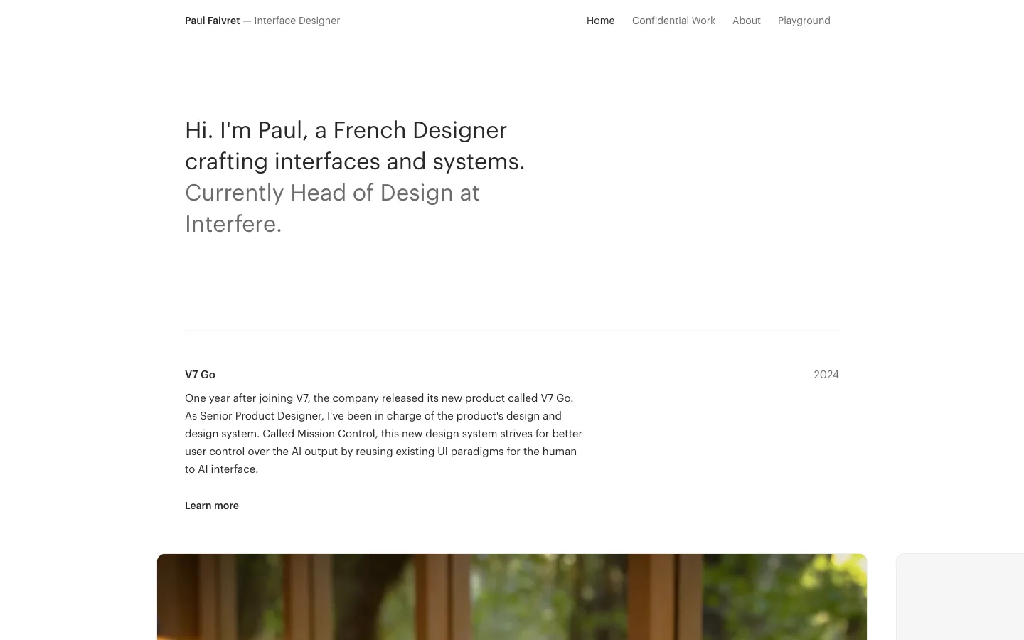
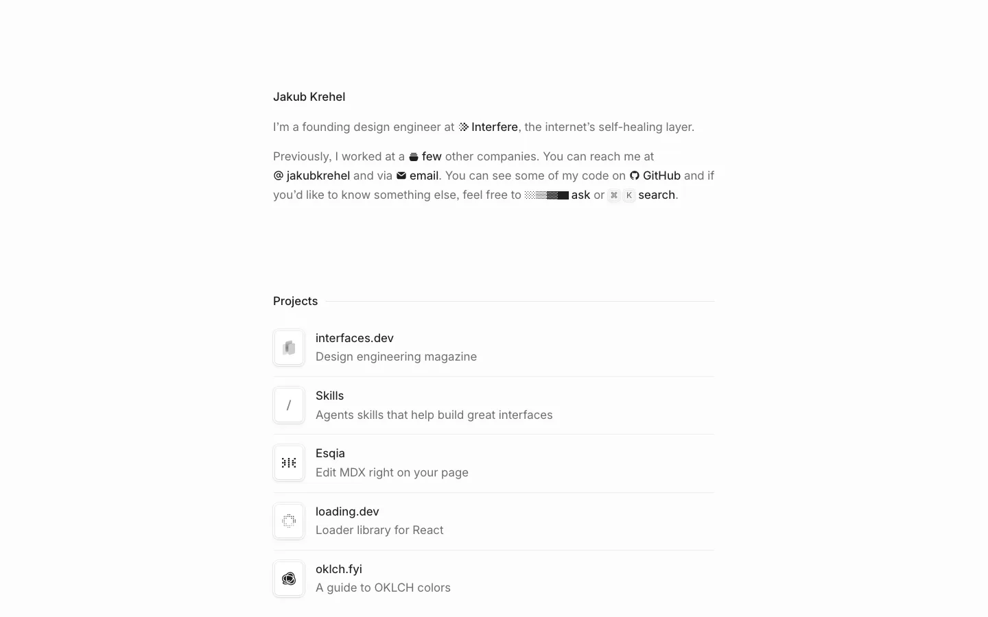
Slash-prefixed headings: a light-gray / glyph before a near-black #202020 600-weight word turns every section title into a command name, and the identity follows from the typography alone
Install command and its CTAs fused into one shell: a 16px-radius outer frame holds a mono npx … row with a copy icon and two equal 44px, 12px-radius white buttons (Skills, GitHub) on a ~4px inset gap. Treat the command, the buttons and the container as one object
Section header as heading plus hairline: the 17px/550 /name sits inline with a 1px #d0d3d1-ish rule that stretches to the column's right edge, so sections divide without boxes or big type
Inline emphasis by weight and ink only: body copy runs at a softer gray with the key phrases ("past agent sessions," "skills," "automations") set darker and medium. The paragraph doubles as a skimmable keyword list
Floating 36px circular icon buttons (back, copy link) in a #f0f0f0-ish gray fill sit at the column's corners, with no nav bar at all
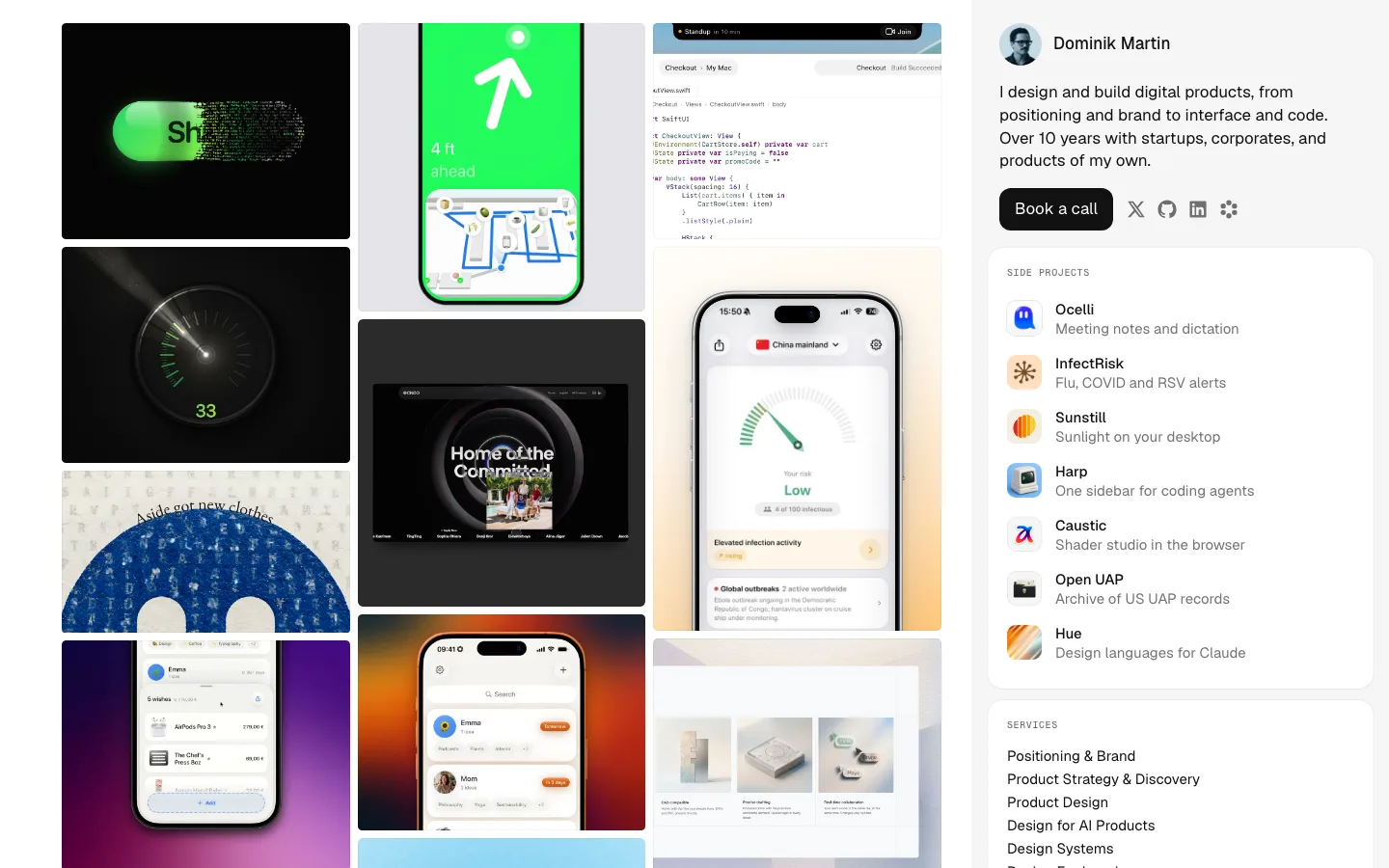
Skeleton-bar diagrams: abstract gray pill bars with a single cyan bar stand in for real UI, joined by thin curved connectors to mono uppercase tags like /ISSUE-REVIEW. You get a product diagram without any screenshots
Before/After segmented toggle docked in a gray tray at the foot of each demo card, so every claim ships with its own proof. The active segment gets a light gray pill and darker text
Hit-area visualization: the "after" state wraps a tiny icon in a dashed cyan outline over a pale cyan wash, which makes an invisible accessibility fix visible at a glance
Mono spec mode: one section drops Inter for a monospace face, with boxed exit/enter property tables, an arrow between them, an ASCII tree of the component and inline code chips in faint bordered pills. It reads like an engineer's notebook dropped into a design page
A dark sidebar panel in an otherwise all-light page: the state-machine demo uses a near-black app sidebar next to a white settings panel, and it is the only heavy mass on the page
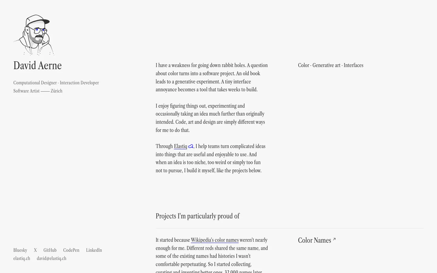
Radius ladder: 9999px for pills and icon buttons, 16px for outer card shells, 12px for buttons and inner tiles, 8px and 6px for inputs and chips. Nested shells step down one rung so the corners stay concentric
portfolio · product · light · minimal · calm, technical, elegant, confident