validata.so4views

Nine details, nine pinned.
View as Markdown ↗Sized by coverage · click to copy.
Ship software that never breaks
InterVariable · 56/56 · 550 · -0.56px
Interfere empowers engineers, product managers and designers with real-time unde
InterVariable · 15/24 · 400 · normal
Learn about issues before your customers do
InterVariable · 15/24 · 500 · normal
Users are unable to complete password resets after clicking reset links generate
InterVariable · 13/20 · 400 · normal
Login
InterVariable · 13/20 · 500 · normal
Specimens are the page's own words at their measured metrics; shown in Inter when the family is not loaded.
 123456789
Keyboard-shortcut chips inside the nav actions: "Login L" and "Get started G" each carry a tiny bordered kbd tag (about 14px square, 3px radius, gray #908d8e glyph), so the marketing header talks like the app's command layer.
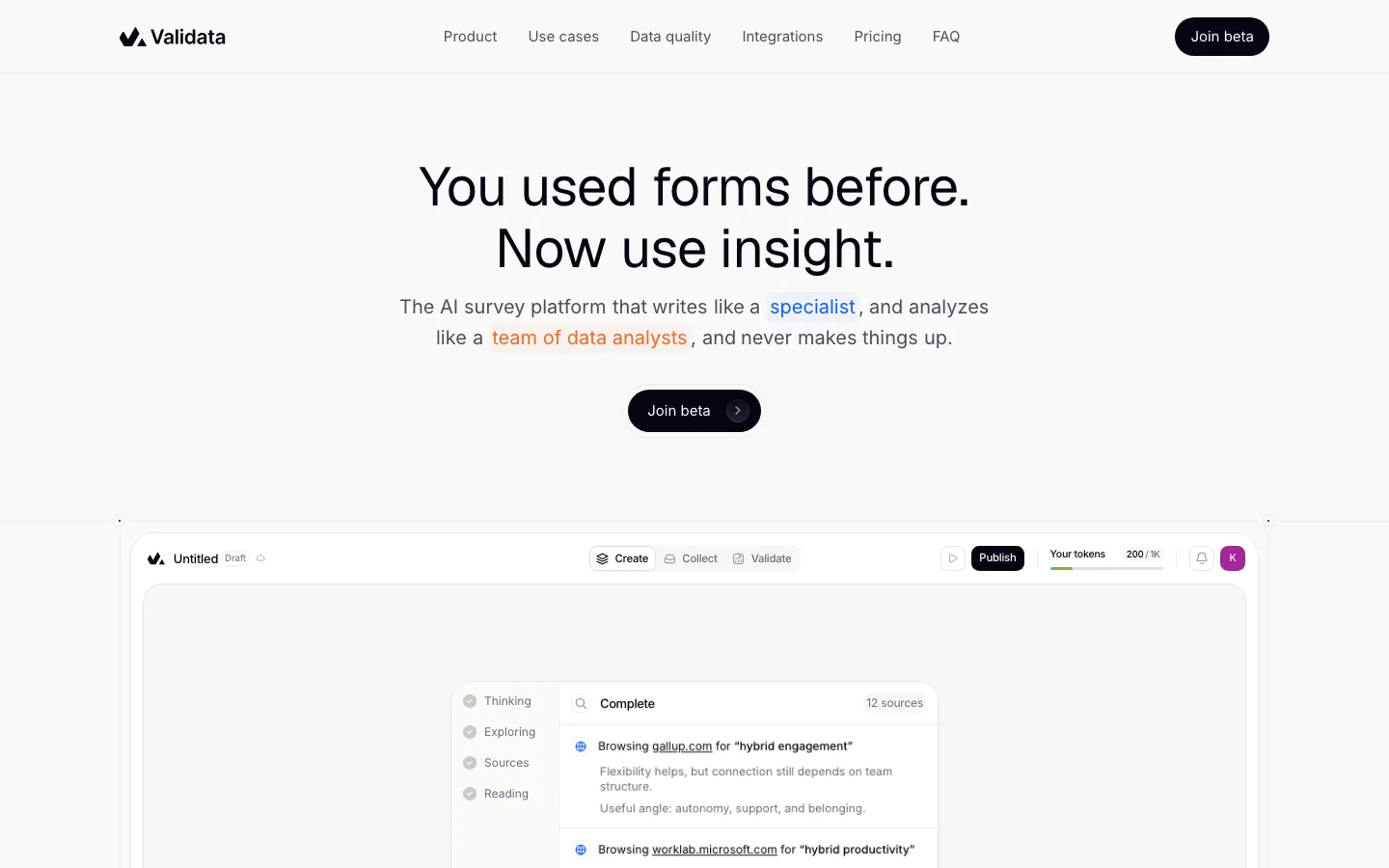
Split hero: a two-line 56px/56px headline (550 weight, -0.56px tracking) sits hard left, while the 15px gray subhead and the black CTA are right-aligned to the same container edge. The two blocks share one baseline band, and that frees the full width below for the product mock.
Aurora wash bleeding from behind the product: a blurred peach (#f6c9bd-ish) glow at the left that drifts to pink and lilac across the top edge of the mock. It reads as light emitted by the product, not as a background, and the rest of the page stays white.
The hero mock is the real app at 1:1 type size (inbox, issue properties, activity timeline, a GitHub code diff with red/green line markers) running off the right edge of the viewport, so it reads as a window you are looking into rather than a shrunken screenshot.
Mission statement with inline word highlights: a 24px sentence where "finds" is set in blue, "understands" sits on a pale gray chip, and the trailing clause drops to gray. It previews the product's verbs as UI states without needing an illustration.
A serif pull quote (a Garamond-style face at about 30px, centered) inside a 1200px card with a hairline border, a 12px radius, a pastel gradient floor and faint curved line ornaments. It is the only non-Inter type on the page, which makes the customer voice feel human against the engineering UI.
Feature mocks dissolve instead of ending: each right-column app fragment fades to white through a bottom and right mask, so there are no hard crops or device frames, and the next section starts on clean white.
A spec list under each feature row: a 13px label, a full-width hairline, then a two-column list of capabilities in gray (Multiplayer Collaboration / SAML/OIDC SSO…). This dense, scannable proof replaces icon grids.
A giant ghosted wordmark at the foot of the footer, set at about 4% contrast and cropped by the page bottom, which signs off the page quietly.
saas · landing · light · minimal, corporate-clean · calm, technical, premium, confident, trustworthy