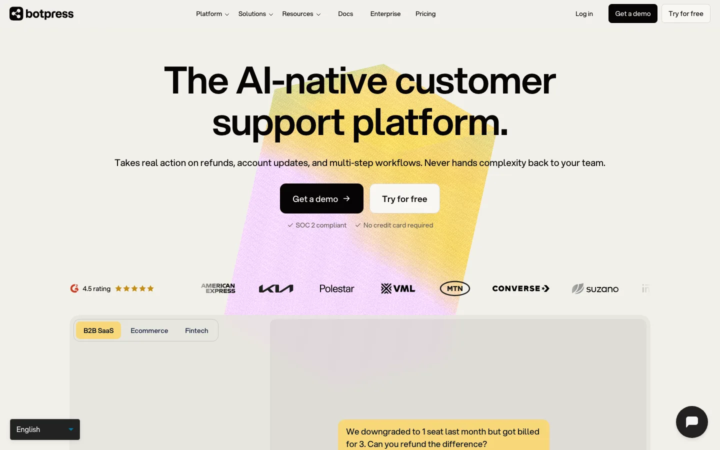
botpress.com1view
Eleven details, ten pinned.
View as Markdown ↗Sized by coverage · click to copy.
Give your business a voice that runs discovery calls.
Instrument Sans · 60/66 · 400 · -3px
Proactive Sales Use Cases
Instrument Sans · 40/52 · 400 · -1.2px
Lead Qualification
Instrument Sans · 28/31 · 400 · -0.56px
Deploy a voice AI in minutes. No code, no call center.
Instrument Sans · 16/22 · 400 · -0.032px
1:35 min
Instrument Sans · 12/16 · 500 · normal
Specimens are the page's own words at their measured metrics; shown in Inter when the family is not loaded.
 123456891011
Display headline at 60px, weight 400, -3px tracking (-0.05em) and 1.1 line height — light weight plus crushed tracking reads expensive without going serif
Primary CTA is a burgundy pill with a white circular arrow chip inset on the right, so the button carries its own affordance icon
Nav pairs a blush-pink "Try for free" pill (#ffe2f9, black text) with a burgundy "Book a call" pill — same shape, two tonal weights, a clear primary/secondary without an outline button
Nav links each prefixed by a tiny gray dot instead of separators or chevrons — quiet rhythm, no dropdown arrows
Interactive "Receive a live call" form card in solid burgundy overlaid on the hero photograph, with the logo in a pink circle and a green live dot
Translucent dark pill "Watch our launch video · 1:35 min" with a white play disc, floated on the photo corner rather than a centered play button
Header detaches on scroll into a frosted, inset rounded pill that keeps both CTAs
Full-bleed burgundy band with pink concentric half-circles framing a centered manifesto line — the logo's wave turned into a section-scale pattern
Use-case cards each carry a different pink or lilac half-circle tile pattern, generated from the same geometric primitive
Industries section as a horizontal accordion: one open panel with a soft Rococo painting, the rest as hairline columns with plus icons
Closing CTA on a solid pink field with the half-circle pattern bleeding off the edges
saas · landing · light · minimal, editorial, corporate-clean · premium, warm, human, confident, calm