moonjar.ai · Sep 20265views
Ten details, ten pinned.
View as Markdown ↗Sized by coverage · click to copy.
A tool to create visual themes , customize colors , and build interfaces with Ch
GT Standard L · 48/64 · 500 · -0.024px
Create your theme in Graphical
GT Standard L · 48/64 · 500 · -0.024px
Bugs & technical issues
Timeless Grotesk · 24/32 · 500 · normal
Select a highlighted word to explore another option.
GT Standard L · 20/32 · 400 · normal
my-app — zsh
-apple-system · 12/20 · 500 · normal
Specimens are the page's own words at their measured metrics; shown in Inter when the family is not loaded.
 12345678910
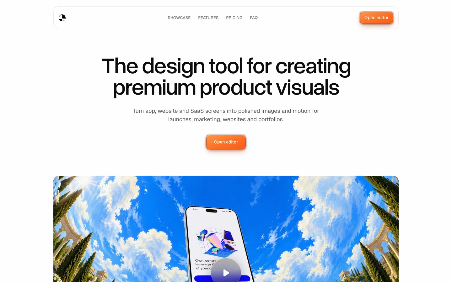
The wordmark is a thick-outlined stadium pill: a bold grotesk inside a ~6px black stroke, radius 999px, centered as the hero's only graphic. It works as logo, badge and visual anchor in one, with no illustration needed
Inline icon chips in the headline: key nouns ("themes", "colors", "ChatGPT") sit in #f0f0f0 pill backgrounds with a small glossy 3D icon on the left, running with the text. The hero sentence reads as a list of features without becoming one
The header is one gray "Login" link at the top right in #909090, with no logo bar, no menu and no CTA. The hero wordmark does the branding
A handwritten "try it out" scribble with an arrow sits beside a centered section title and points at the interactive editor. One human mark on an otherwise clinical page
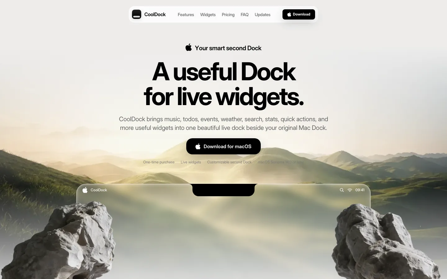
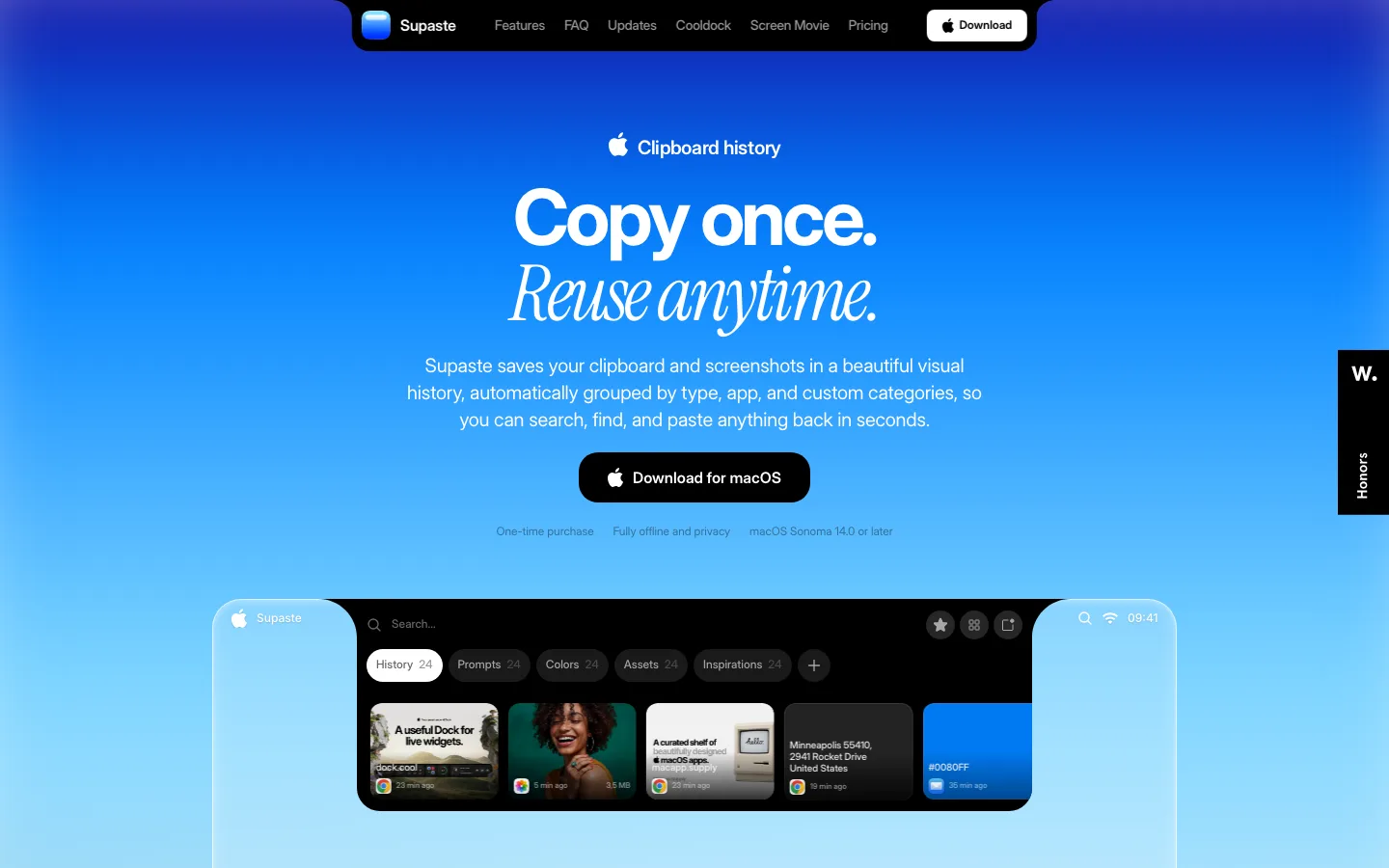
Product artifacts float on one huge, soft drop shadow (roughly 0 40px 80px rgba(0,0,0,.12)) instead of a border. The black terminal and the white app window lift off the white page the same way
The terminal is the install proof: a real-looking zsh window with ASCII-art branding in lavender, teal file names and a blinking block cursor. It shows the developer workflow instead of describing it
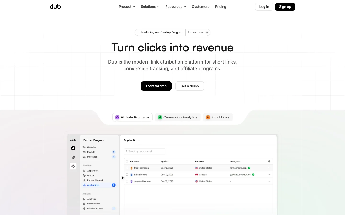
The feature grid uses only line icons and type: a 2-column list with 1.5px-stroke icons, a 20px #111 title, and #909090 body at 20/32, with no cards at all
A three-up card row is split by hairlines inside one 24px-radius outlined container, a single box with internal dividers rather than three separate cards
The pricing slab is the page's only black surface: a near-black rounded panel with a white pill button reading "Buy for $49" and a struck-through "$99" in gray. The scheme flip marks the one decision point
The footer shows a fanned collage of tilted UI cards bleeding off both edges. It ends the page on product variety instead of a link farm
saas · landing · light · minimal · calm, confident, technical, friendly, premium