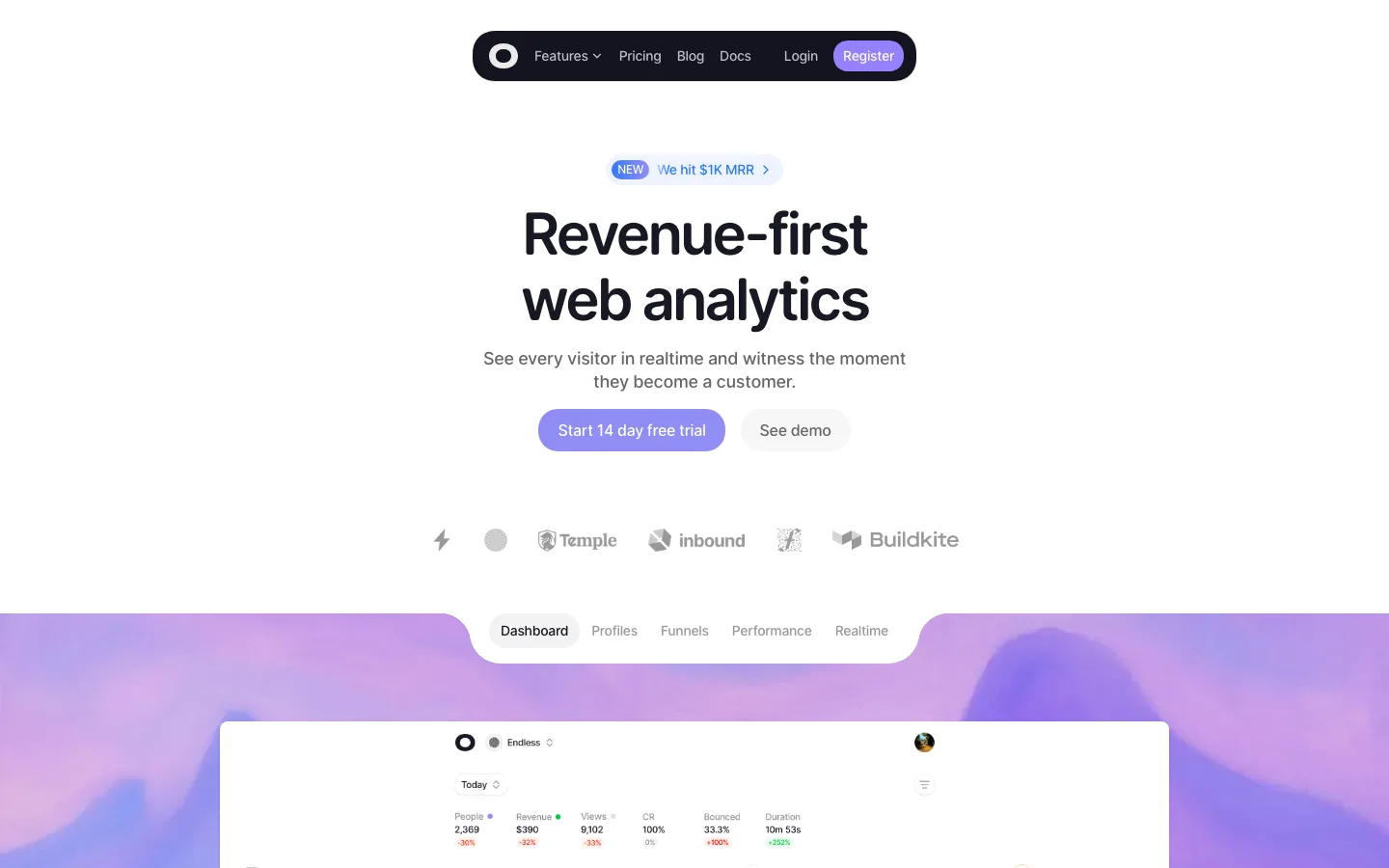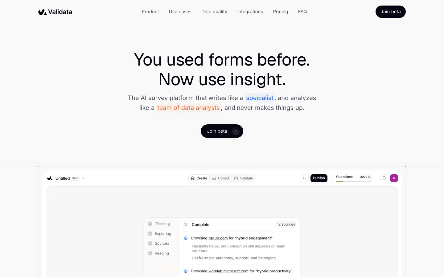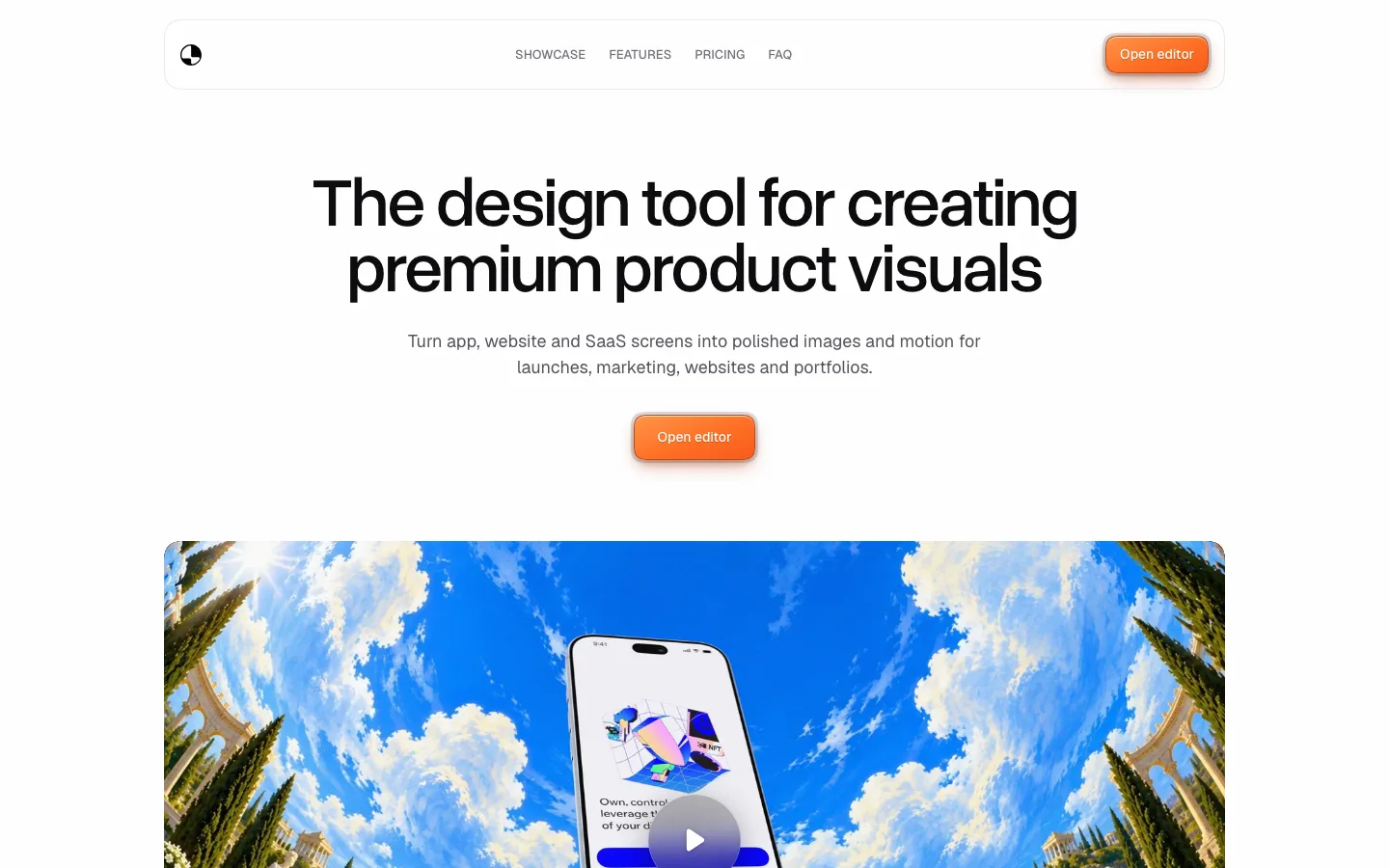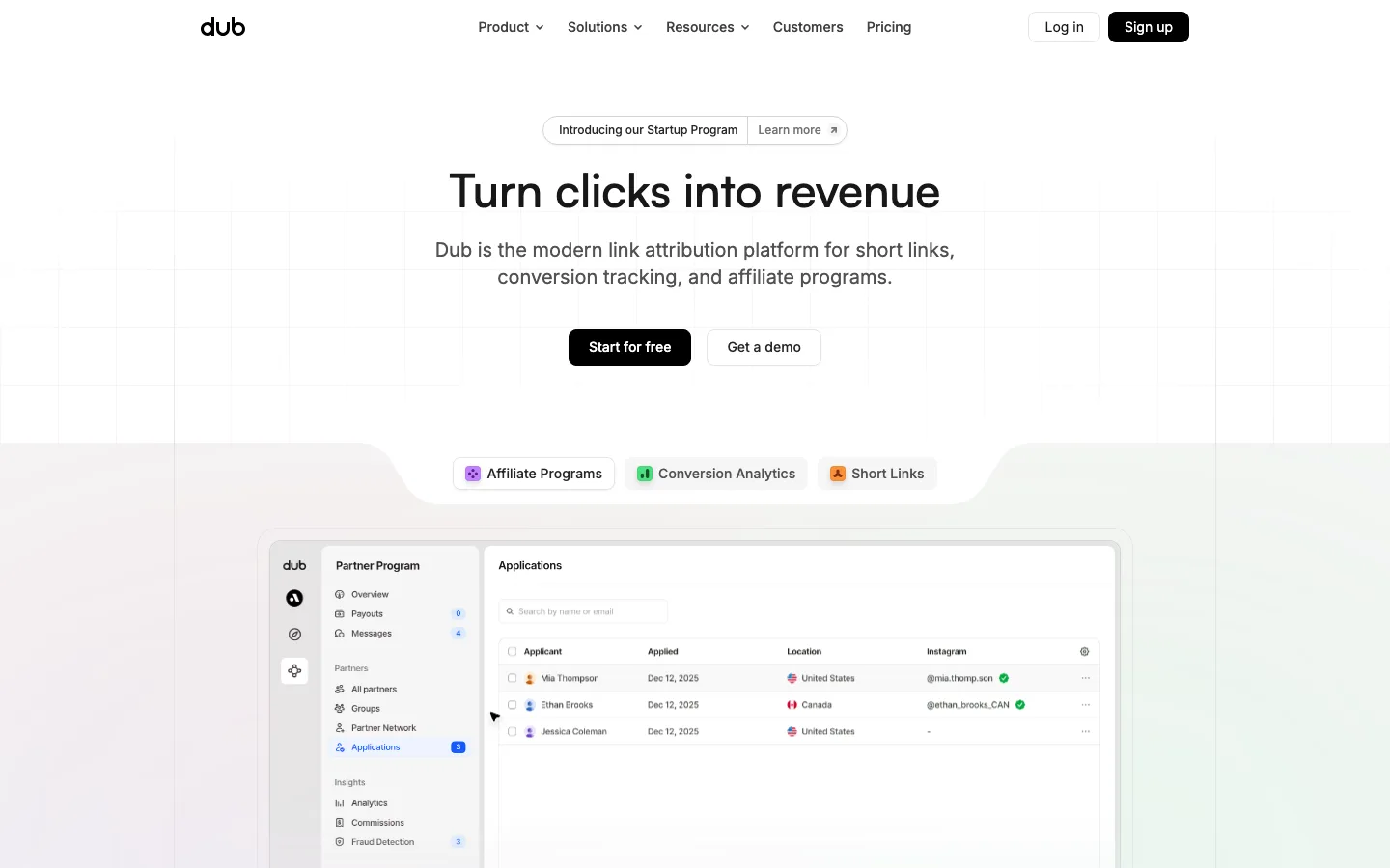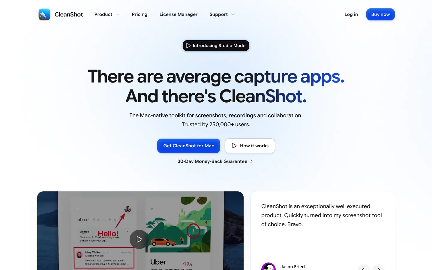
cleanshot.com0views

Ten details, nine pinned.
View as Markdown ↗Sized by coverage · click to copy.
A simple, easy-to-use Google Analytics alternative
interTight · 60/64 · 500 · -1.5px
Three steps from nothing to numbers, and the first one is a copy-paste.
interTight · 36/40 · 400 · -0.9px
Add it to your site
interTight · 16/24 · 500 · -0.4px
Understand your website traffic, visitors, and conversions without the complexit
interTight · 24/32 · 400 · normal
YOU'RE IN GOOD COMPANY
interTight · 11/17 · 500 · 2.2px
Specimens are the page's own words at their measured metrics; shown in Inter when the family is not loaded.
 1234567910
Two-tone headline: line one in near-black, line two (the product category) in the brand blue — one color doing the work of a subhead.
The subhead's key phrase sits in a soft blue-tinted highlight pill (rounded, ~4px inset), like a marker stroke — quieter than bold, more pointed than italics.
Primary CTA pill carries a white circular chevron badge at its right edge, inside the button; the secondary is the same pill in light gray with dark text.
Proof points framed by thin laurel-wreath glyphs, with a letterspaced 10px uppercase label above a 14px value — a trust strip without logos.
Feature cards are pale gray (#f5f6f7-ish) at 28–32px radius with a white product mock floating inside at 10px radius, so the mock reads as a window sitting on a mat.
Each feature title takes its own hue (pink Filters, green Funnels, blue MCP) matched to a tinted outline-circle icon above it — color as a per-feature key, not decoration.
Ring gauges for funnel steps: three thin arcs in graded hues with the percentage inside and a tiny caption below, plus a faint helper line ("2% make it all the way through").
Sticky nav shrinks to a translucent, blurred pill that floats over content, holding logo, three links and the one blue CTA.
A live-visitor list uses generated animal aliases ("Amber Falcon", "Nimble Lynx") with monospace paths and flag/browser/OS icon triplets — playful privacy made visible.
Two-tone closing statement: first clause in near-black, the second half in mid-gray, at display size.
saas · landing · light · minimal, corporate-clean, bento · calm, trustworthy, friendly, confident, technical