conquerorapp.com0views
Eight details, seven pinned.
View as Markdown ↗Sized by coverage · click to copy.
Don't start peptides alone. Don't start peptides alone. Start with a specialist
Junicode VF · 56/55 · 400 · -1.12px
How miora works
Junicode VF · 52/56 · 400 · -1.04px
Complete your health assessment & meet your longevity clinician
Montserrat · 32/34 · 400 · -0.96px
Your protocol built around your goals, labs, and history. Someone watching every
Montserrat · 16/25 · 400 · normal
Invite-only · Reviewed within 48 hours · From $129/month
Montserrat · 11/17 · 400 · 0.55px
Specimens are the page's own words at their measured metrics; shown in Inter when the family is not loaded.
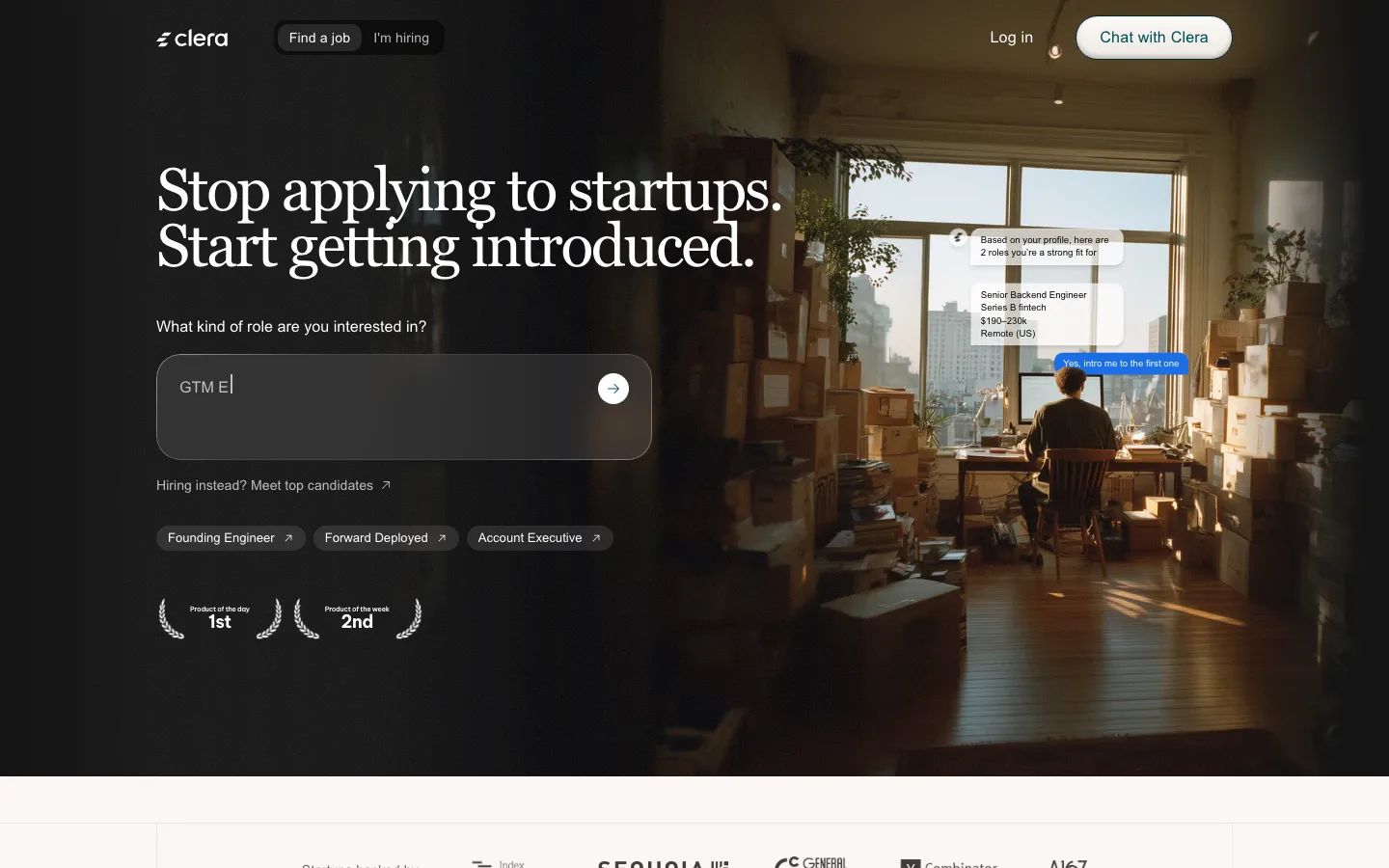
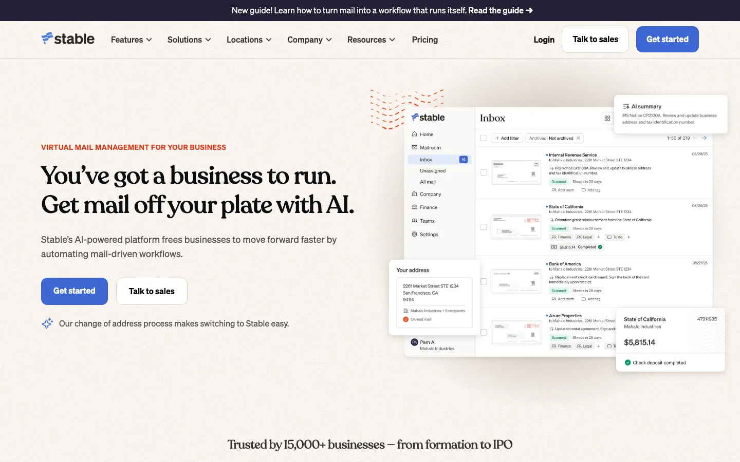
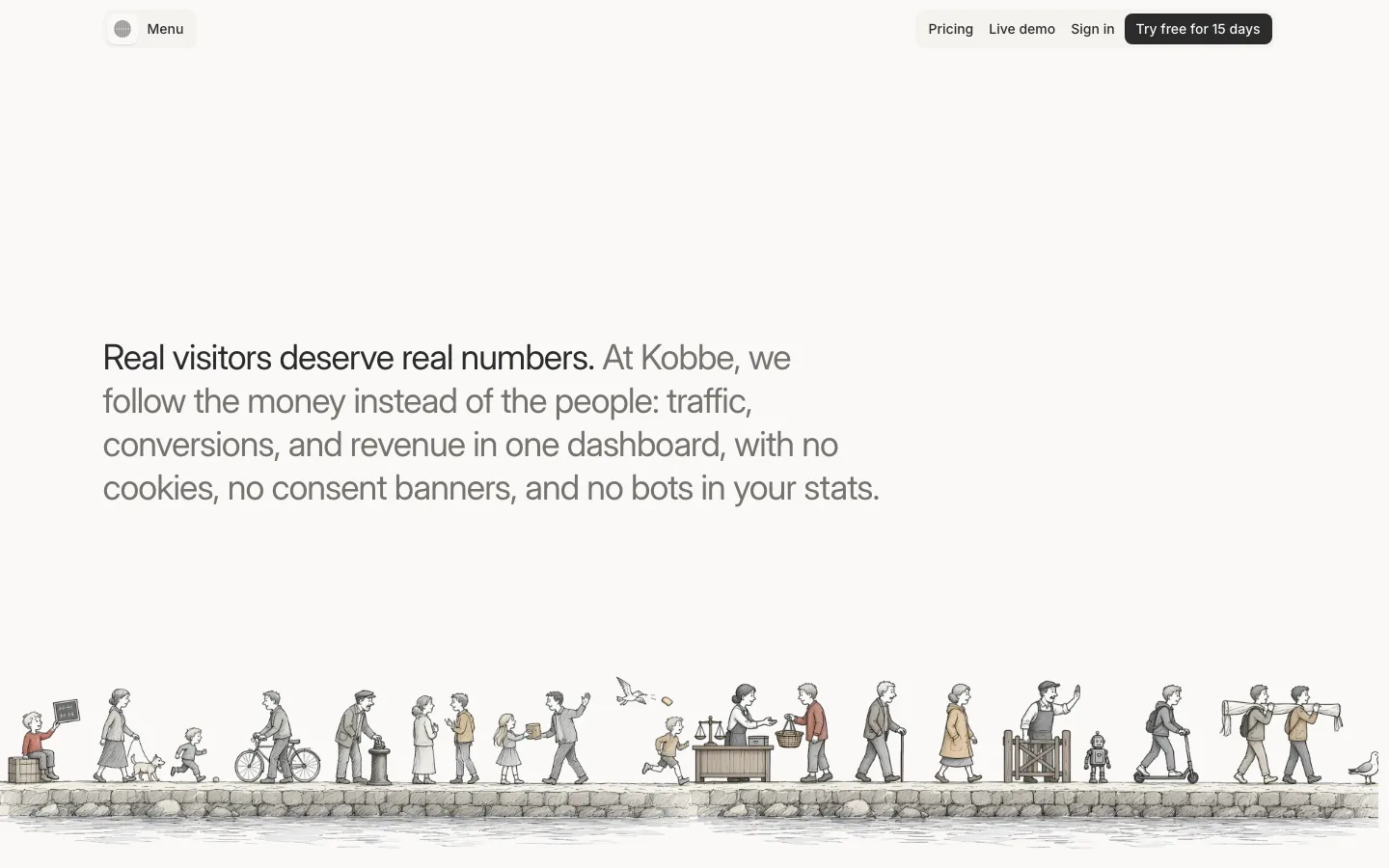
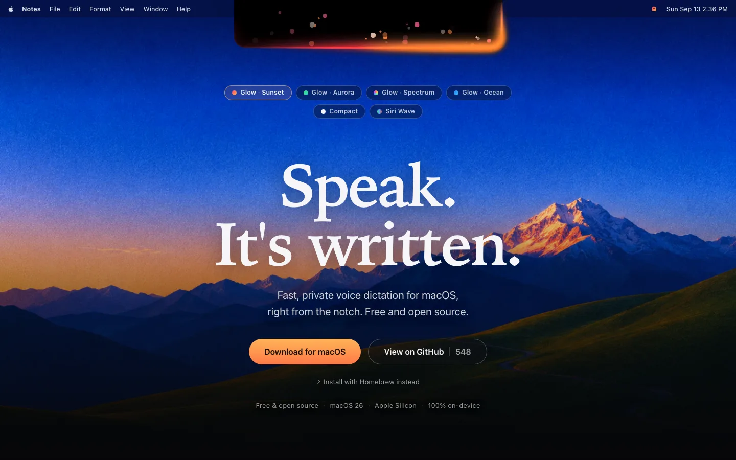
 1234678
Unscrimmed photographic hero — the headline is set straight onto the image with no overlay, no darkening layer and no text panel; the crop is chosen so the subject's mass sits low-left and the sky opens a naturally quiet band exactly where the type lands
The header has no bar of its own: no fill, no border, no blur, no shadow — just a white wordmark left, three 16px links centered and an outline pill plus a text "Log in" right, floating directly on the photograph
The primary CTA is deliberately tiny: a 31px-tall outline pill (border-radius: 9999px, 1px hairline, transparent fill, 8px/16px padding) in 12.5px/600 Montserrat under a 56px serif headline — the scale gap does the persuading instead of a big filled button
A qualifier line replaces a second CTA: 11px with 0.55px tracking, dot-separated — invite-only, review window, entry price — so gating, speed and cost are all stated above the fold in one 60%-opacity string
Two families with a hard job split: the serif is display-only (h1 56px, h2 52px, both weight 400, tracking −0.02em, line-height 0.98–1.08), and the sans takes everything from h3 down — including a 32px h3, which is bigger than most pages' h2 and still reads as body voice
The how-it-works section is a numbered ladder, not a card grid: 01–05 in zero-padded serif numerals, each step alternating a two-line heading plus three lines of copy against a floating product or app mock, separated by tall empty black rather than borders
Pricing is the page's only warm frame: two frosted cards (32px radius, 1px white hairline, backdrop blur) laid over a macro ember photograph, with the tier name in a small outlined uppercase pill, the price in 56px+ sans, checkmark rows, and a solid white pill CTA inside each card
The footer ends on a wordmark blown up to viewport width, clipped to the same fire photograph and bled off both edges, paired with a live count set in the display serif and an "online" dot — a closing signature rather than a logo
saas · landing · dark · luxury, editorial, glassmorphic · premium, confident, calm, trustworthy, warm