strawberrybrowser.com0views
Eight details, seven pinned.
View as Markdown ↗Sized by coverage · click to copy.
A virtual workspace that feels refreshingly human
Graphik Web Semibold · 64/74 · 400 · -3.2px
What is a virtual office?
Graphik Web Semibold · 56/64 · 400 · -2.8px
See who's free
Graphik Web Semibold · 16/19 · 400 · -0.32px
The remote collaboration tool where you can meet, chat, and work together like y
Graphik Web Regular · 20/30 · 400 · -0.4px
Natasha
Inter · 12/16 · 500 · normal
Specimens are the page's own words at their measured metrics; shown in Inter when the family is not loaded.
 1234578
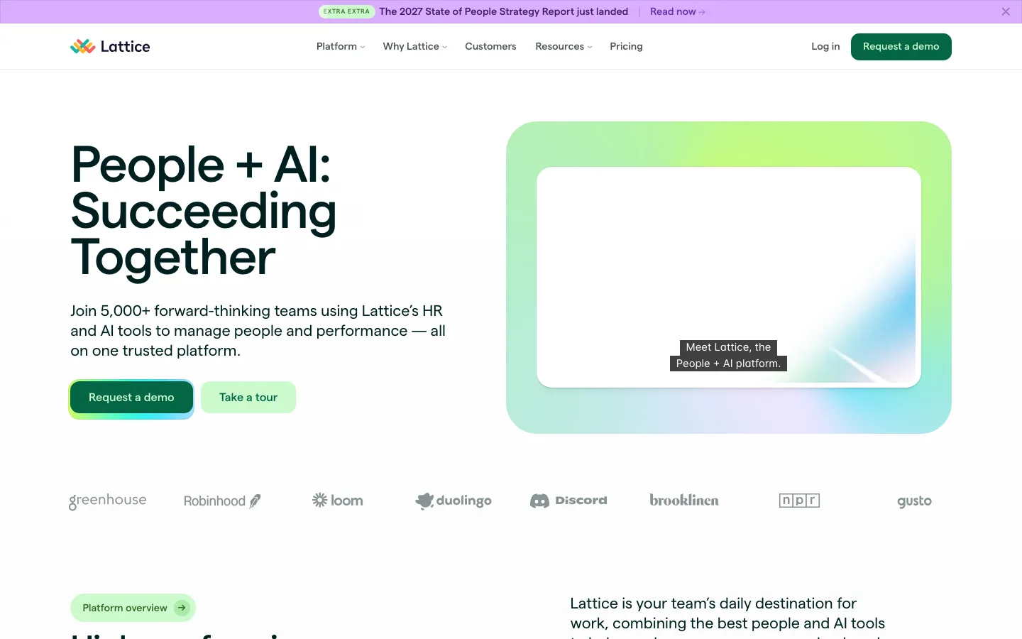
Display type carries the page: 64px semibold at -3.2px letter-spacing and a 73.6px line height (1.15), centered and deliberately broken to two lines, so the headline is a dense rectangle of type with no rule, no eyebrow and no background behind it
An announcement capsule floats above the headline instead of a banner across the top: white pill on the warm ground, 13px ink label, an emoji doing the illustration, and a circular chevron puck at the right edge that reads as "there is more" without a word of link text
The hero preview is switchable — a white segmented capsule (Meetings / Chat / Activity) with a mint-tinted active segment and an icon before each label — placed *between* the copy and the media, so the product shot below is a tab panel rather than a static screenshot
Product shots are shipped as near-black slabs with their own title bar (document name, a lock chip, view-mode icons at the right) at a 12px radius, edge to edge across the content column — the dark frame both crops the app honestly and gives the light page its only heavy mass
One micro-component does all the status work: a hairline white pill holding a 6px green dot plus a 12px label, reused for "What's new" beside the wordmark, an "Event" eyebrow, and an "Available" marker mid-page — the dot is the only place a second accent color is allowed
The header starts chromeless — transparent on the page ground, centered links at wide even gaps, no border — and on scroll collapses into a white bar pinned to the top with *rounded bottom corners only*, so the nav reads as a card sliding down rather than a sticky strip
Cards nest at two radii: a ~32px white outer card holding a ~12px inner media tile with its own tinted inset, which keeps a big feature block from looking like a plain white rectangle and gives the media a visible mount
The testimonial wall is a three-column masonry that simply fades into the page ground at the bottom, with a "View all testimonials" pill (plus-icon, white, hairline) sitting on the fade — no carousel, no pagination, and the cut-off rows advertise that there are more
saas · landing · light · playful, corporate-clean, minimal · friendly, warm, human, optimistic, trustworthy